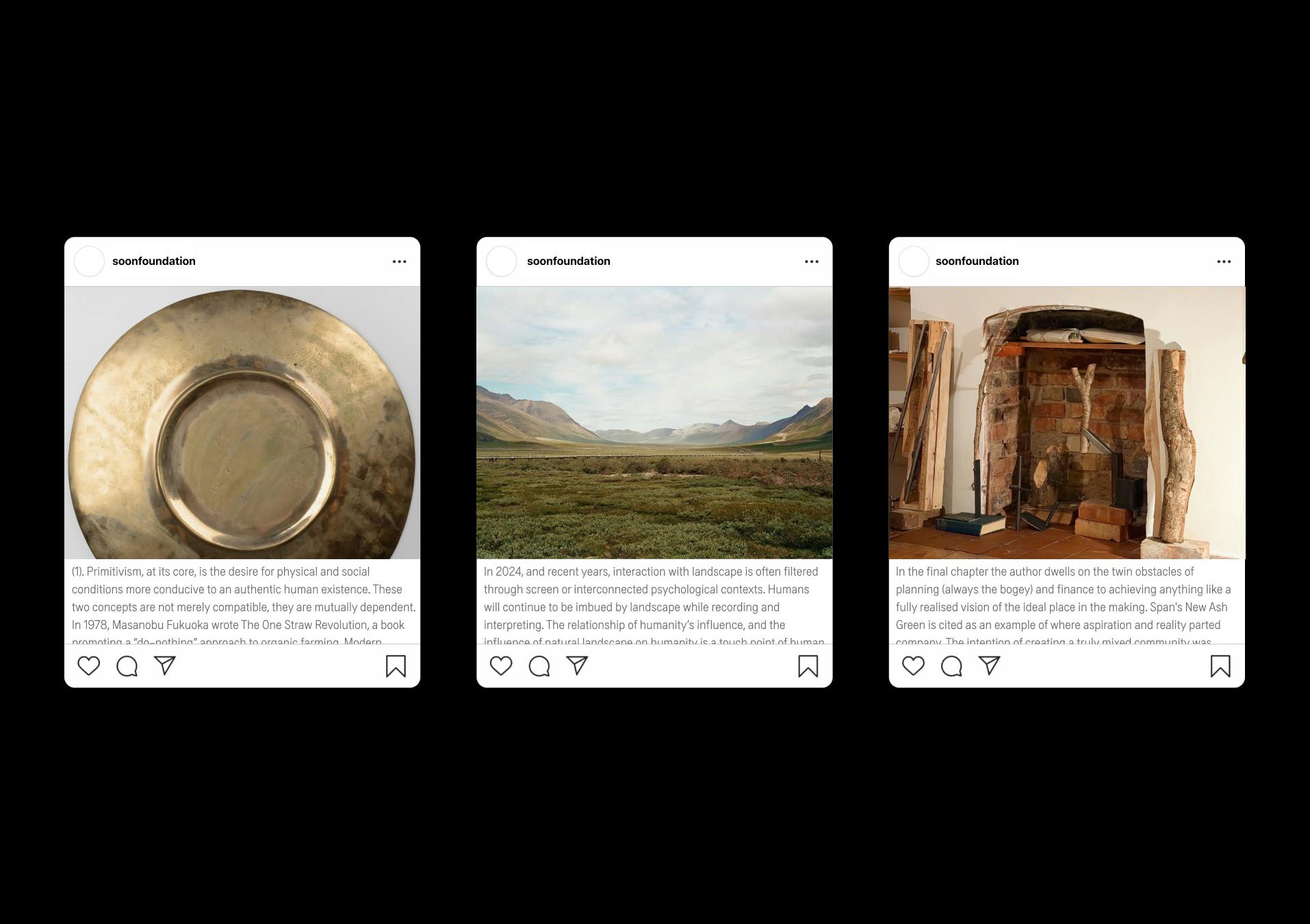
ACCUMULATED PROJECTS
Collected Works 2017—2025
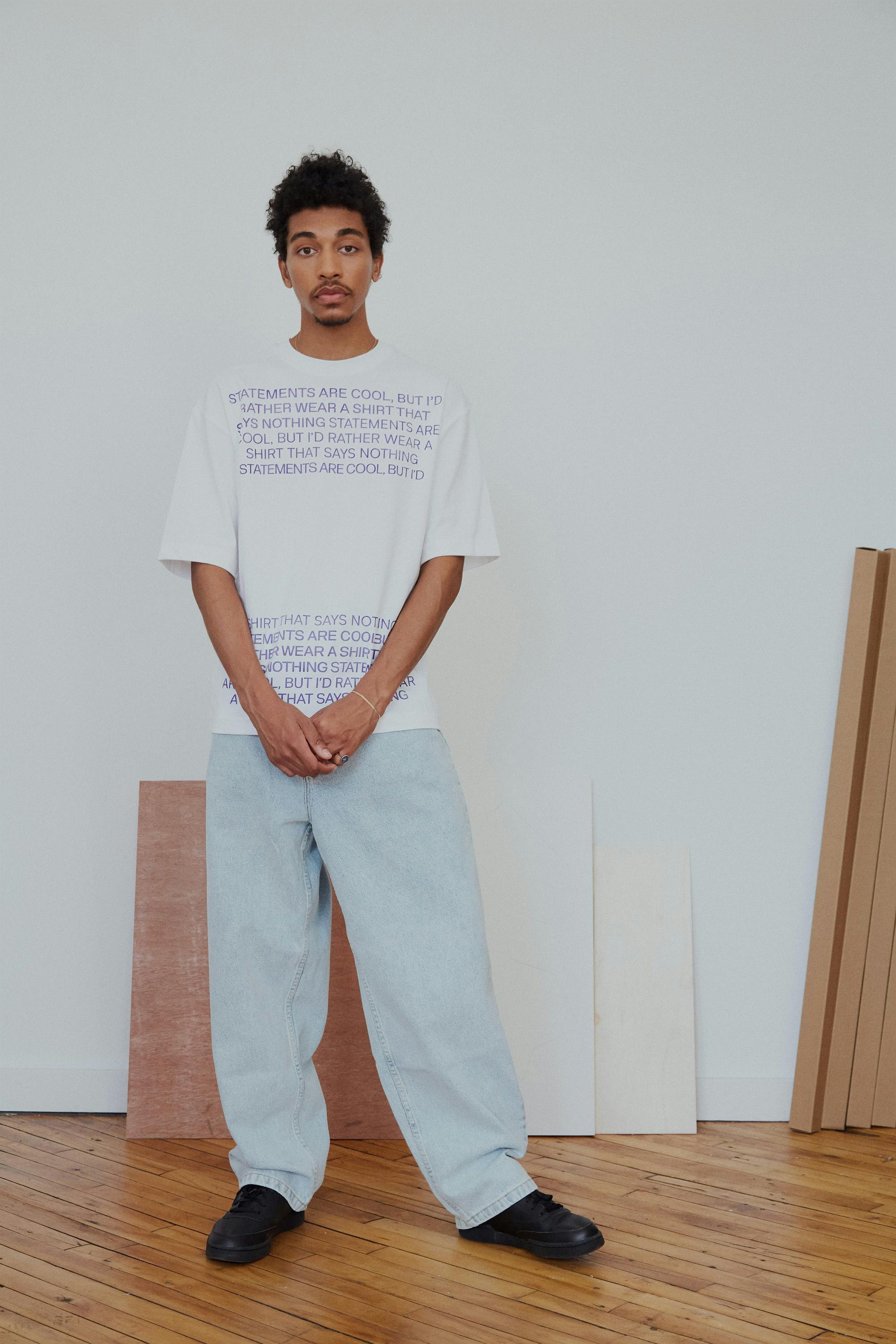
Initiated February 2023, Completed August 2025
Initiated February 2023, Completed August 2025
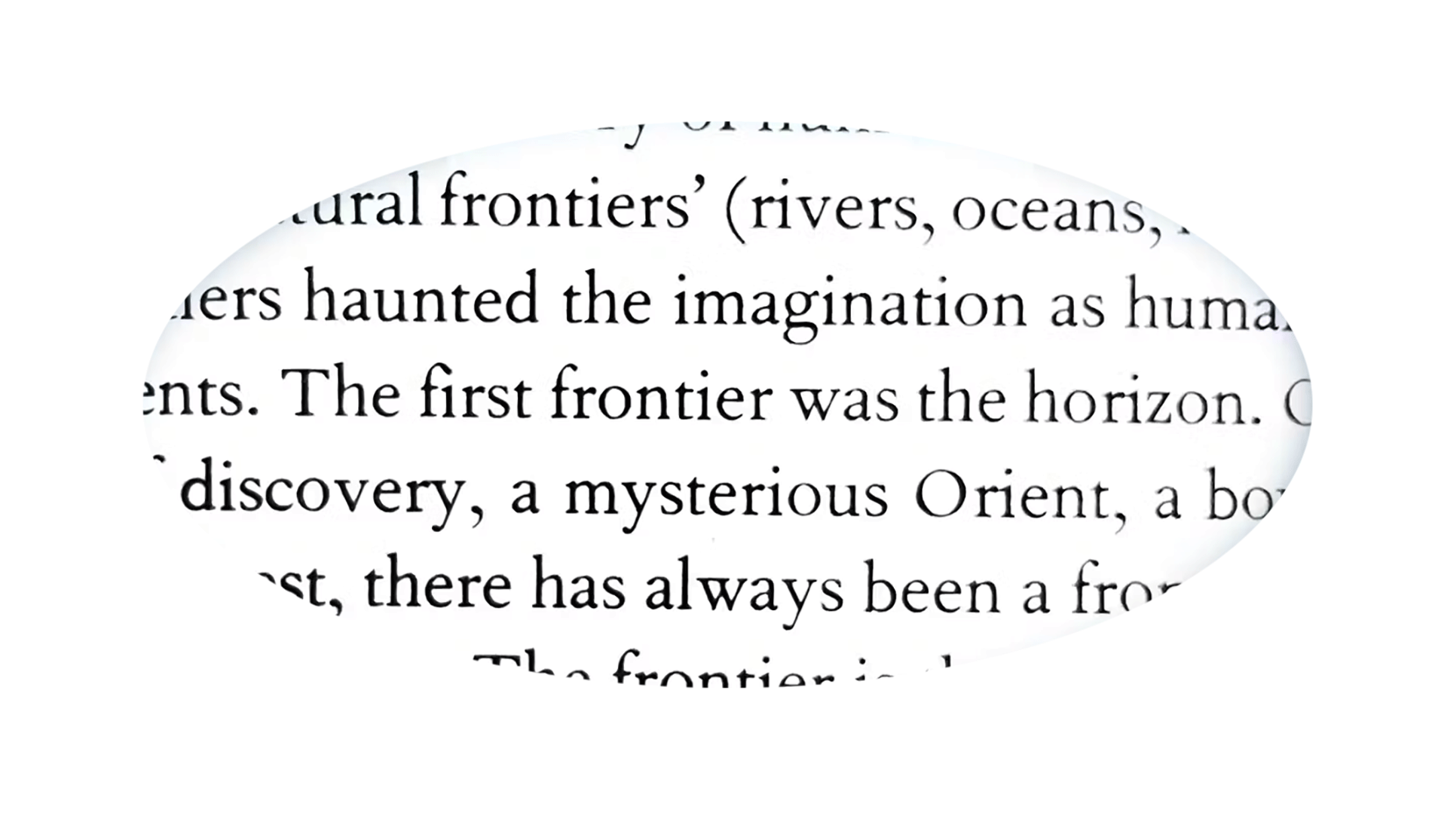
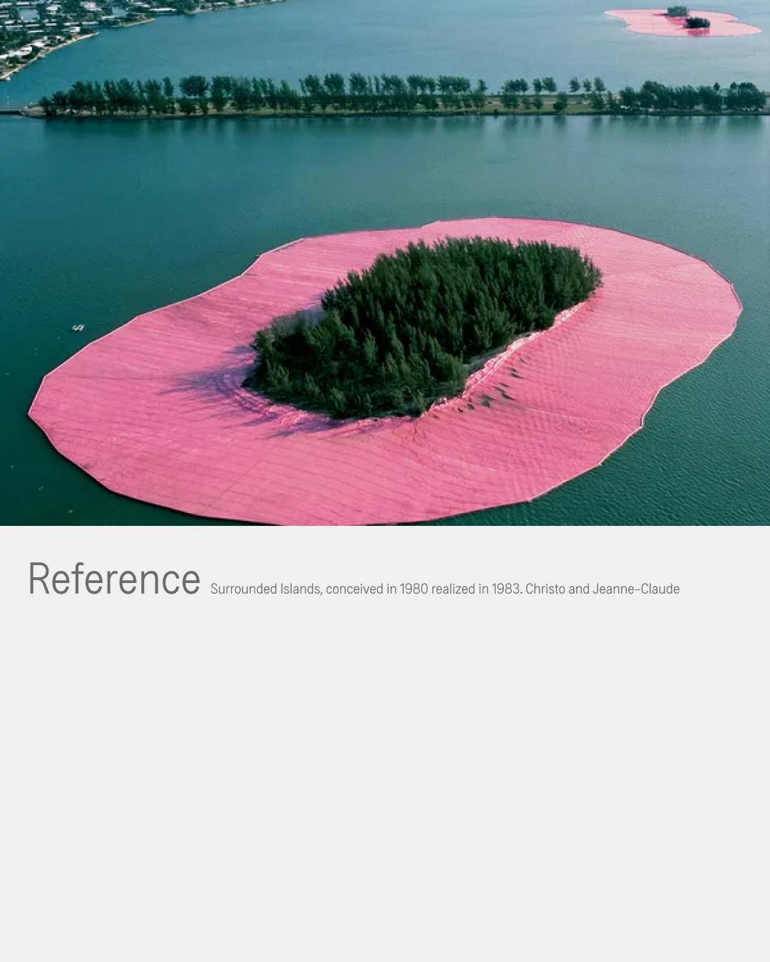
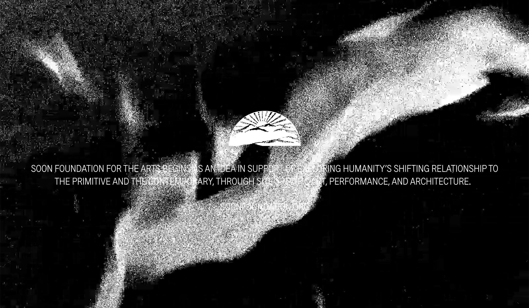
In 2023 we initiated an aspirational project committed to seeing artistic ventures realized. (Quoted Text from: Non Places, An introduction to Super Modernity by Marc Auge)
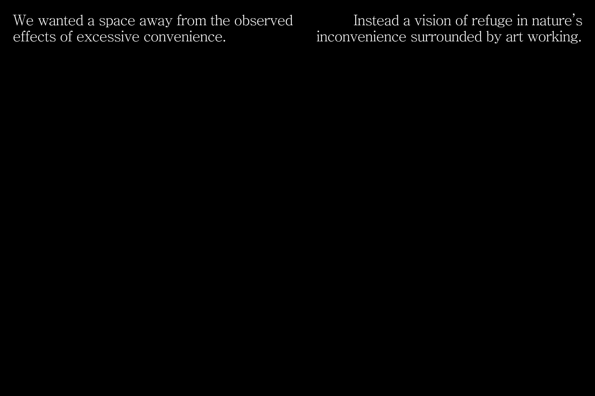
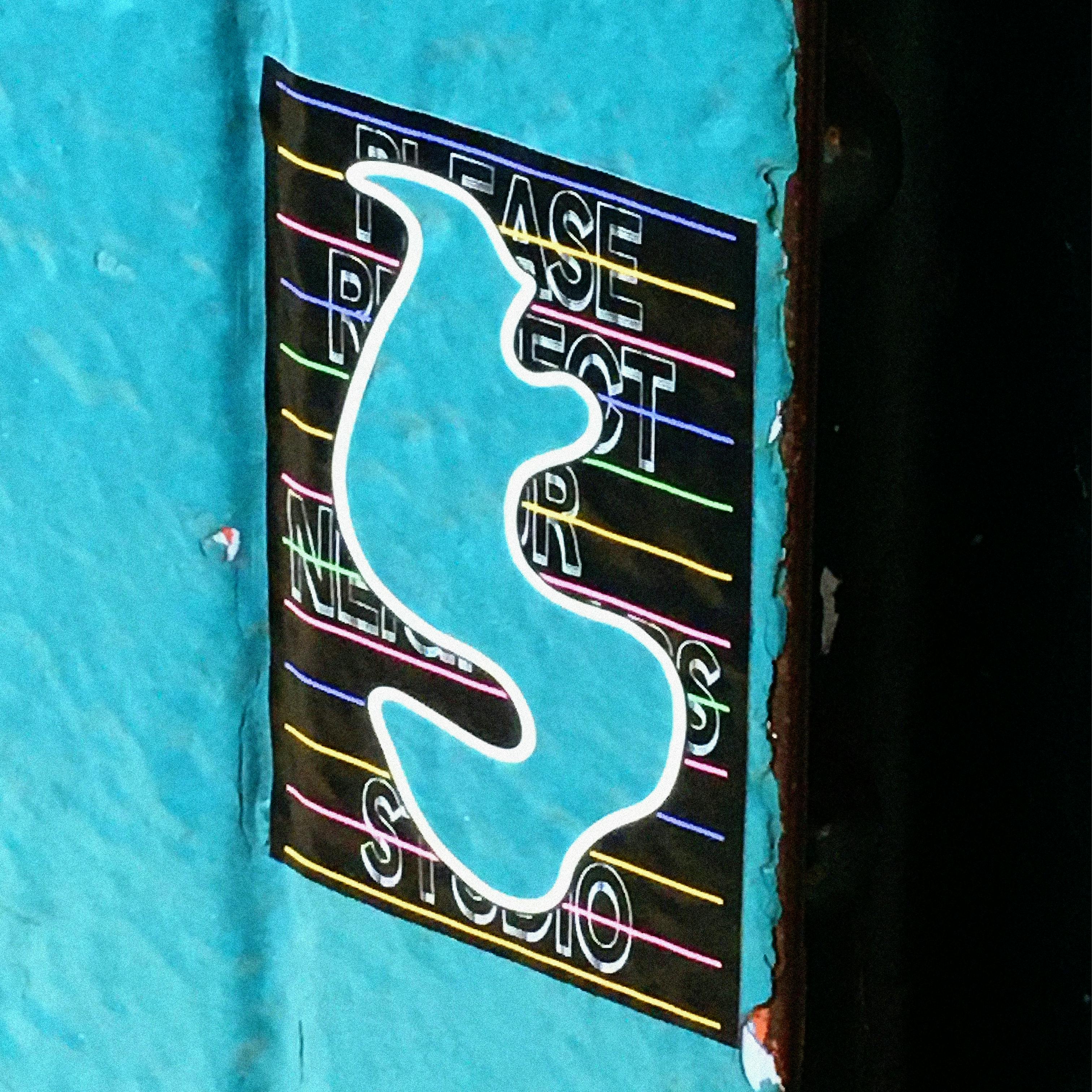
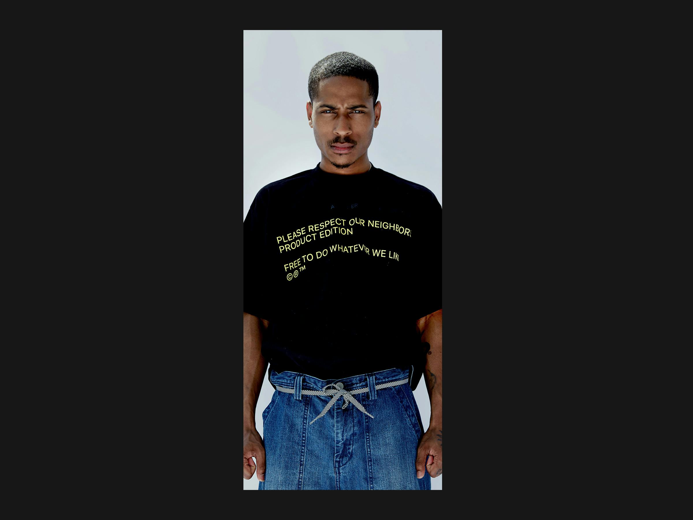
The focus of this branding / creative pivot opportunity shifted our practice entirely toward non-graphic, non visual communication referencing, instead more toward the ideals of place and highly ambitious projects that ripen and come to a definable form over time.
After the discovering this internal brief, our taught approach to creative steps and goals do not apply. We had to contemplate space, which had us oscillating between boundaries, parameters, and limits forming and identity based on the delineation of what we are not.
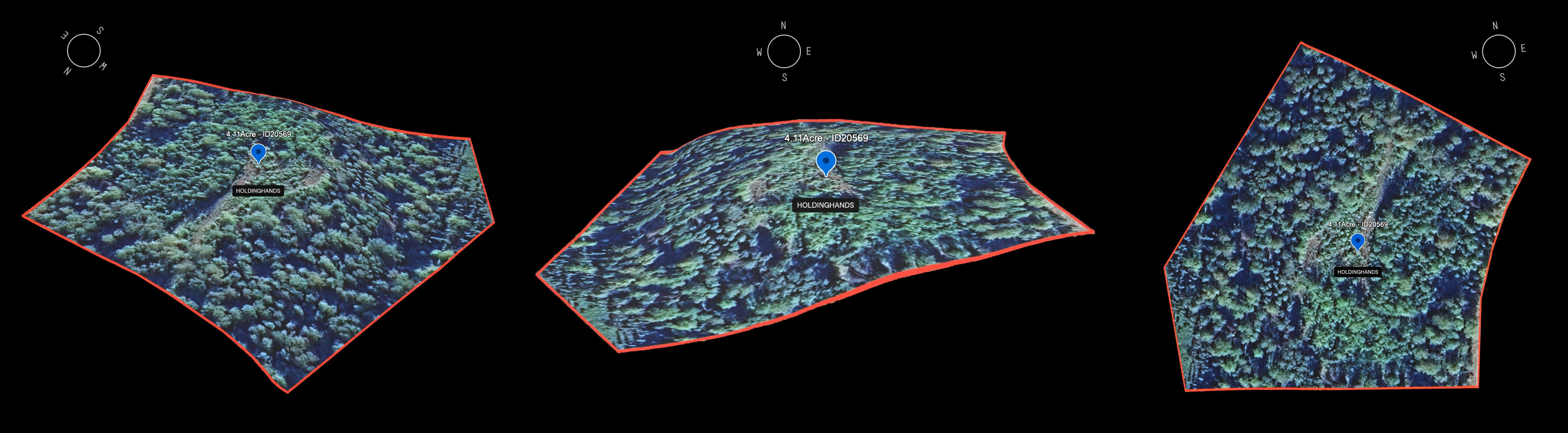
Finding out our key design parameter was large scale protected nature with significant grade elevation, as a means to galvanize psychological interpretations of vastness and freedom.
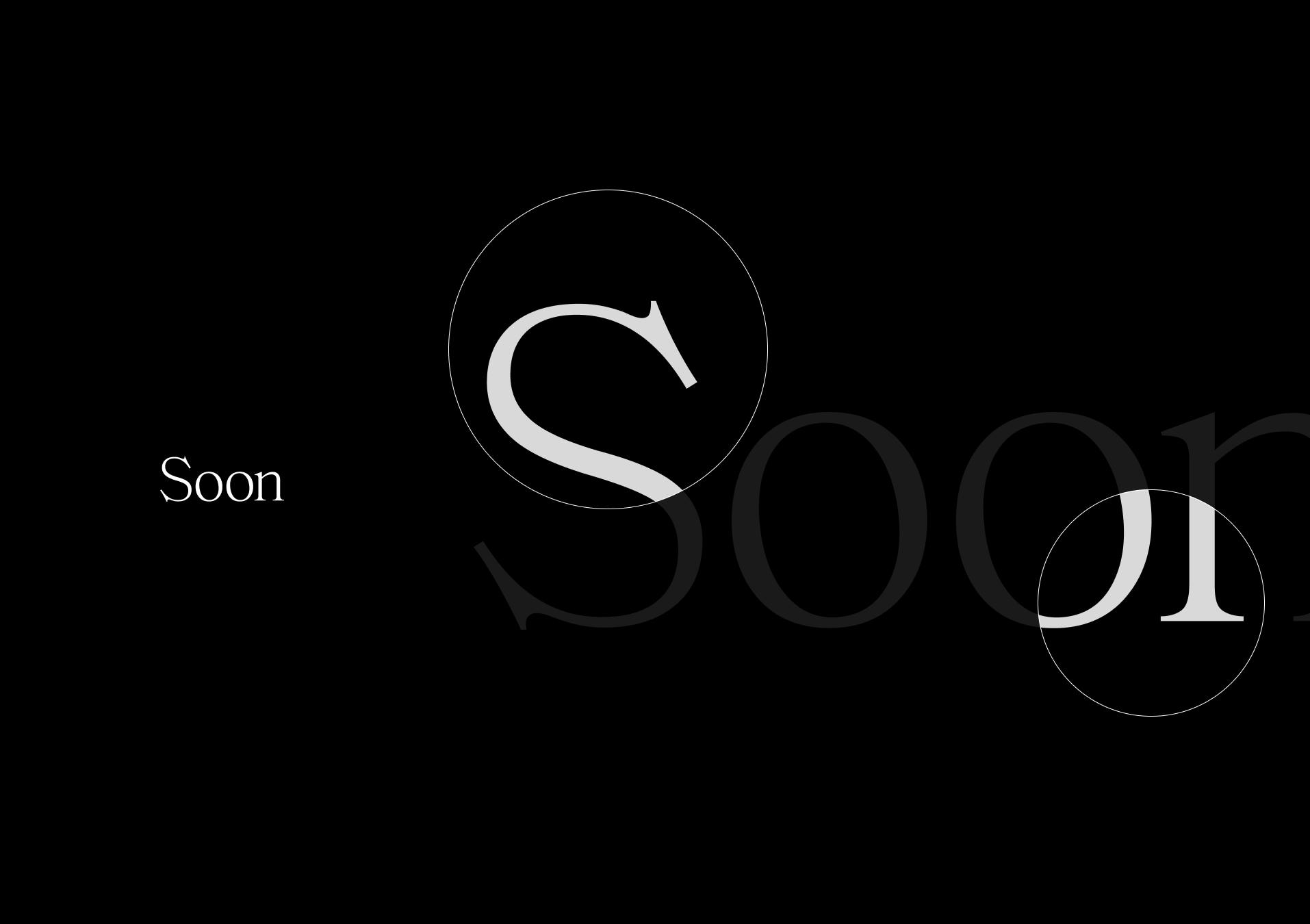
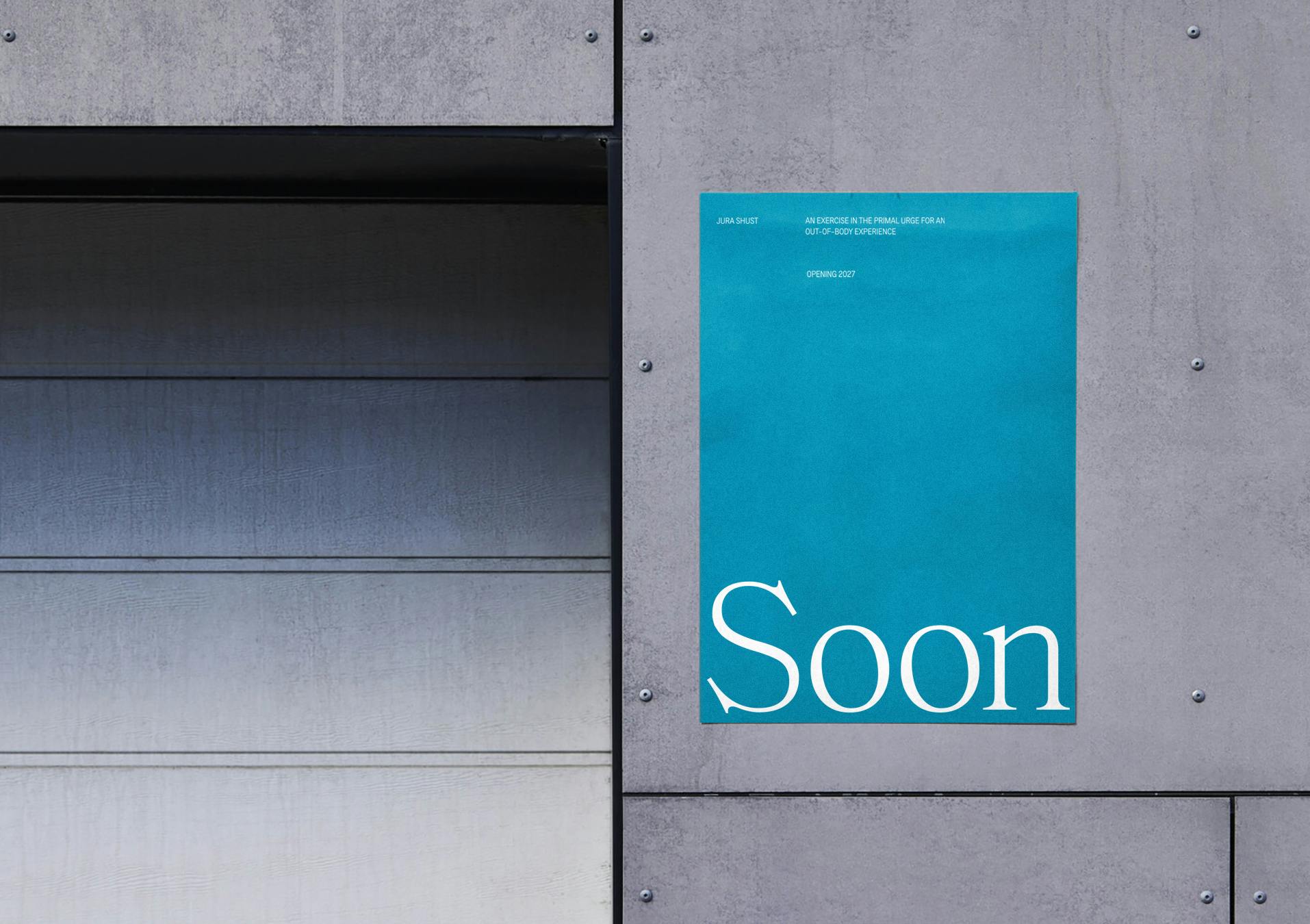
Naming. Branding. Purpose.
A conventional primary serif, modified to reference fish hooks (a tool for subsistence) with thinner proportionality.
Stark – Soon – shorthand used as a statement and attraction.
Selection of a contrasting monospace semi-condensed typographic pairing is parallel with the represented contrast of the physical project, with muted neutral grays to reduce our stature in communications.
Social media blocks are designed to leave information to be desired.
With headline and subtext meant to always sit secondary, letting artwork and imagery collate first.

Initiated September 2022, Ongoing ∞ — Antonia Klimza, Marta Sharapova , Maxwell Osborne
Initiated September 2022, Ongoing ∞ — Antonia Klimza, Marta Sharapova , Maxwell Osborne
anOnlyChild as a client requires an ongoing visual asset support. Developing and cataloging different reference groups.
Overall looking at tangible ways to output, and looking to keep those aesthetics aligned no matter what material.
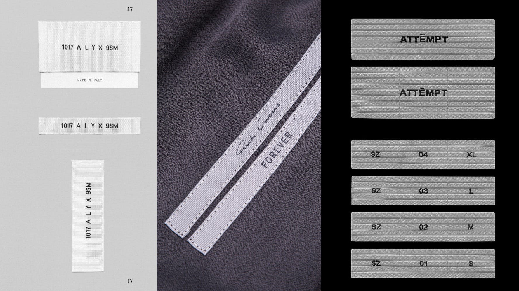
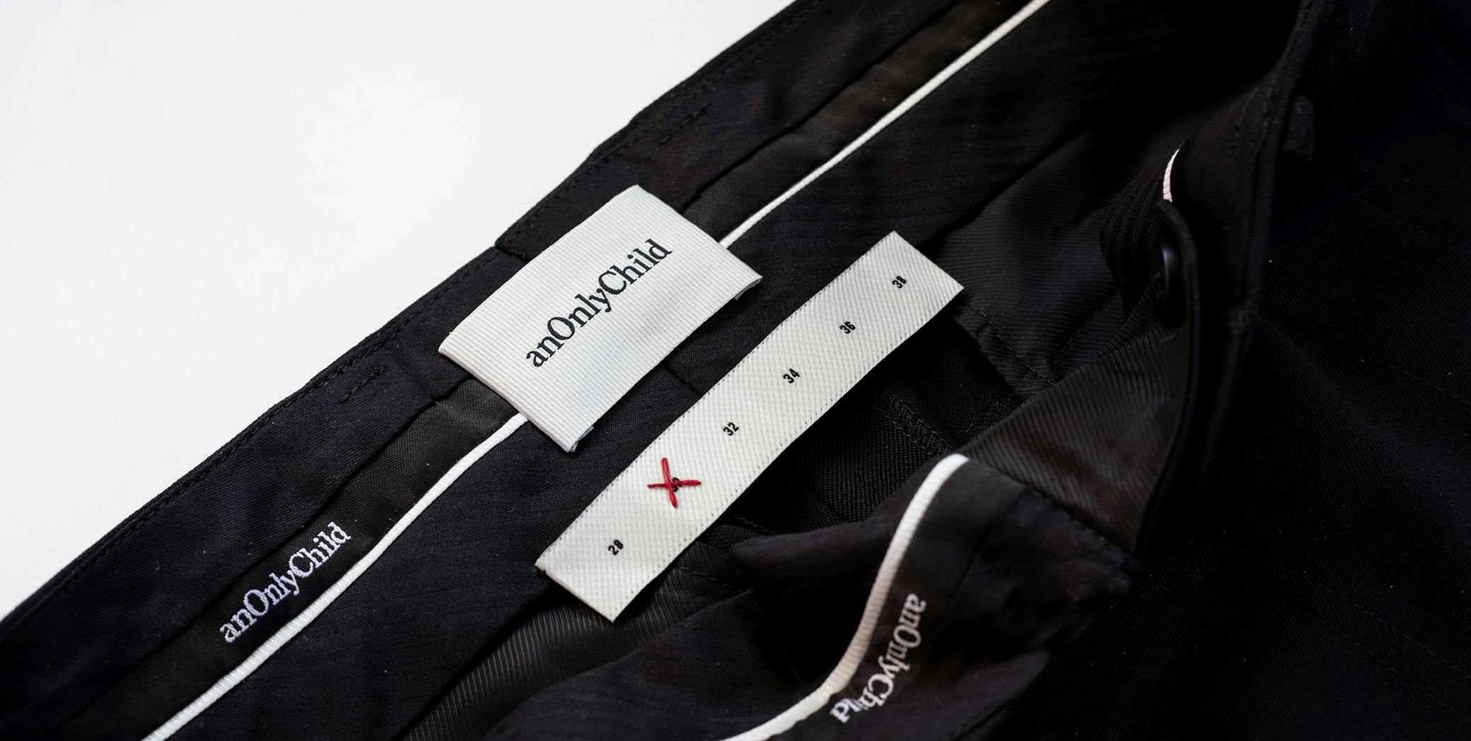
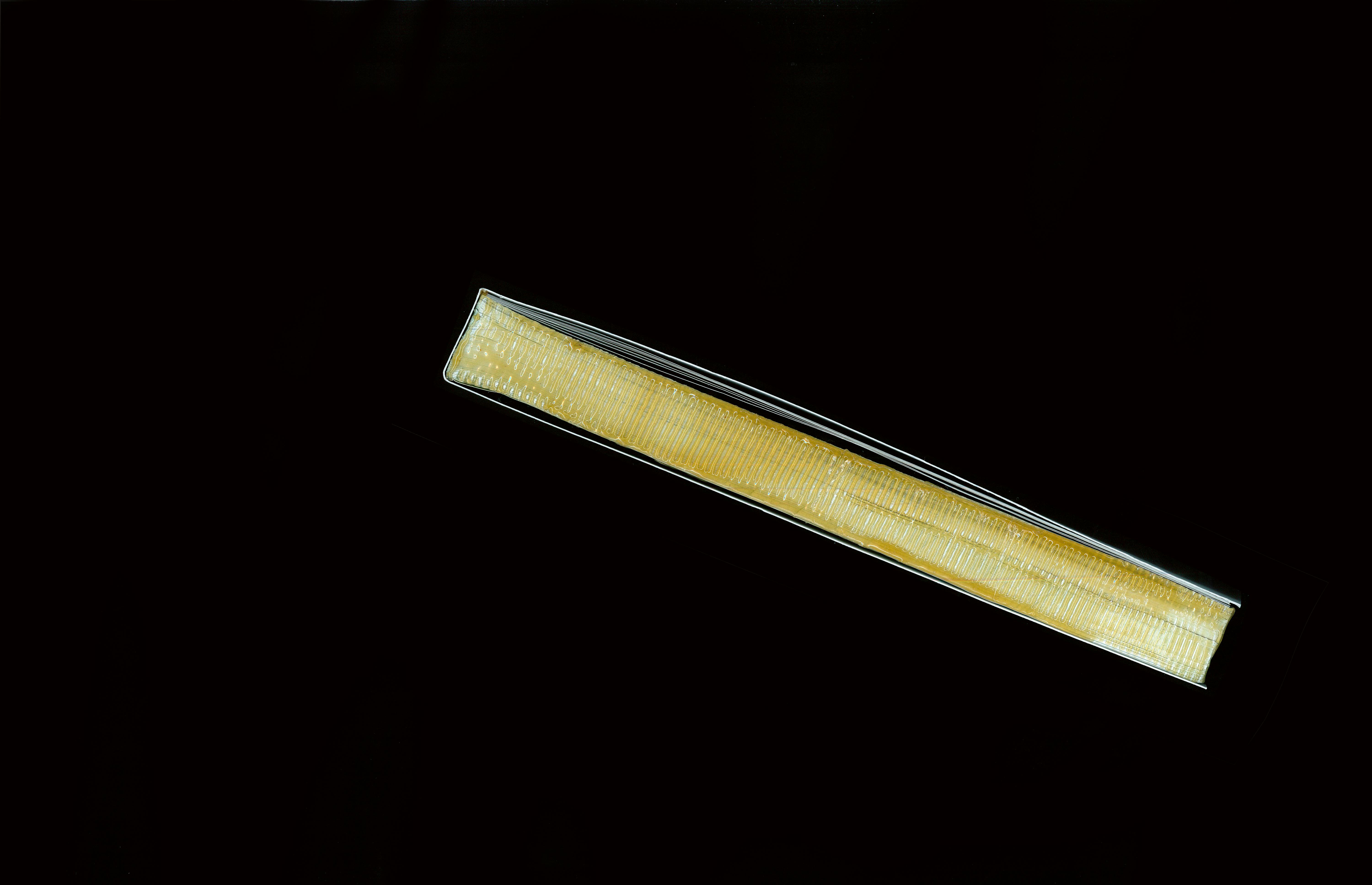
Trim sees constant evolutions as new product styles create alternative needs, and experimentation of tier systems develop.
The current trim system uses a mixture of directional woven patterns, with hand stitching to indicate size.
We adopt and utilize un-pretentious methods for visual direction to showcase clothing off-body.
Helping to maintain a home grown feeling to the Brand's presentation.
We decided to give "story" or context to our campaign presentations by always including subtext related to capture or inspiration.
Ongoing references to help us ideate around more tangible looking assets.
Sundays SS24 acts as a 'one of one' open cover book to display seasonal looks to showroom visitors.
With naming in the review stages and - open to more suggestions:
Manifest by Tia
Hair by Tia Mowery
Tia Mowery Hair
Gratitude by Tia
Hair by Tia
Tia Hair
Affirmation by Tia
For you by Tia
Short listed competitor audit and reference:
Aesop
Olaplex
Prose
Florence by Millie Bobbie Brown
Diptyque

Based on the short brief and understanding of Amyris' overall vision and plan for this product offering — We needed our identity and products to showcase ecologically purposed, clean chemical products for everyday homes.
While redefining luxury in the curled hair hygiene space.

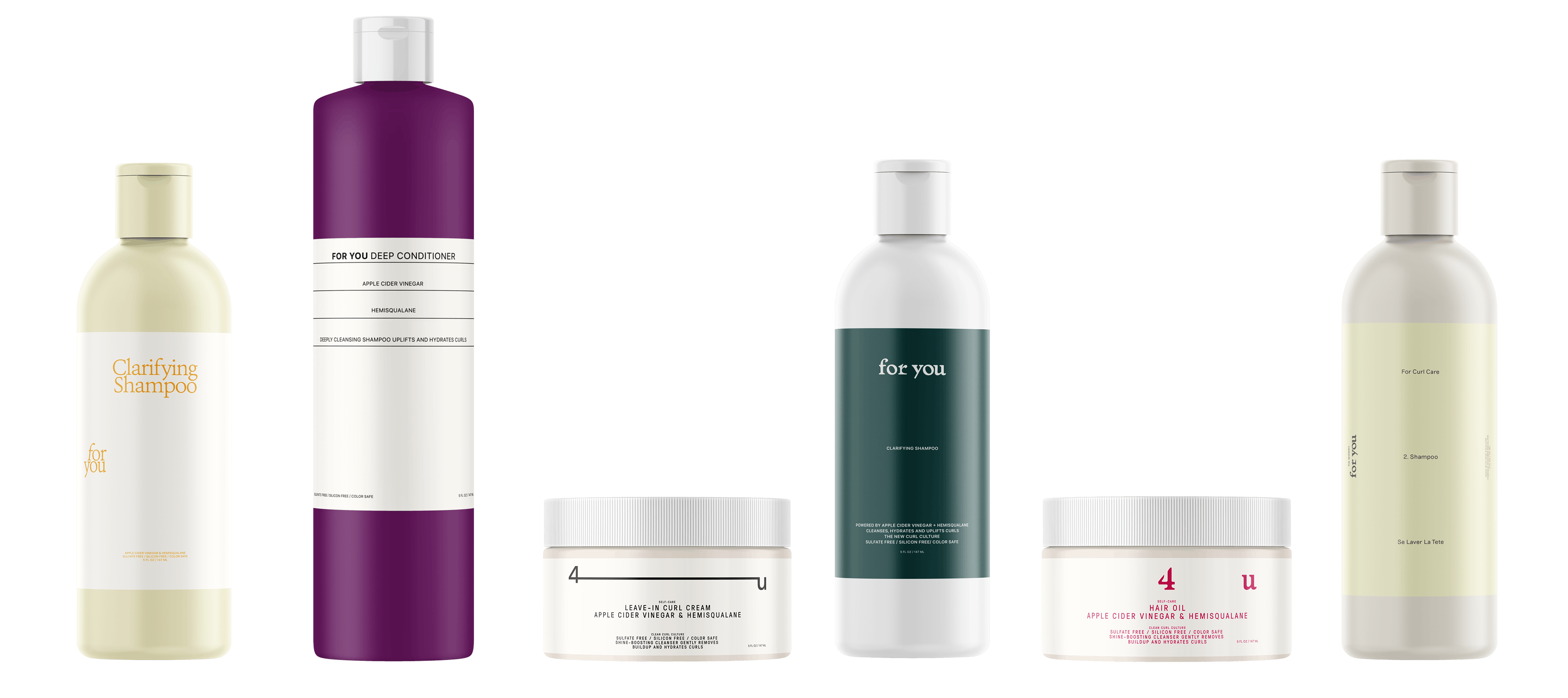
Initiated May 2022, Completed January 2023 — Sophia Marinelli
Initiated May 2022, Completed January 2023 — Sophia Marinelli
As a retained studio for Amyris Biotech we Initially we received this project as a quick brand 3 direction identity sprint, for a product to be launched by celebrity ambassador Tia Mowry in line with her social media messaging around beauty for her communities. The product briefed as a partnership between Tia, Amyris, and Walmart as the exclusive supplier.
Our client partner and parent company Amyris inc. prides themselves as leaders in sustainable biotechnology, making effective beauty products – doing better for people and the planet.
Shampoo's: Detox really a deep clean. (Light conditioner), Moisture- for very dry hair to nourish/moisturizer (heavy conditioner), Defining gel: give definition to curls, url cream (lots of moisture) for holding curls in place, Pre-wash: Hair oil / scalp oil.
We started with 4 quick and dynamically different directions, all keeping with the brief. Presenting us with many variables to discuss with stakeholders.
Ultimately large piece of feedback that surfaced was — looking for a more feminine option, to round out the directions. Referencing brands like prose which are in fact most focused on color palette and less designed in a way.. or as put “have more float”…? so it would be great if we had a pass at an additional option, while the naming is leaning toward for you or 4u by tia.
We quickly created several more options based on this feedback, simplified and apply the selected naming. Ultimately landing with elements from these few moments in our extensive explore.
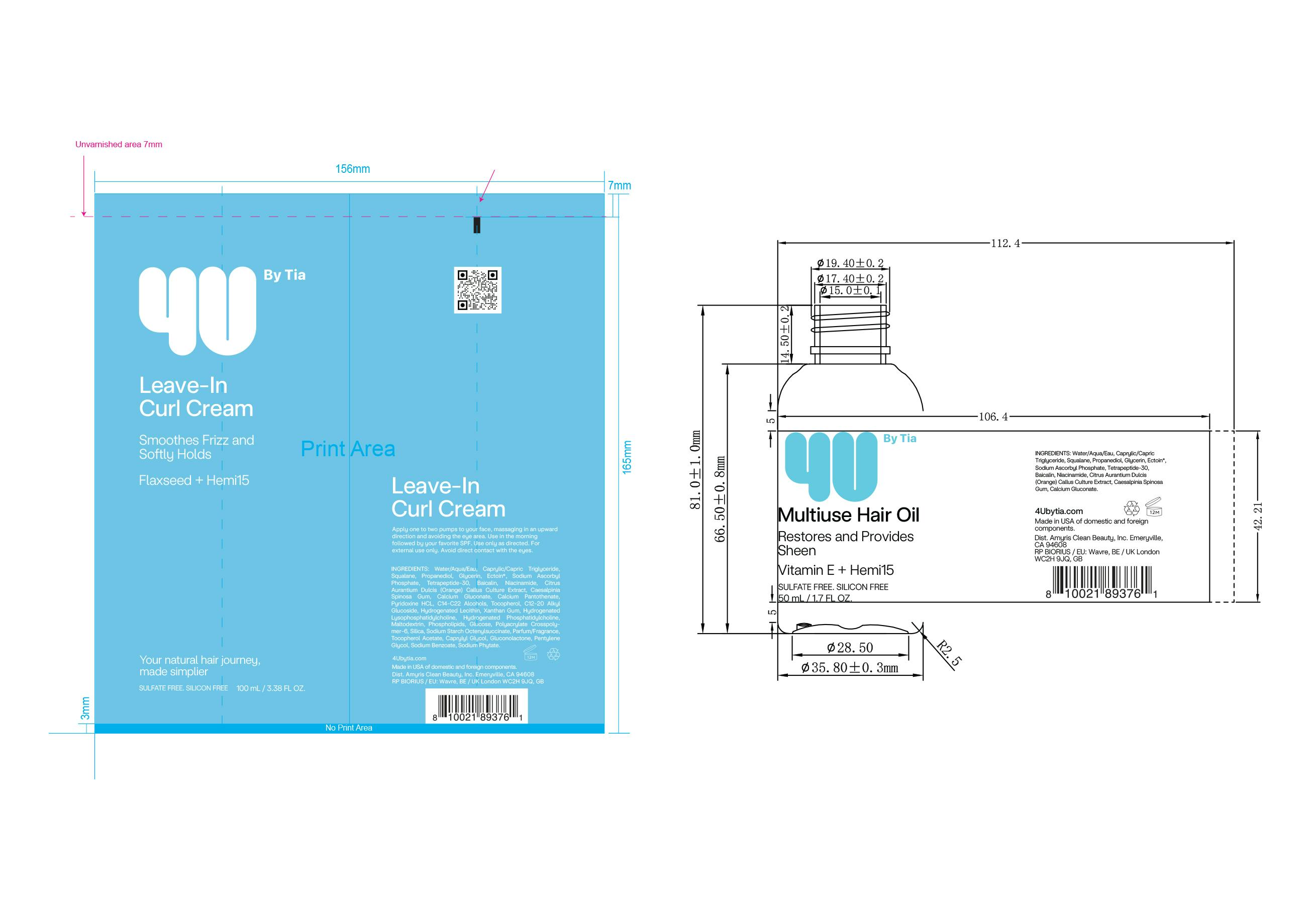
After determining that we no longer needed to show dual language due to Canadian standards, as well as finalizing our front of pack copy — we were able to simplify the overall design, to include a left aligned product name + product benefit layout below a separated 4Ubytia short hand logo.
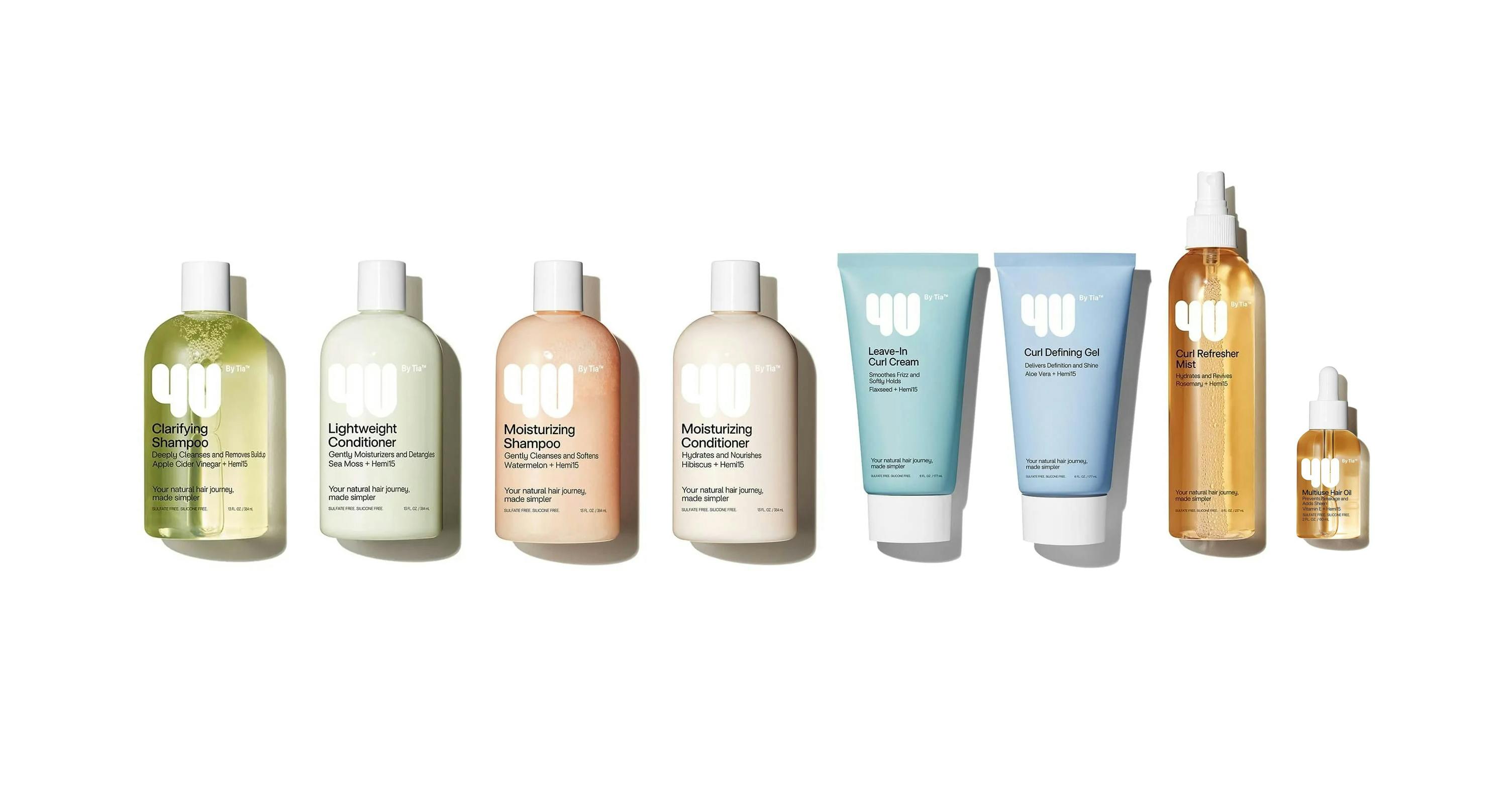
The full product line.
Social media assets developed after handoff — from the voice of professional hair care.
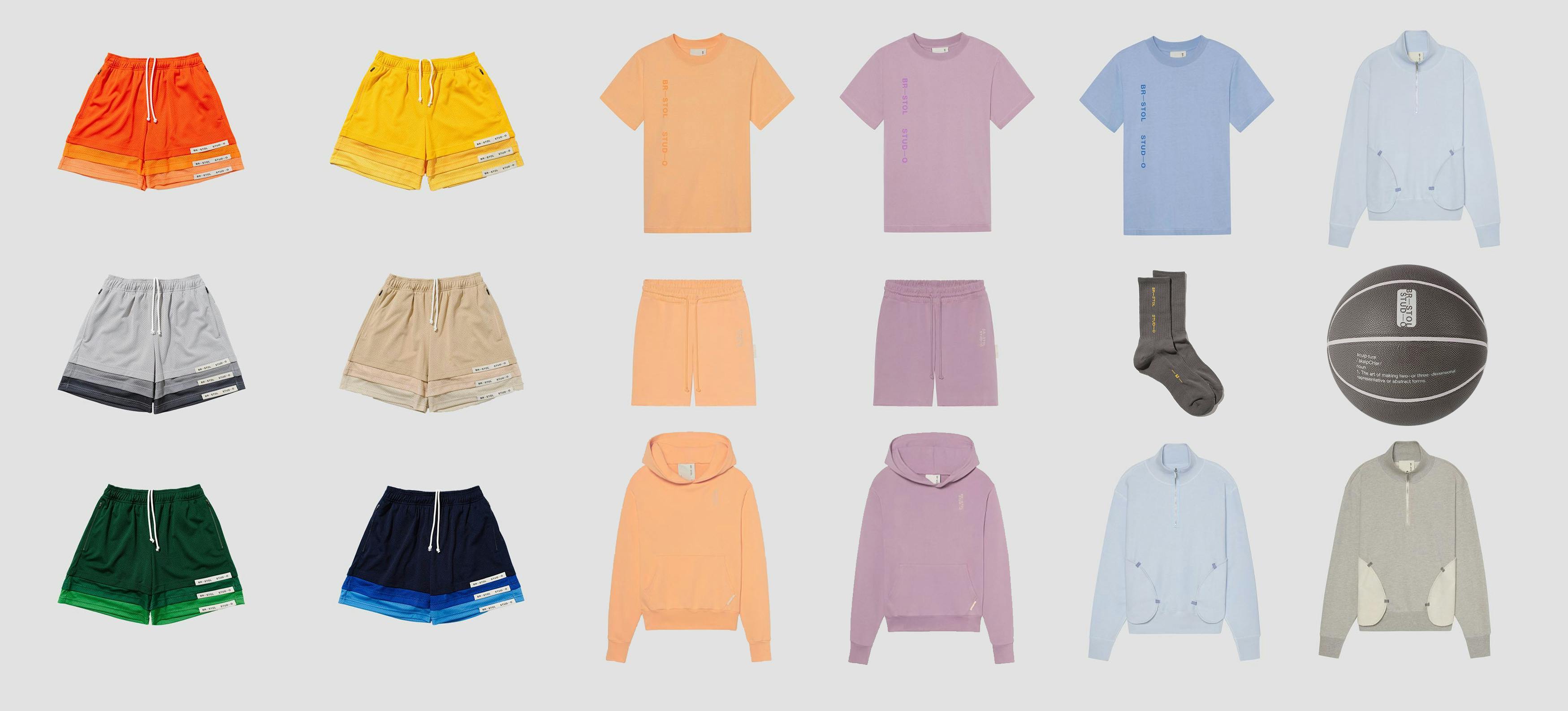
The conversation began with inquiry about the graphic direction of the brand's clothing products. Seeing that brand has already had such minimal graphics and a singular focus on the quality and uniqueness of the apparel — so the challenge became a question of how we would link the brand's pureness to a definitive graphic language.
So we began looking at brands who had successful yet meaningful approaches to presenting graphics, such as; Ader Error, Madbury Club, Salomon, and Nike.

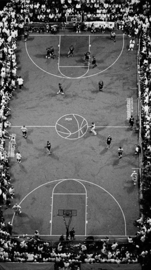
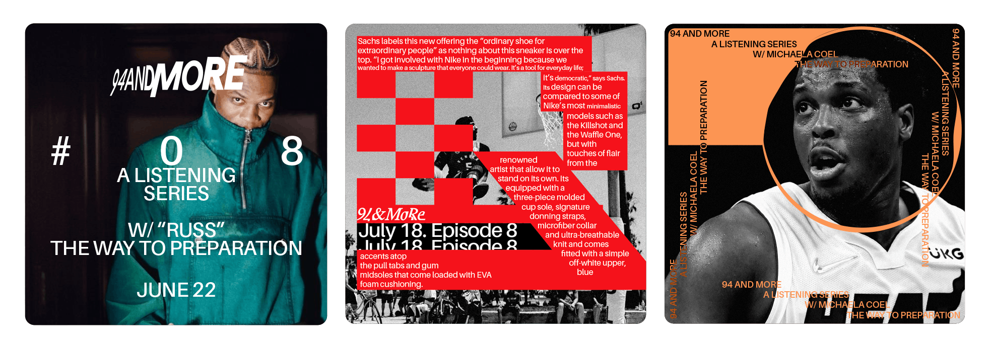
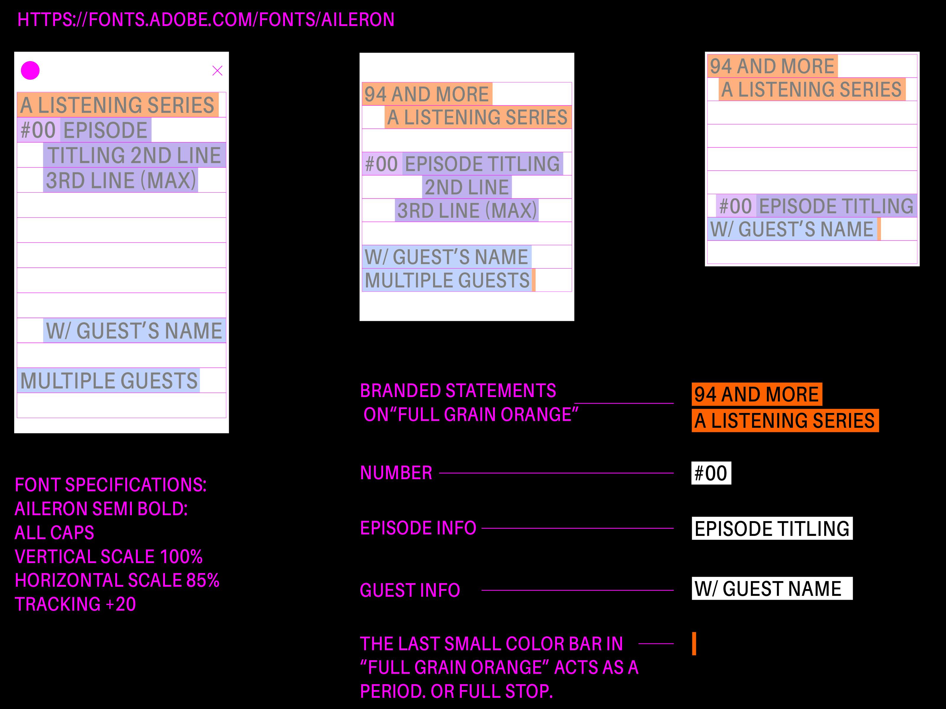
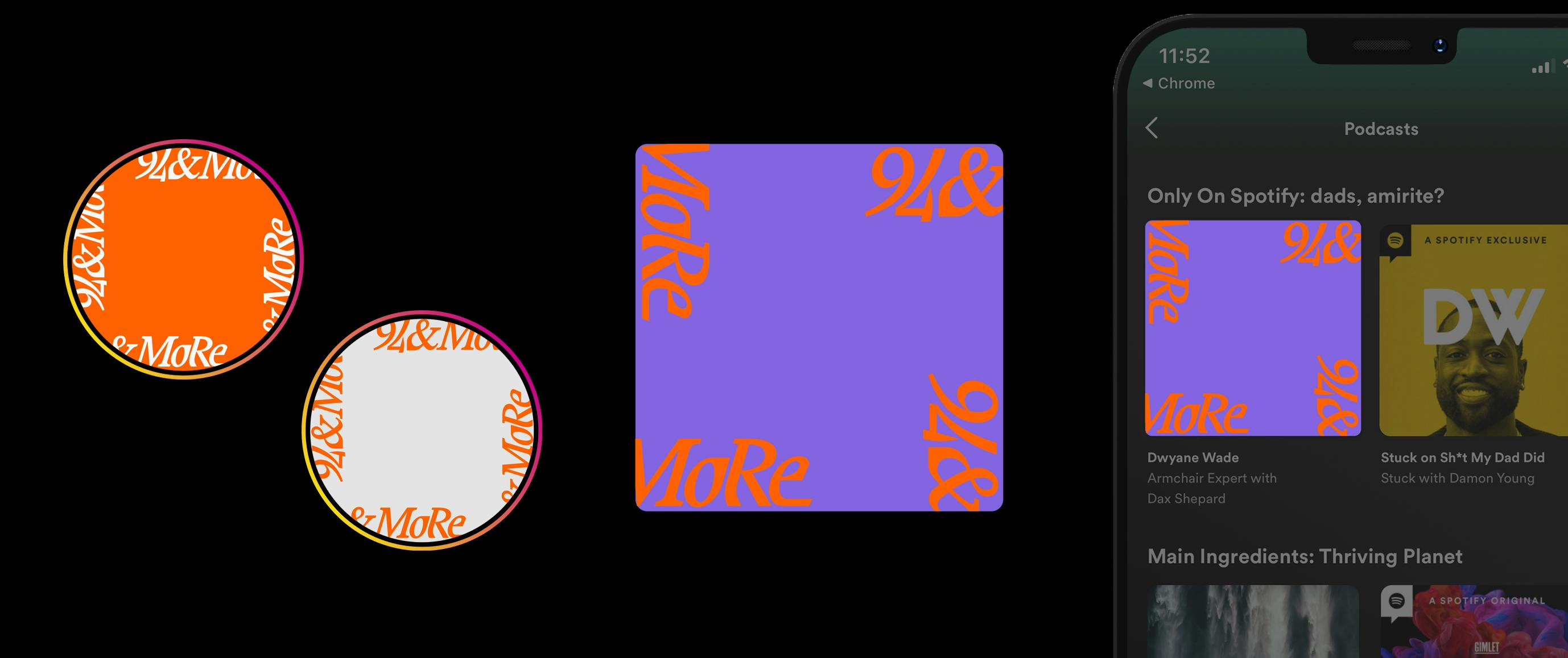
During the research phase we talked about branding other lifestyle components that Br—stol Stud—o looks to achieve. One being the revival of their podcast series, 94 and more, that brings conversation around the aspects around the the idea of the game of basketball. Bringing on guests of sport to discuss elements that affect the players and enthusiasts alike.
Having already spent time gathering reference there were a few grounding concepts we could use for pillars to set up the brand identity for 94 and more.

Initiated May 2022, Completed August 2022 — Gersh Leroi Mutumbo, Luke Tadashi
Initiated May 2022, Completed August 2022 — Gersh Leroi Mutumbo, Luke Tadashi
Br—stol Stu—o has always been an experimenting lifestyle brand developing refined garments for athletes in and around the extended basketball community.
Initial Brief
Even with the selection of referential brands and graphic applications, the range of directions is vast, subjective and misaligned — unless siloed for highly specific use cases.
Podcast Brief
1. Court as the canvas. 2. Heavy word count, to express the content of episodes. 3. Variety of color combinations and typography layout for newness.
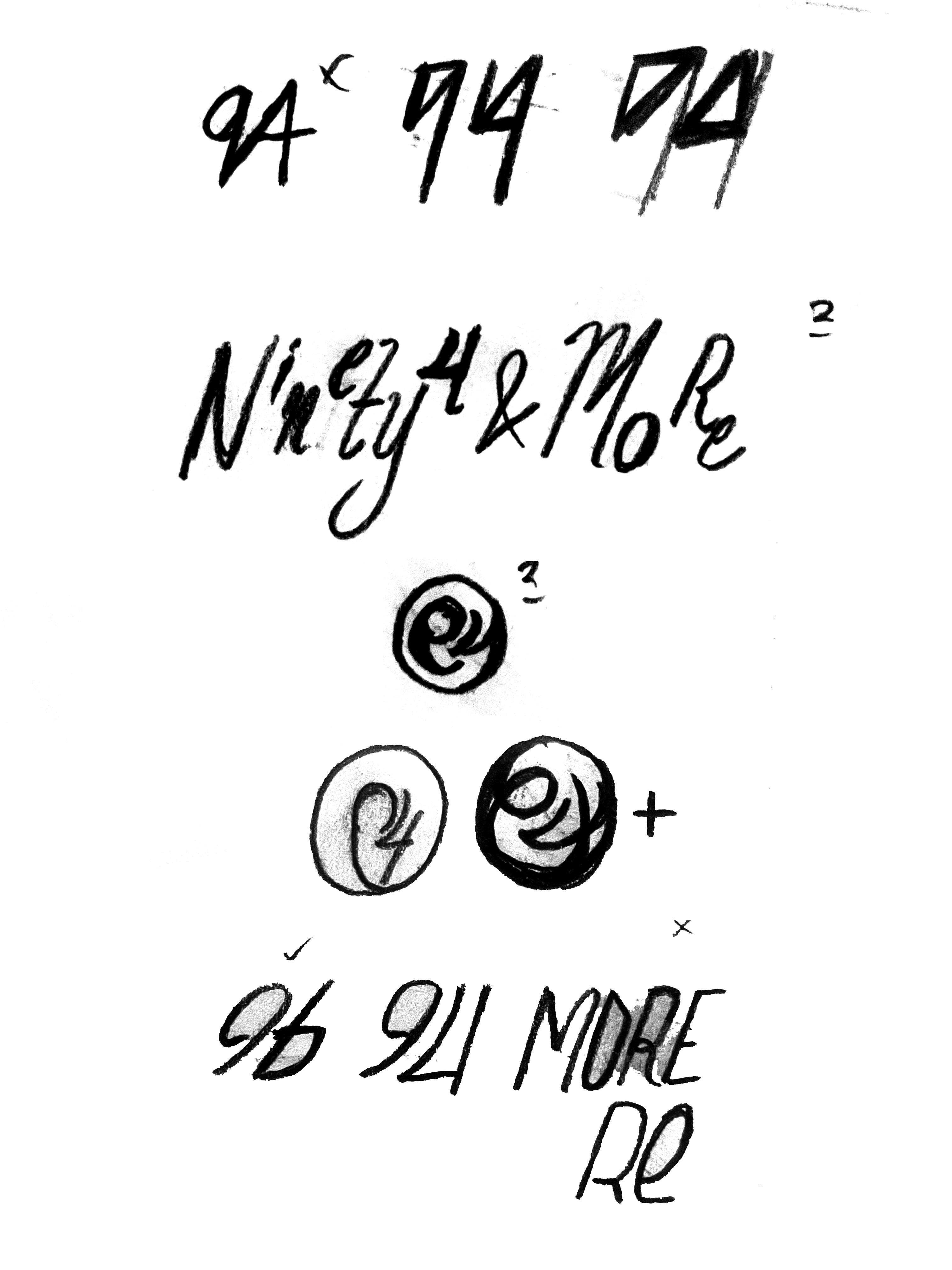
First pass at realizing typography combinations and wordmark explore.
The defining sketches.
Finalized 94andMore logotype and shorthand identity, designed to imply the edges of the court.
A simple framework with wide expression.
Social and app example framework.
Initiated July 2022, Completed August 2022 — Hannah Price
Initiated July 2022, Completed August 2022 — Hannah Price
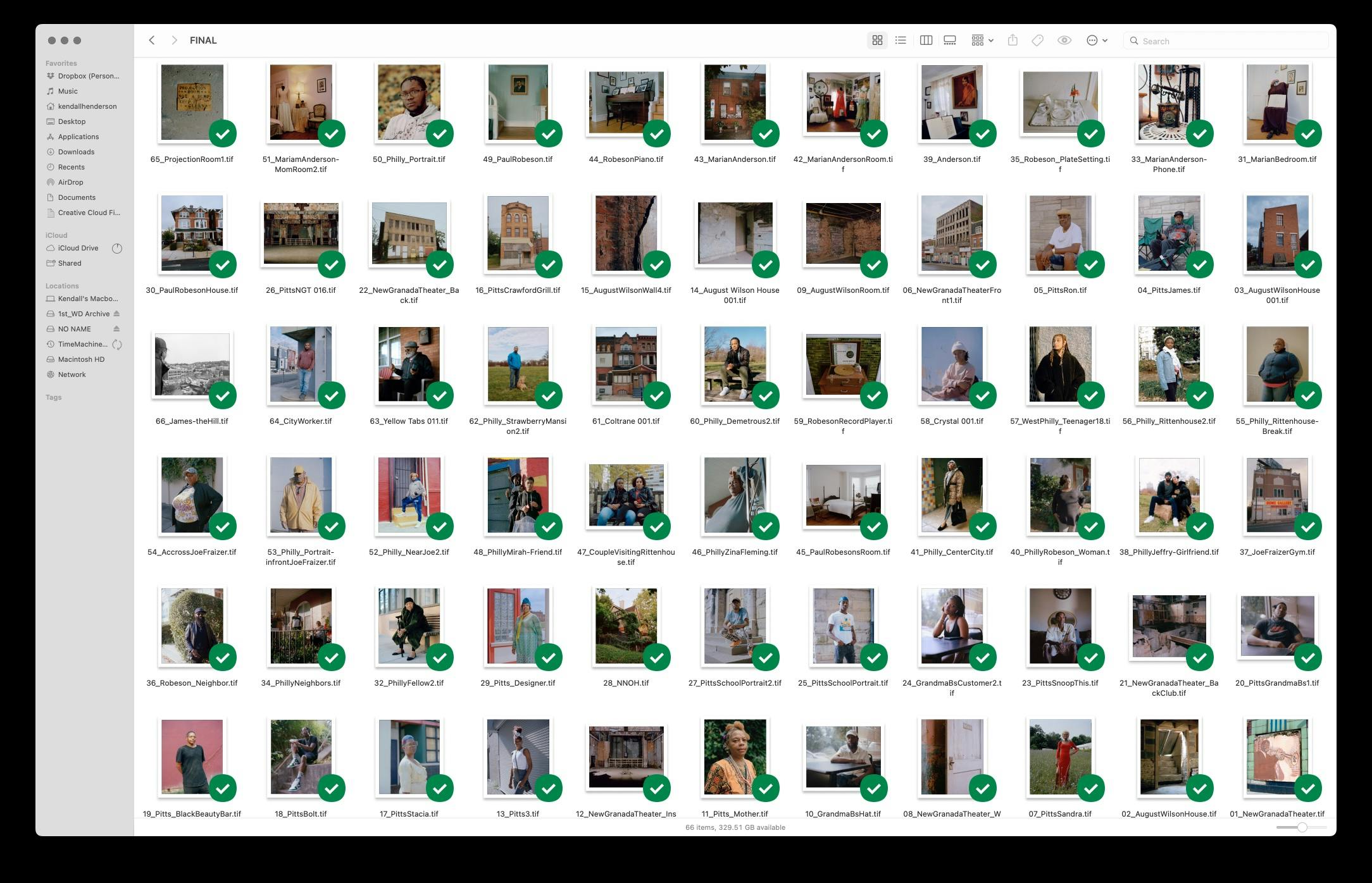
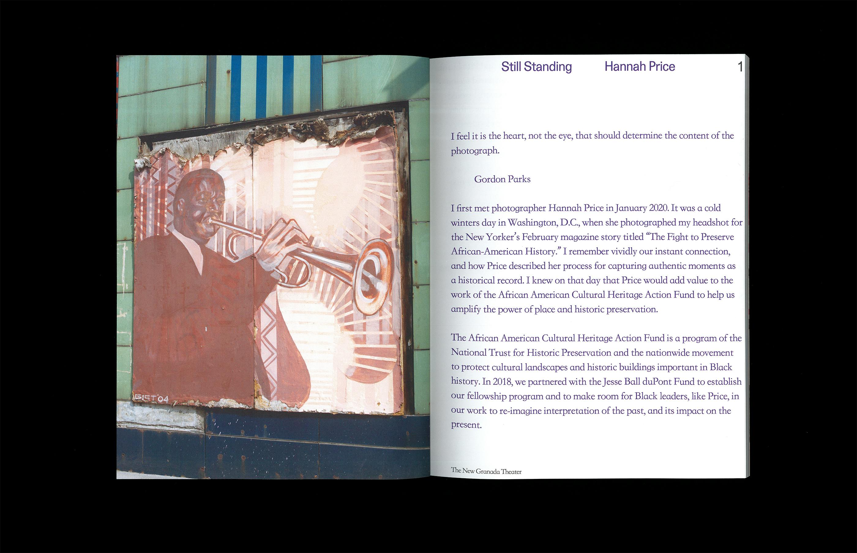
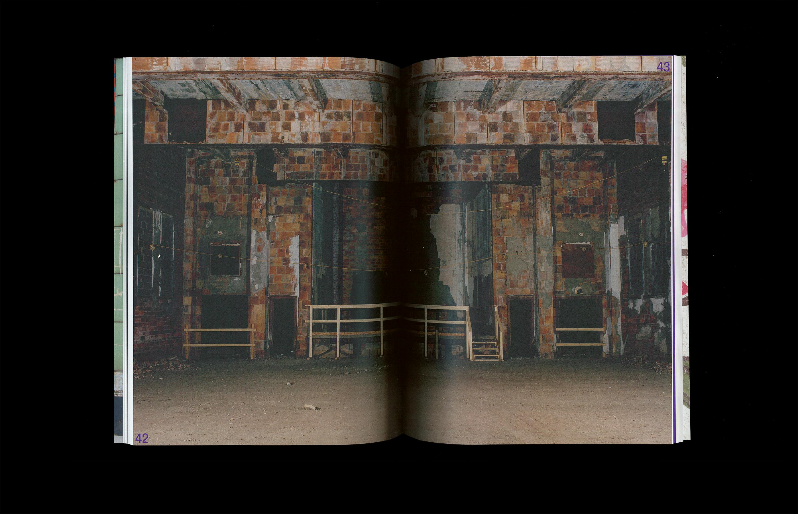
Hannah Price reached out via instagram regarding a photography project she was developed, which called her to document several historic black land marks in Pennsylvania. (some officially noted and some unofficial but relevant to culture).
We spoke over email for about 1 week regarding the value of presenting historical and present documentation in a contemporary way. We then quickly landed on, what would be, the close to final layout with a few crop adjustments to maintain her photographer's intention for each image.
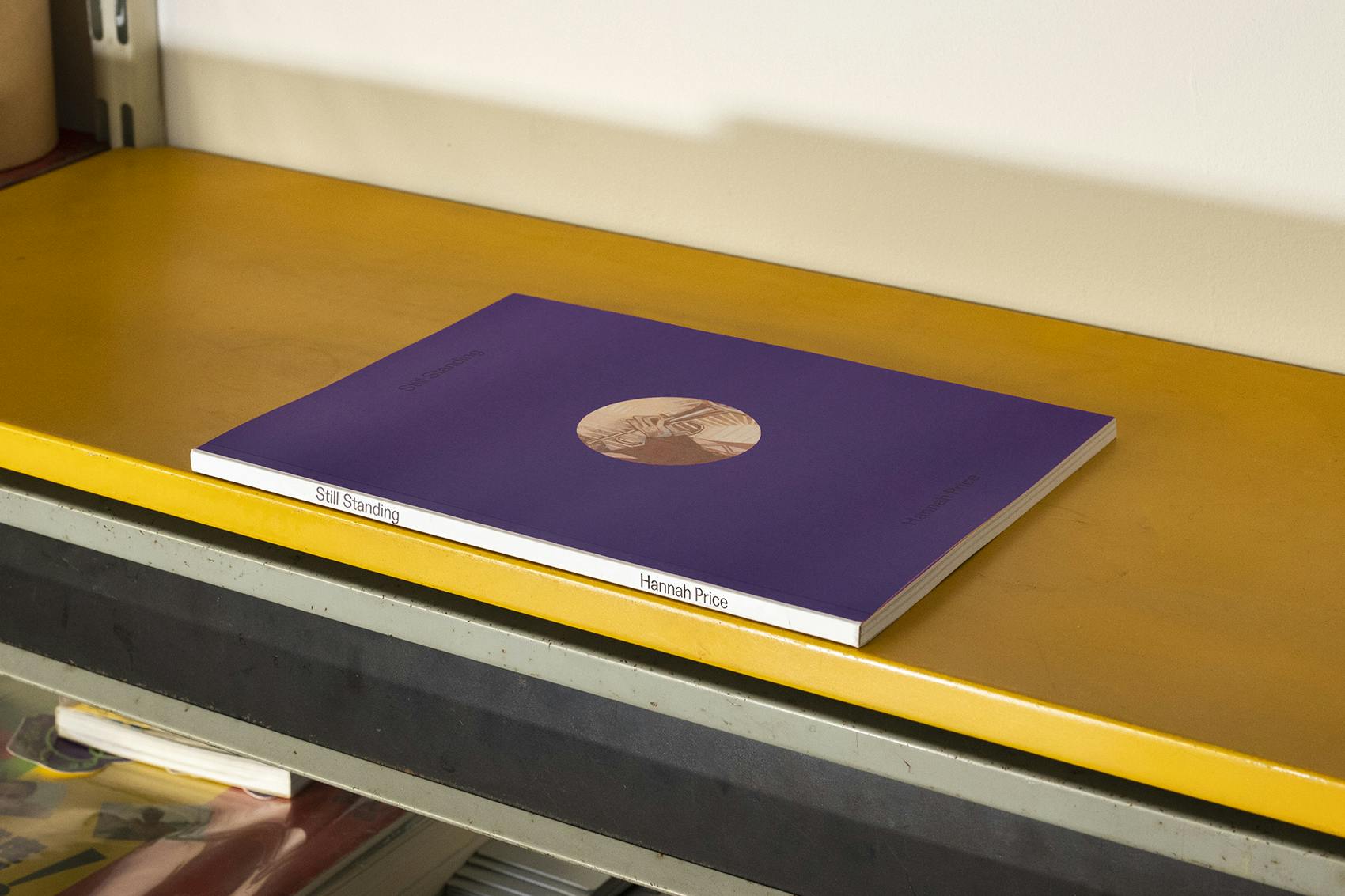
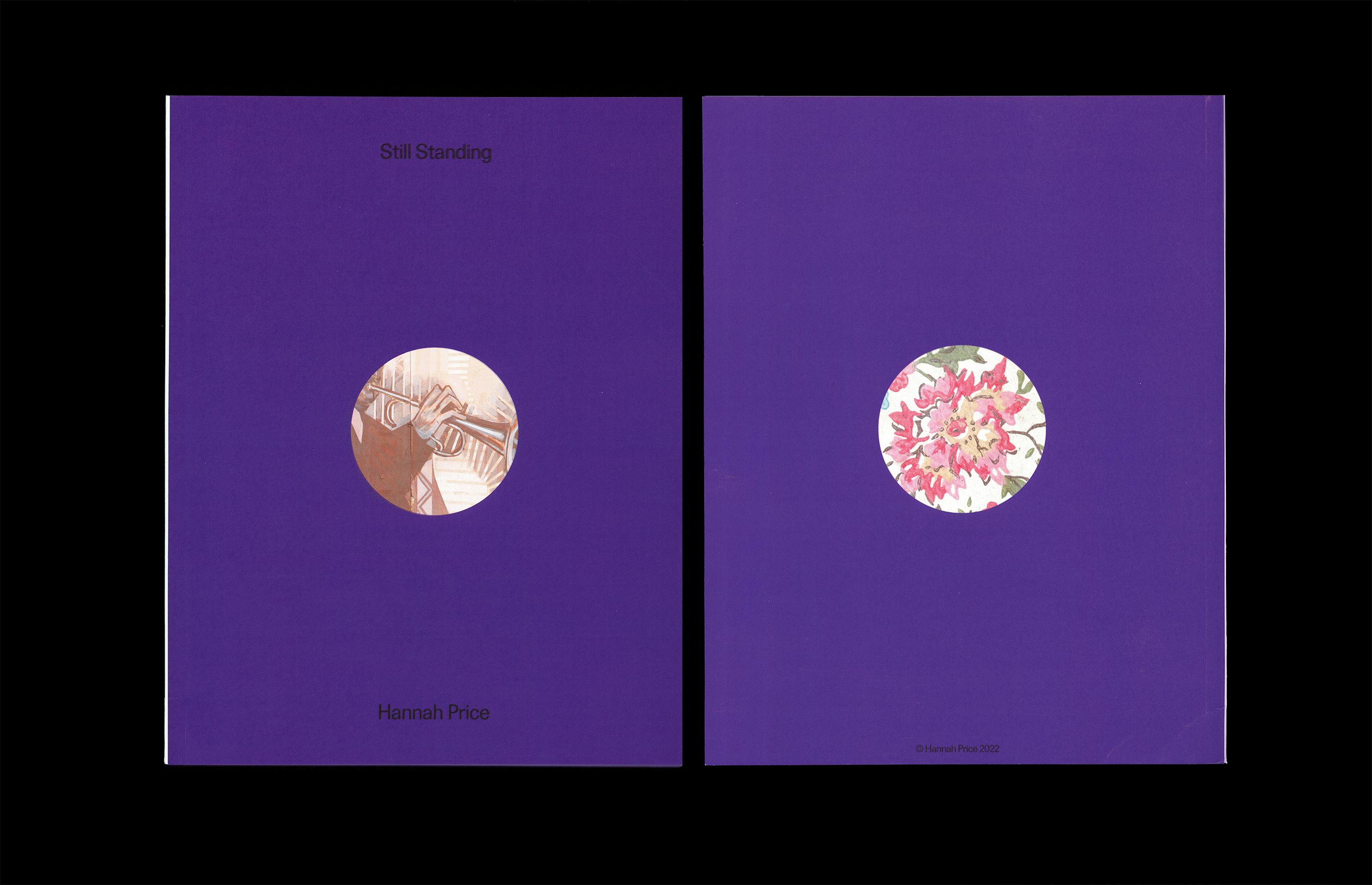
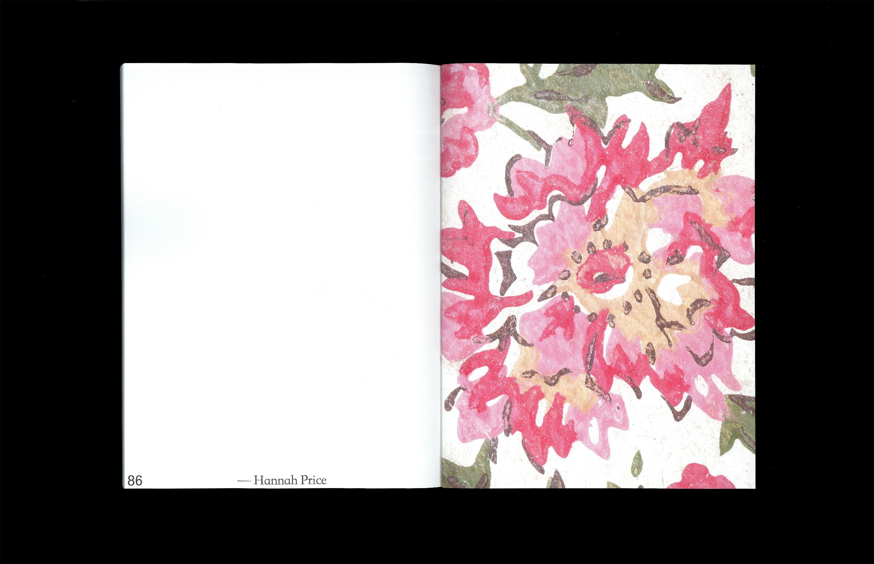
Perfect Bound. Finished Size 7"x9". 86 pages. Digital Print.
We chose a flood of royal purple for each cover, and peek invite to the image on the inside covers.
Parts of the forward, by the late Gordon Parks and Brent Leggs, (Executive Director of the African American Cultural Heritage Action Fund and Senior Vice President at the National Trust for Historic Preservation) and other introduction writing.
Hannah's documentation centers around specific landmarks; Paul Robeson's house, Marianne Anderson's House, Joe Fraizer's Gym, August Wilson's House, The New Granada Theater and The National Negro Opera House in Philadelphia and Pittsburgh, PA.
During which she captured individuals who happened to be in the vicinity, which gives adjacent context to the overall collection of images. Read her words here.
Conclusion.

Initiated July 2022, Completed September 2022 — Thee Tham
Initiated July 2022, Completed September 2022 — Thee Tham
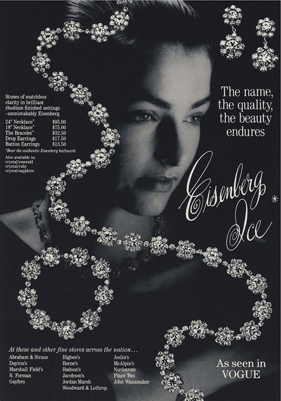
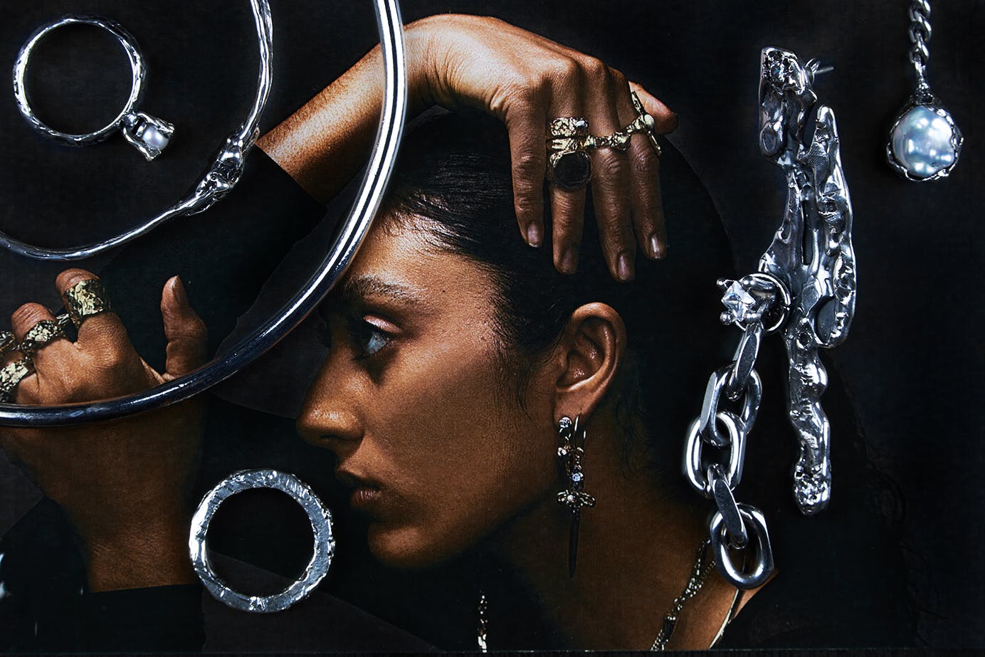
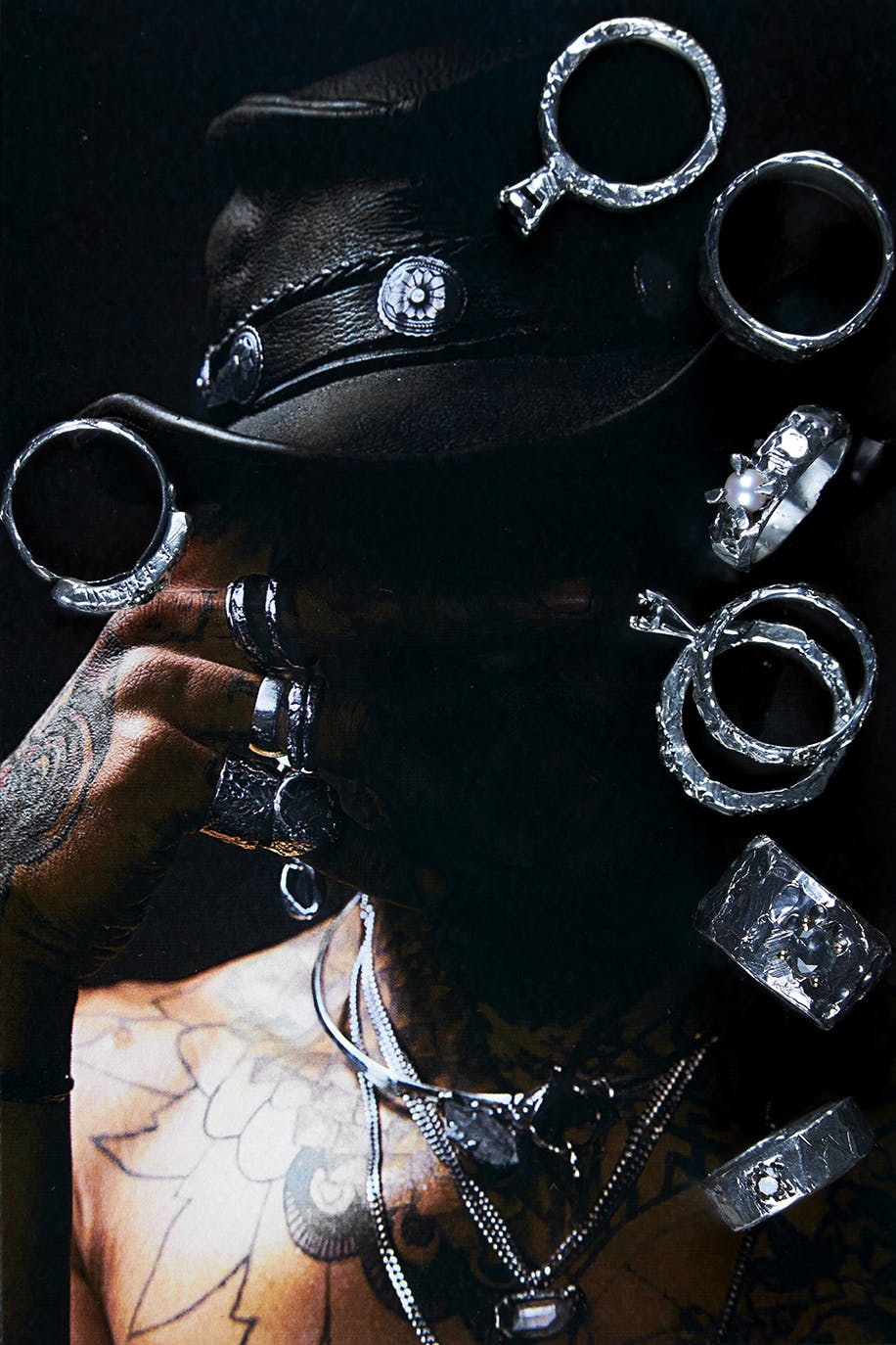
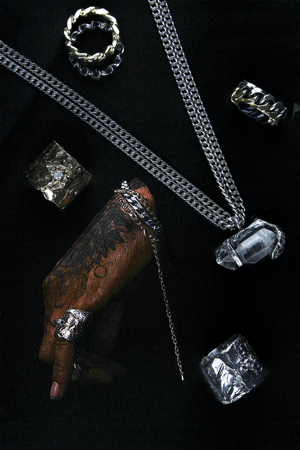
Our decided expressions of the brand, come from the theories of alchemy – cultured compositions, physicality and witchcraft, which are characteristics of Paris the maker and artist.
For this group of assets our art direction was inspired by the analog compositing of fine jewllery advertisements from the 50's.
The output combines traditional concepts of feminine beauty with intensity, power and dark aesthetics.
The finalized logotype boldly contrasts the brands characteristics while referencing the action of working with metals in a uniquely simple form.
1. Equilibrium
We are a brand that forever considers the parallel affect our products / other products have on the natural earth. Creating and reinforcing new infrastructure to alter existing past behavior.
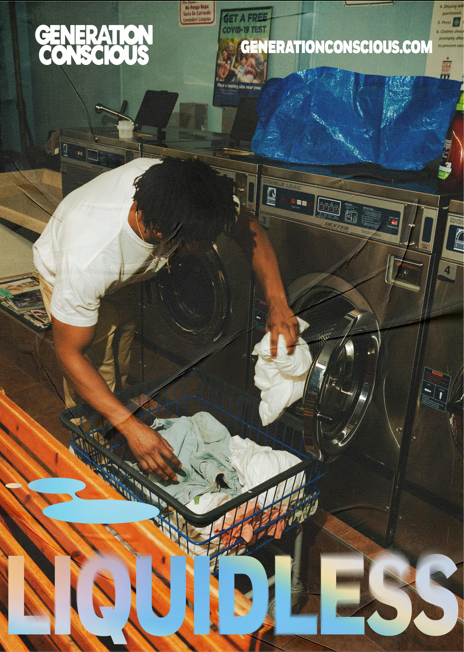
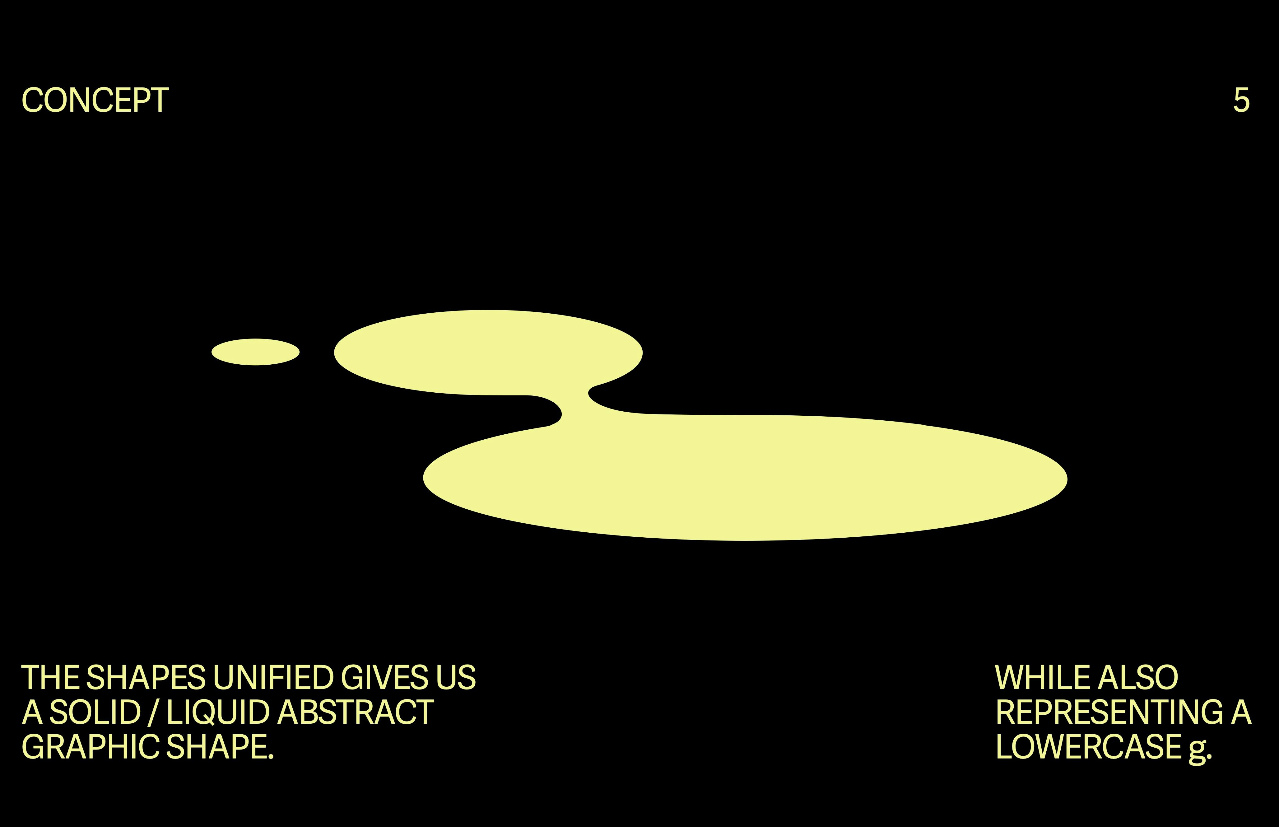
2. Liquidless
We make products that are sustainable in composition as well as existing in a liquid-less form, which is unique to the category as well as positively impactful on carbon footprint.
3. Surprising
Since our measure of success is the change in overall behavior toward ecology we should always have the conversation in an unexpected way. Normalizing the subject in the present of sustainability in order to be a building block for future thinking.
4. Encouraging
We would like to reframe the type of dialogue around ecology. Most of this is not encouraging and places nearly all the responsibility of change on the individual, when we believe that responsibility falls on those who create infrastructure.

Initiated June 2021, Completed August 2022 — Marta Sharapova , Kendall Henderson
Initiated June 2021, Completed August 2022 — Marta Sharapova , Kendall Henderson
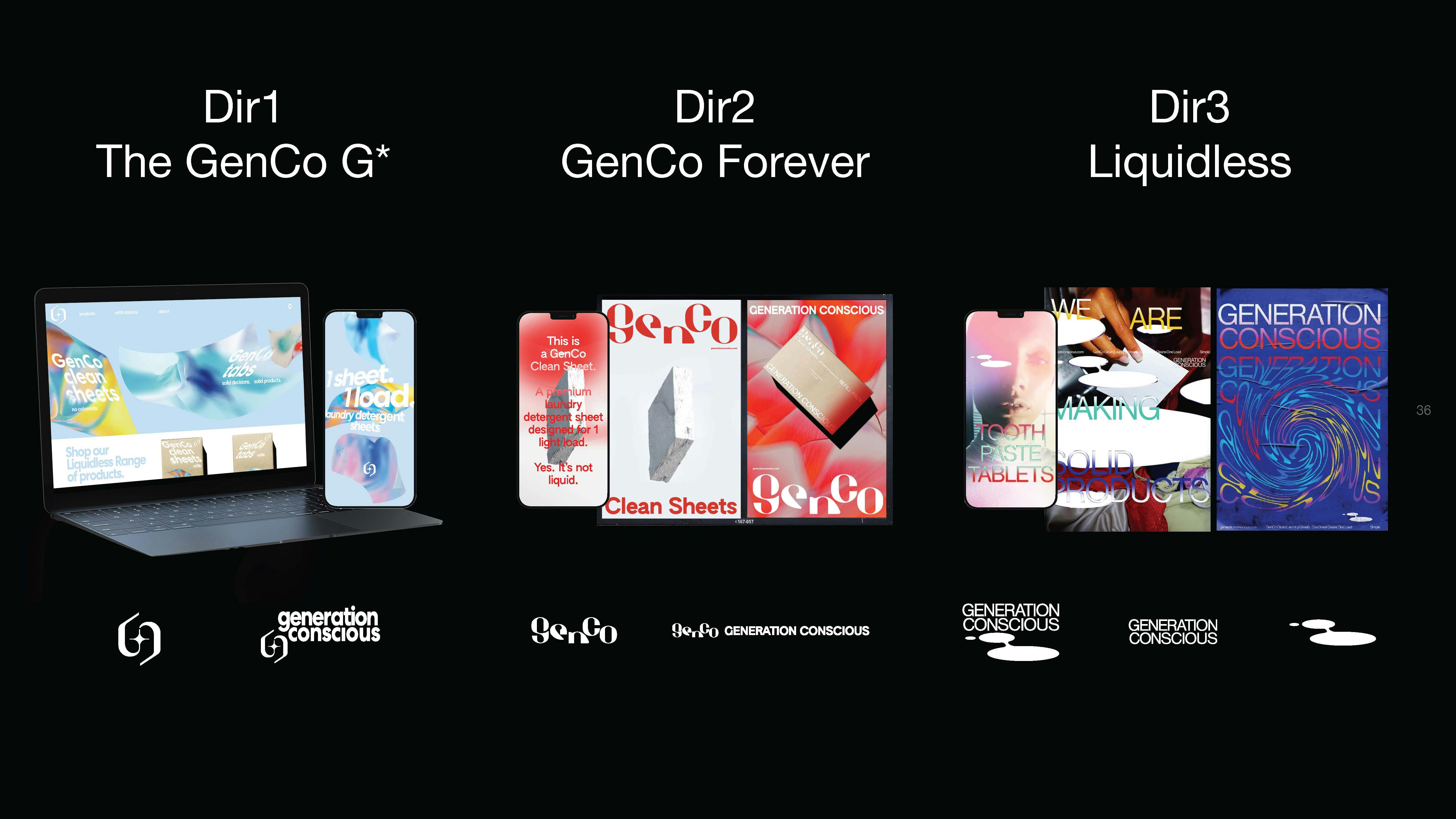
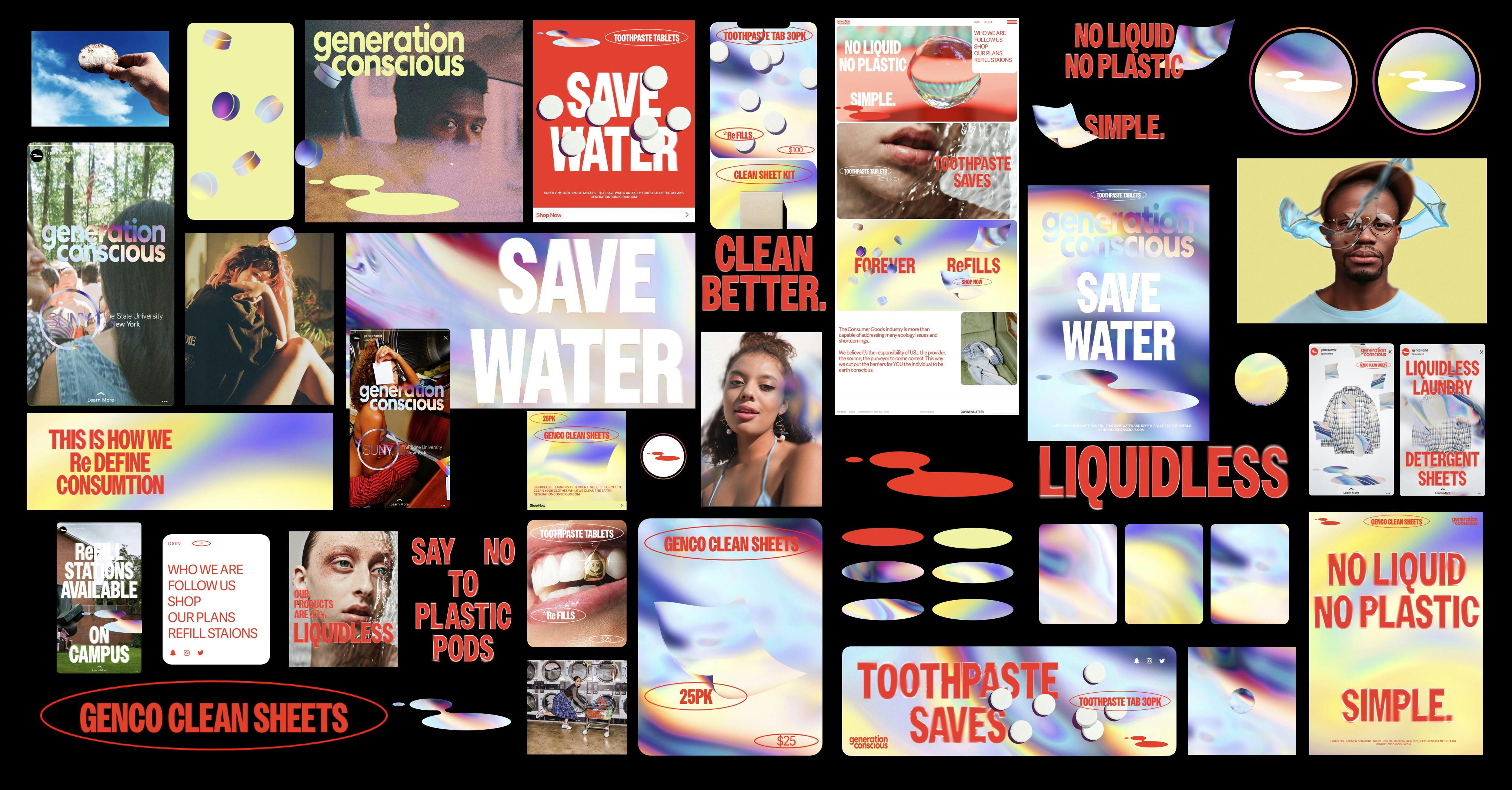
We began with our overall synopsis of sustainable cleaning product brands — outlining specific visual properties in use.
The findings led us to align on pillars that Generation Conscious could represent, while also giving us meaningful foundation to build into our visual exploration.
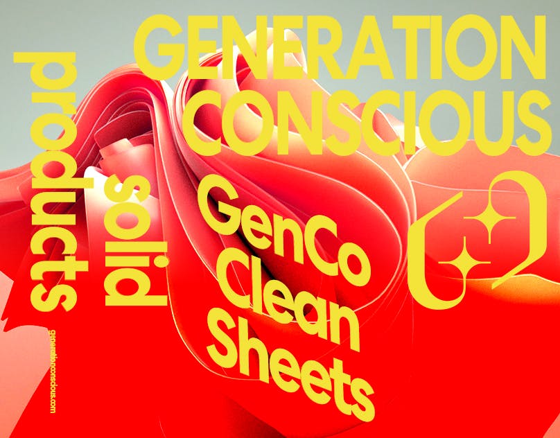
Our overarching goal. Be new, for the future present.
Our 3 directions were distinctly focused on the look of clean, attraction and appeal, and ironic visual expression.
We identified the success' of the first round of design — weighing the pros and cons of a differentiating mark as well as wild typographic styling.
We determined that a balance between the stamp of a professional product and a more wild behavior from the system would be most effective for Generation Conscious' pursuits.
The liquid puddle logo mixed with a unique florescent gradient (not final) and effected typography allowed the brand to strike a range of professional and youthful tones.
Refinements and firming of our final brand marks.
Initial titling furthers the notion of liquid visuals as graphics. Motion by Joe Wright.
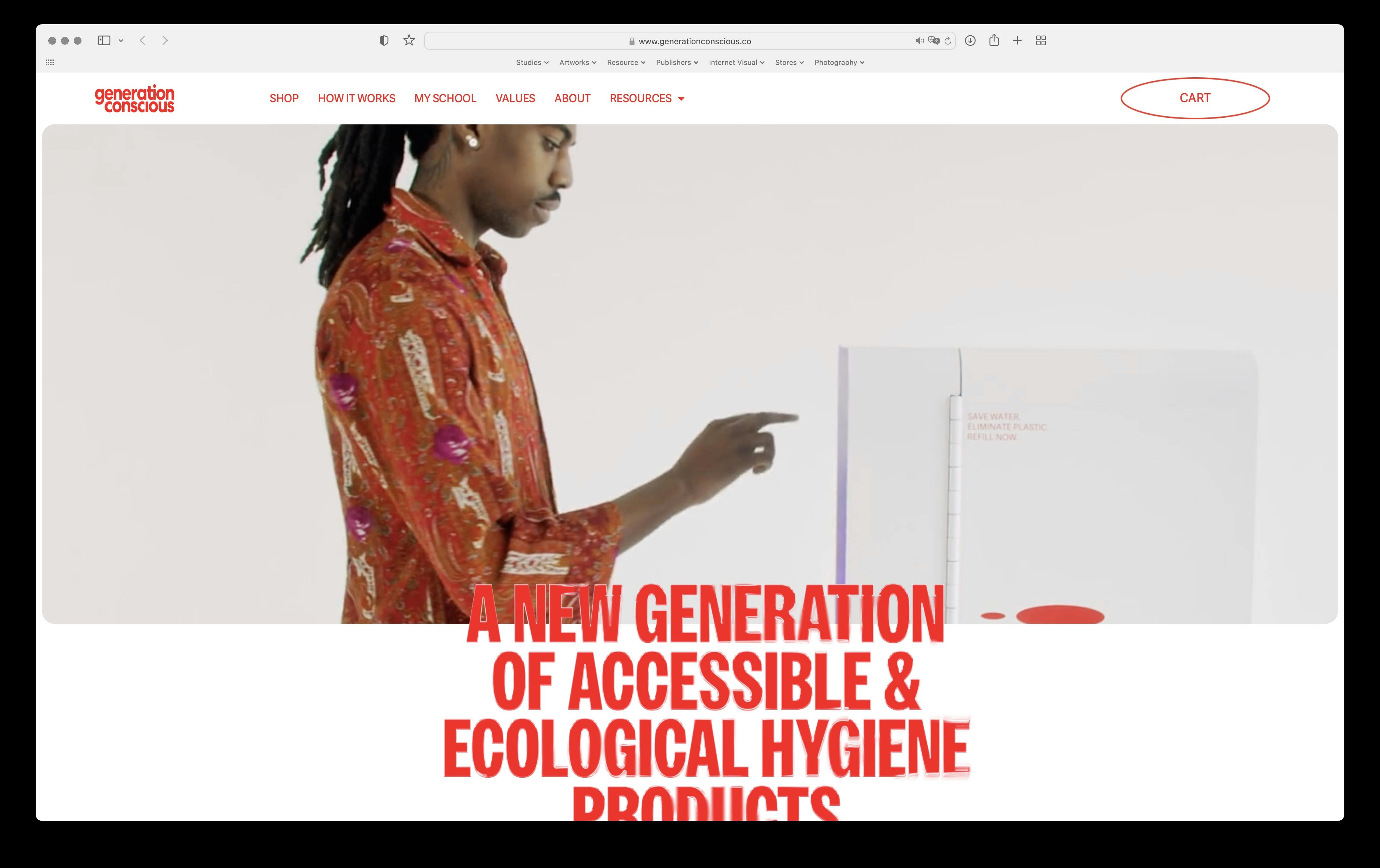
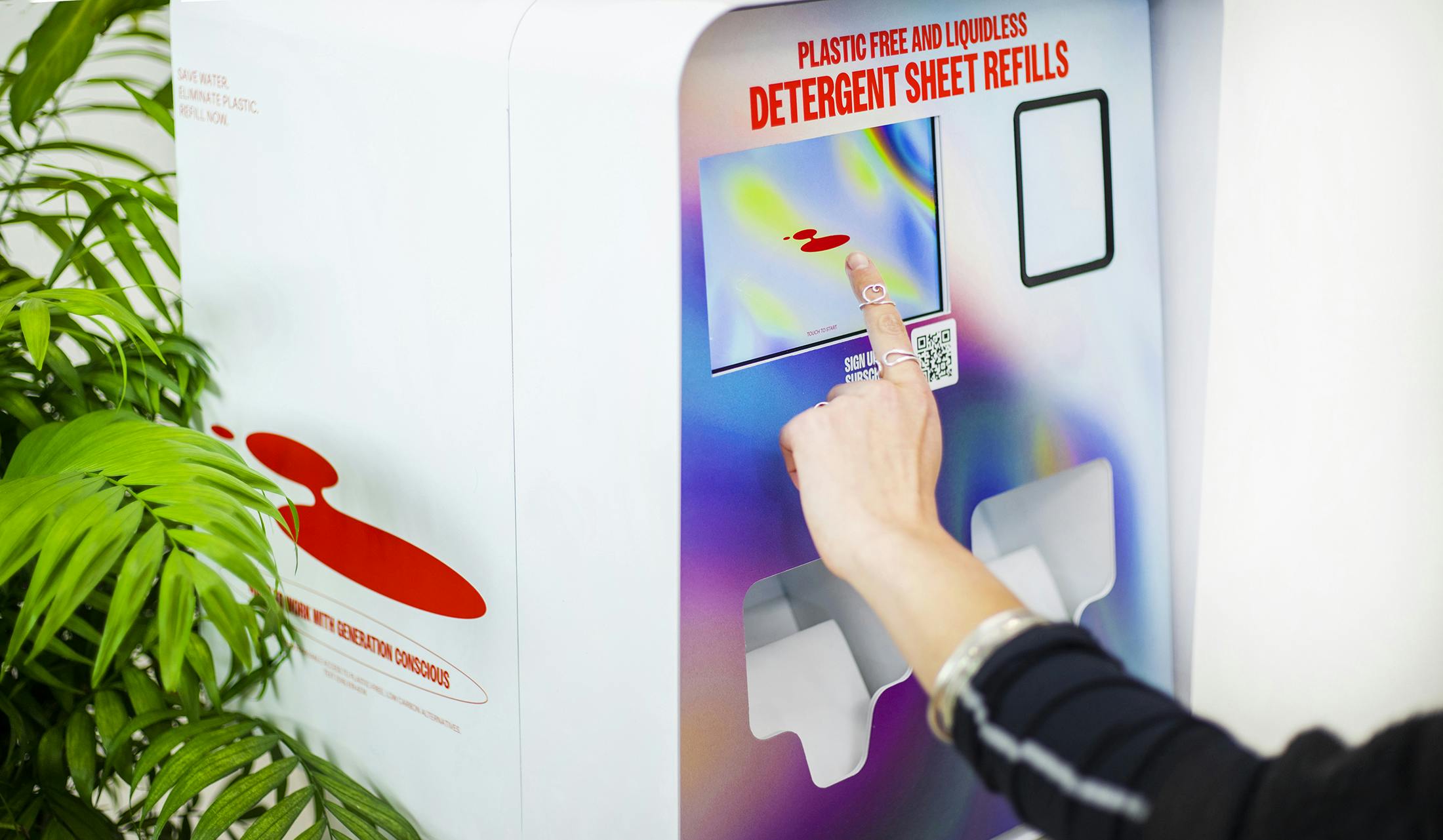
Overview of how the baseline brand identity system comes together online and offline. (revised color palette)
The final website was designed to live between a vibrant new brand developing trust worthy product. Development by krftwrk.ca.
Generation Conscious' patent laundry sheet dispensing wall mounted vending is the center of the brand, while supporting DTC items are made available for purchase.
The usual approach, when presenting BLACK related holiday campaigns, is often very one note. Lacking a profound depth and thus exposing inauthenticity.
Direction 1 compositionally hints at the nuance and multiplex of the individuals being celebrated. They are not solely rappers, musicians — they are much more. Each one is a universe of titles, emotions, and legacy.

Initiated January 2022, Completed February 2022 — Kendall Henderson
Initiated January 2022, Completed February 2022 — Kendall Henderson
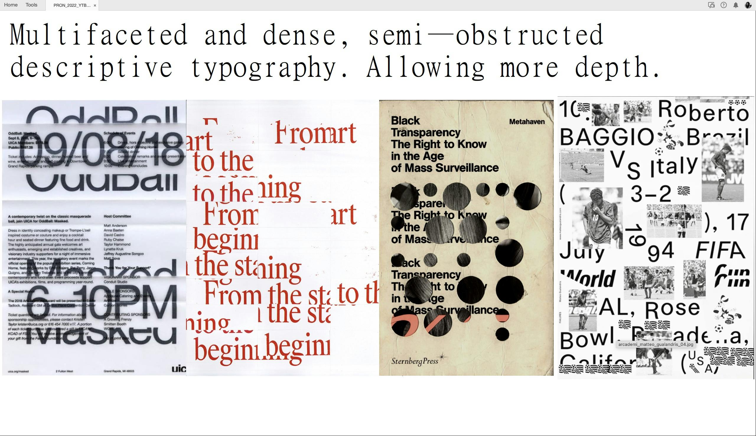
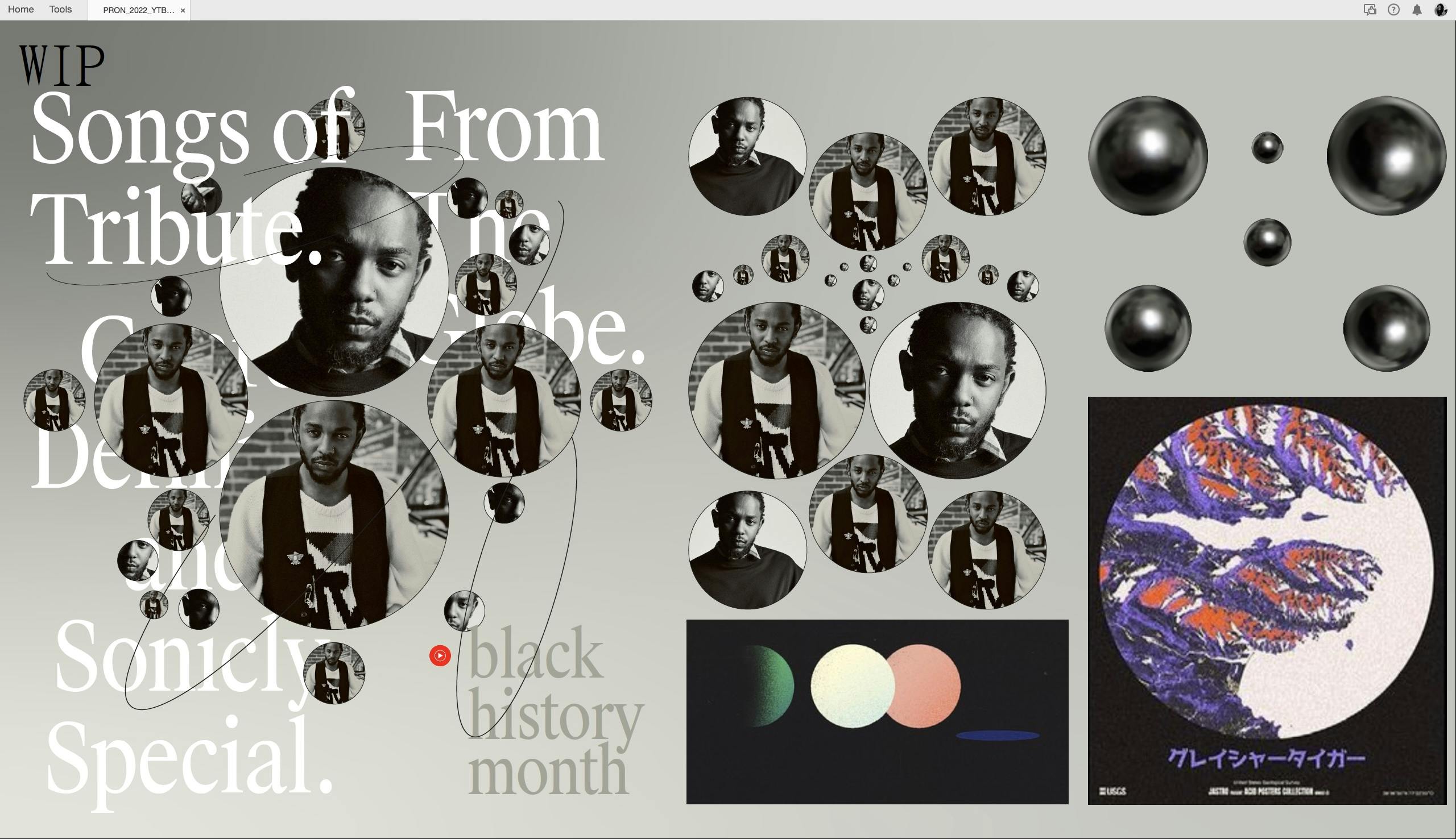
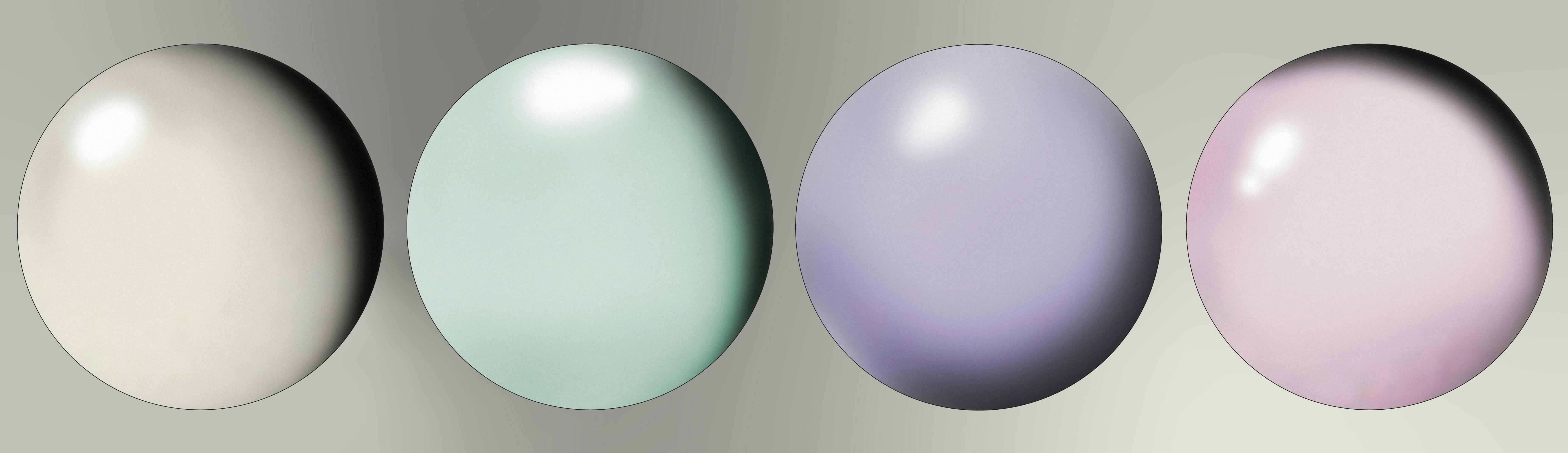
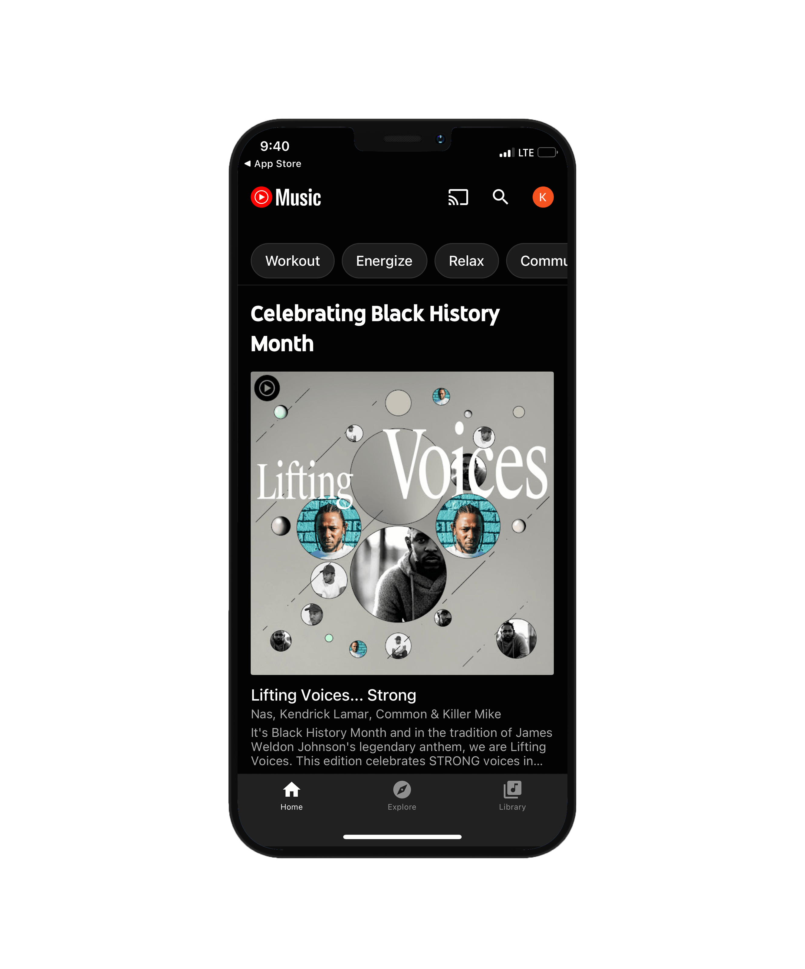
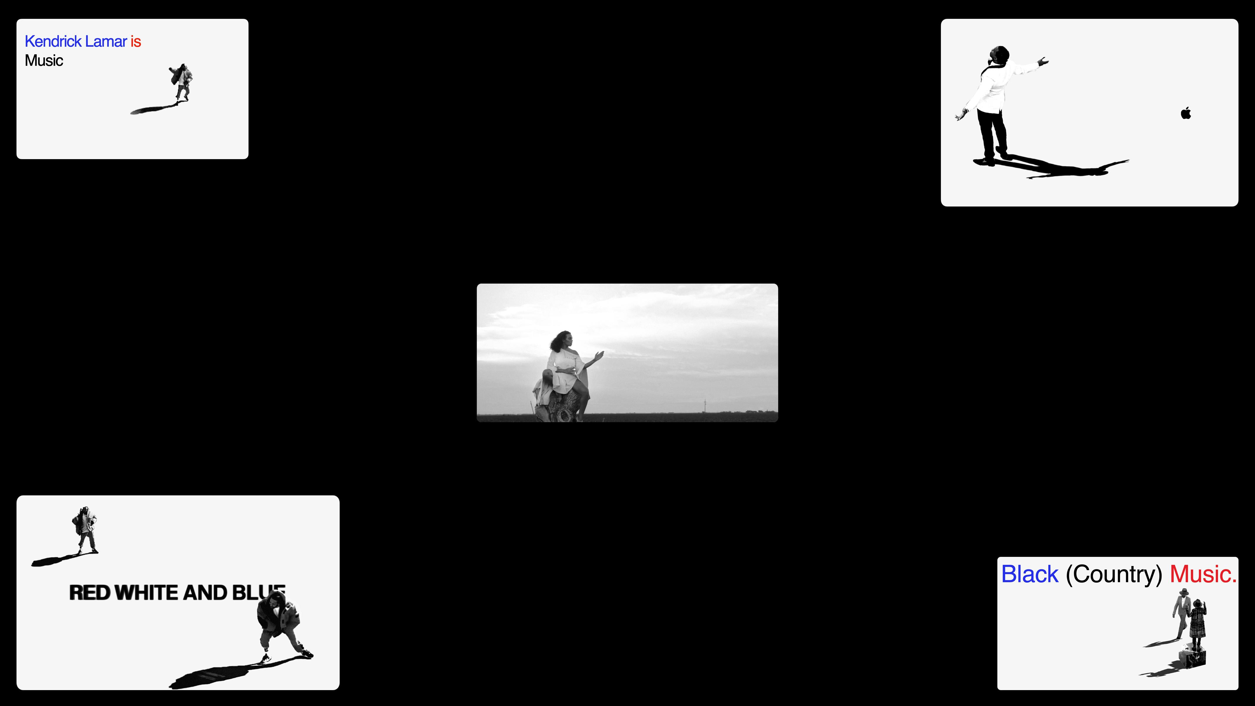
Our YouTube Music BHM direction starts from a constant contemplation of just how big and vast the black music discography can be (from recorded history and limited visibility through time). Much like our galaxy.
Proof of concept through a 1 pager of sketches and color reference, along with some scale testing.
With the core visuals in place, we built the structure of elements to combine and form many variations of playlist covers.
The main playlist covers featured prominent artist who've lead music and culture over the course of time.
Supporting playlist covers were genre focused, highlighting the sounds of Black and universal music.
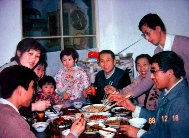
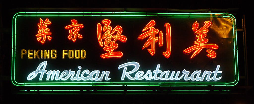
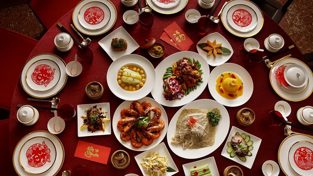

Initiated April 2021, Completed November 2021 — Kendall Henderson, Kristy Chen
Initiated April 2021, Completed November 2021 — Kendall Henderson, Kristy Chen
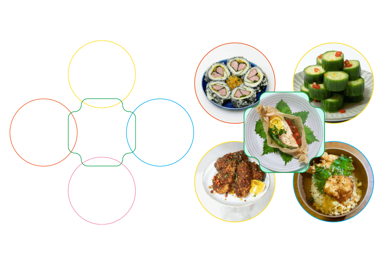
Childhood memories of large family gatherings in a small town in Chengdu, and years of exposure to flavors of all kinds inspired a series of malleable private dinners in creative open spaces during the summer months in Brooklyn.
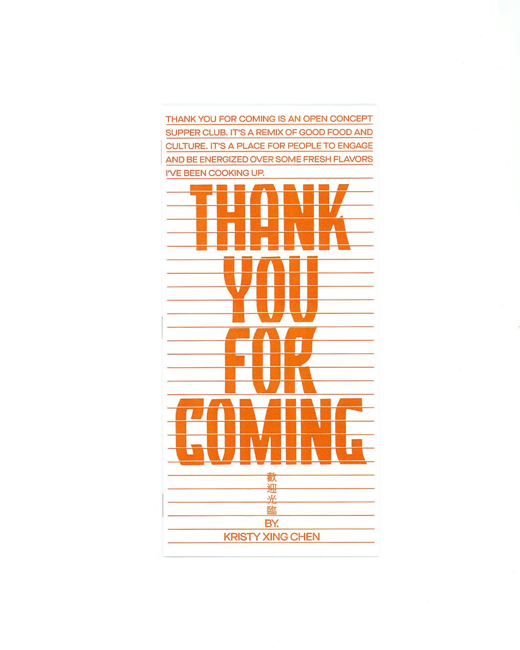
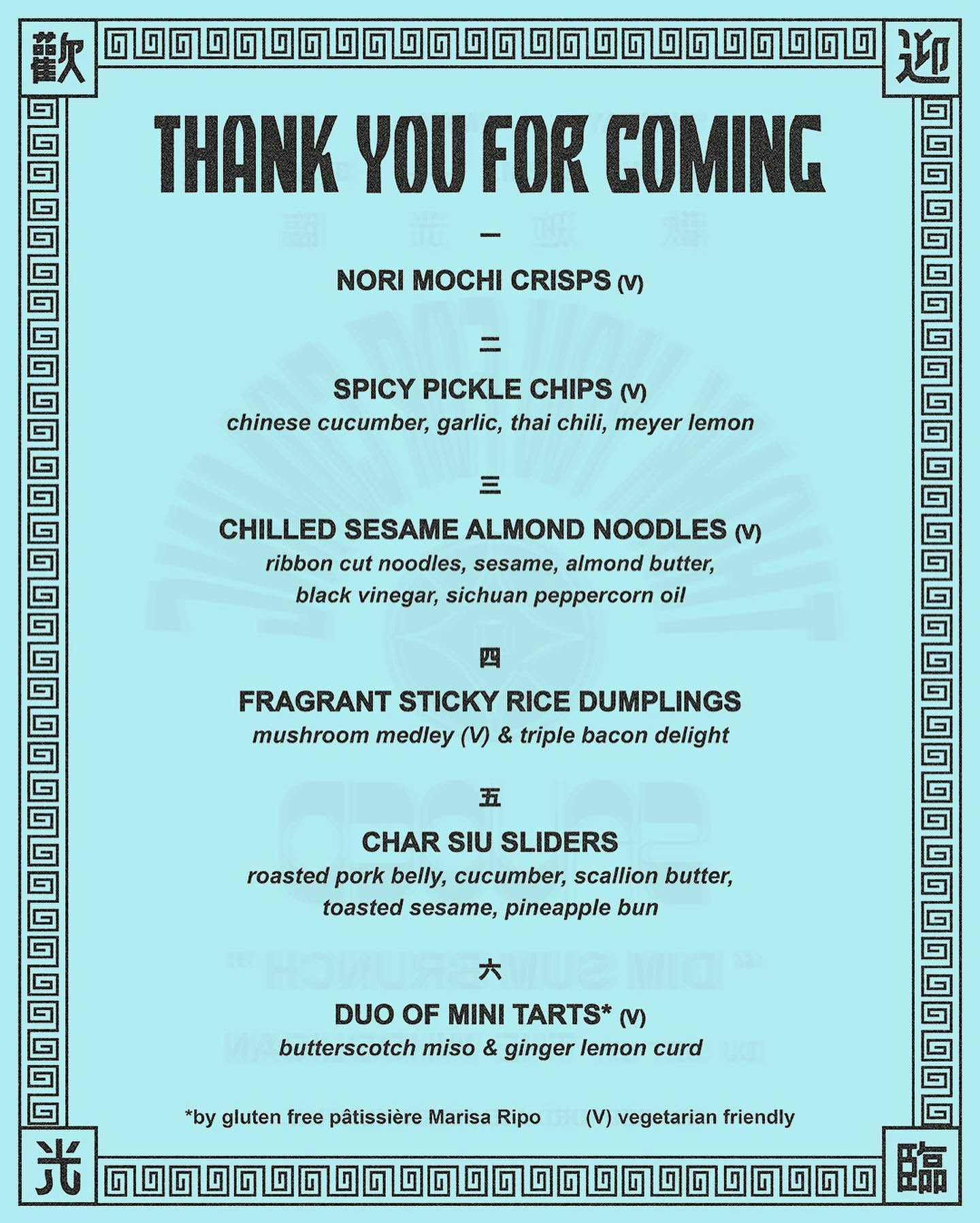
During the early stages of New York re-opening Kristy Xing Chen put together a small gathering open concept supper club to re-engage social groups while exploring and showcasing new and mixed cuisine based on her families northern Chinese heritage.
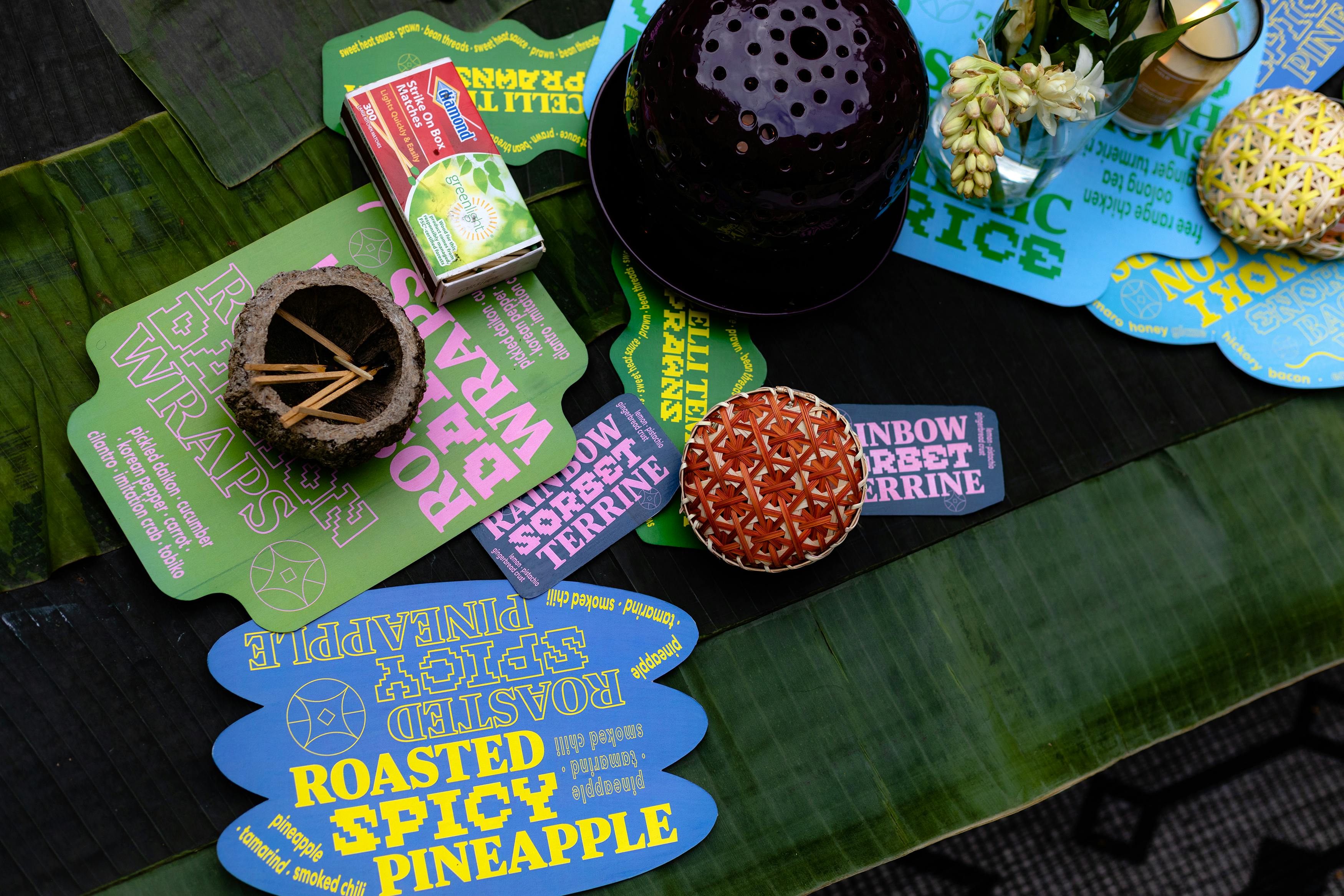
Whilst developing the first dinner we looked at the qualities of typography and elements of neon restaurant signs. A visual reference that blends the spaces of American and Chinese cuisine in an adjacent way.
We also took note of the communal style of circular tables and plating style of traditional Chinese dinners as an element to build the brand from. Along with an evolved Chinese coin shape, which combined Kristy's given name Xing – meaning shooting star – with the luck associated with Chinese money.
Various branded elements: Plate Container Shapes, Wordmarks, and TYFC Coin Logo
The title Thank You For Coming is the begging of a welcome greeting and a polite send off. Each dinner carried different themes based on season and Kristy's specialties.
Since each dinner was themed we could ideate evolving visuals and design around each meal's concept.
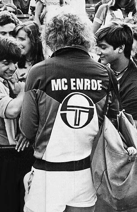
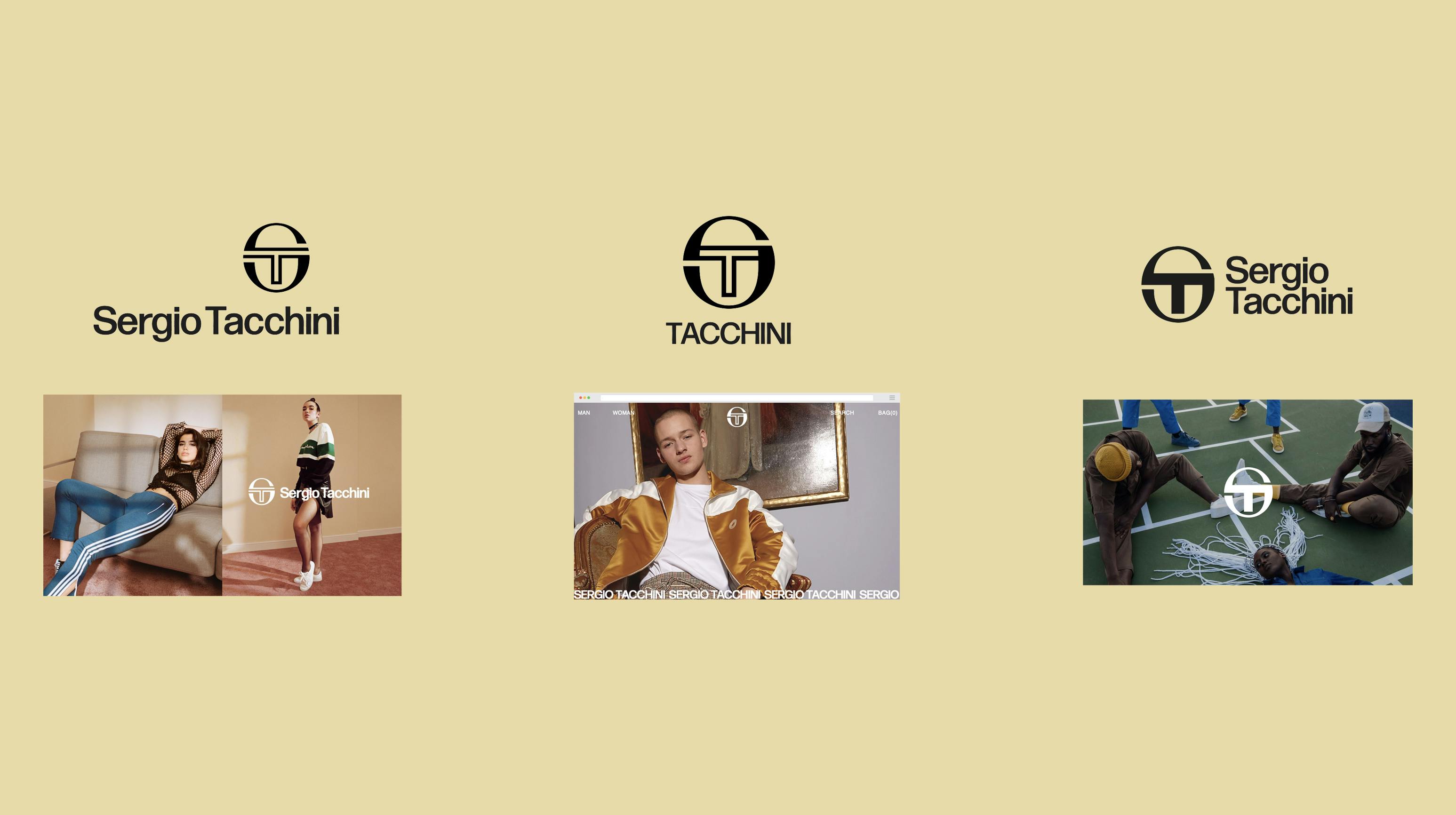

Initiated May 2019, Completed January 2020 — Kendall Henderson, Jackson Cantor
Initiated May 2019, Completed January 2020 — Kendall Henderson, Jackson Cantor
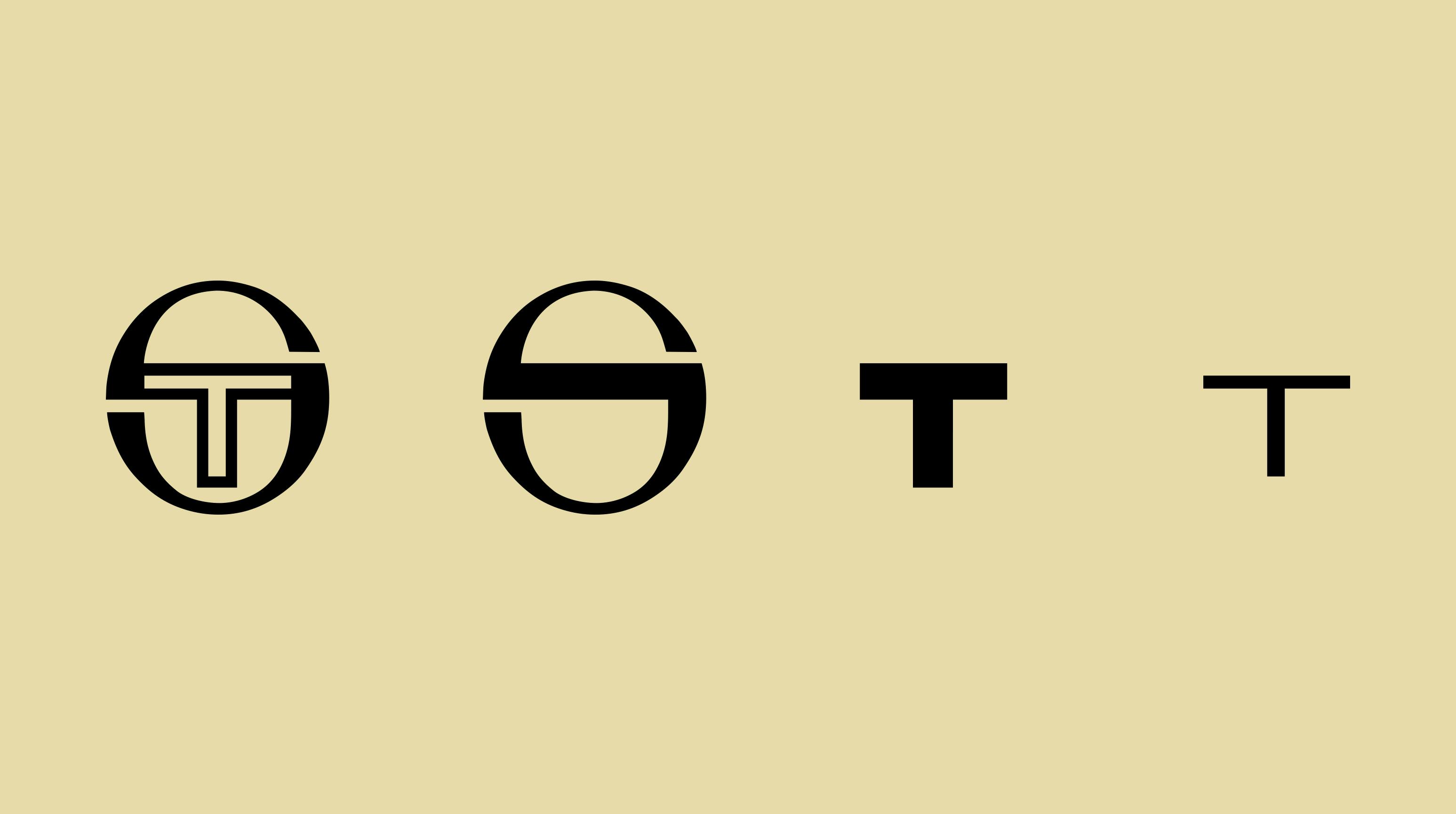
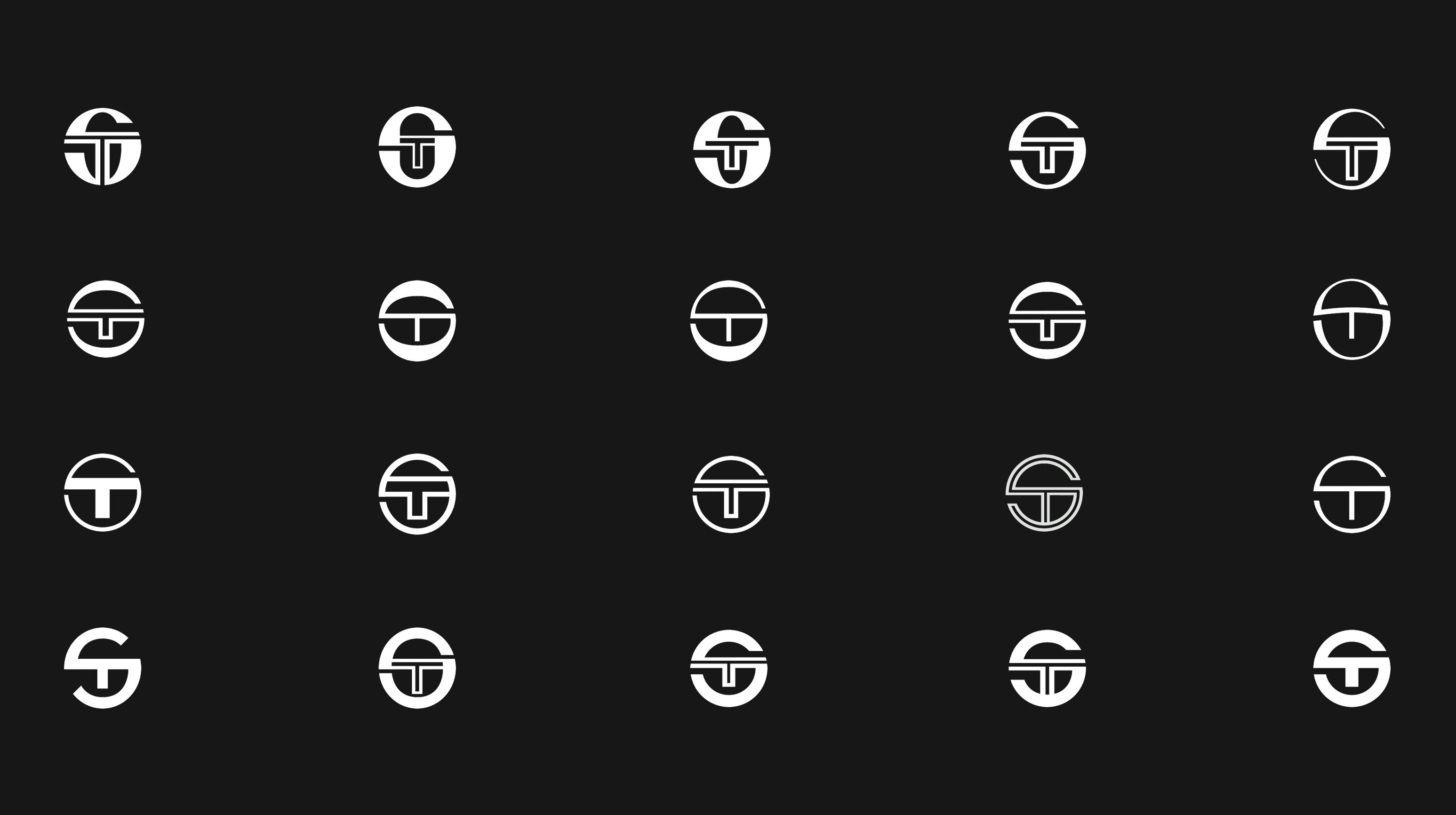
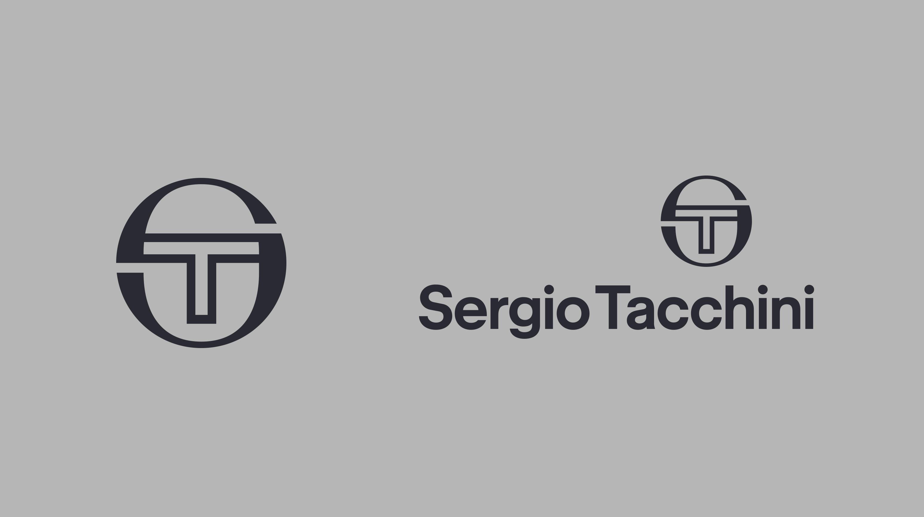
We started by over analyzing Sergio Tacchini's archives as reference and our base foundation for developing an updated identity.
Discovering the anatomy of the (1980's) logomark and the history of typography used in the logotype.
(Some of) a series of iterative logomarks that tested the range of departure we could achieve without losing recognition.
Internal conclusion of the first 3 direction proposals. (Full Exploration / Design and Strategy Proposal)
The selected Logomark and logotype followed rigorous series of small steps to Maintain the heritage of the brand.
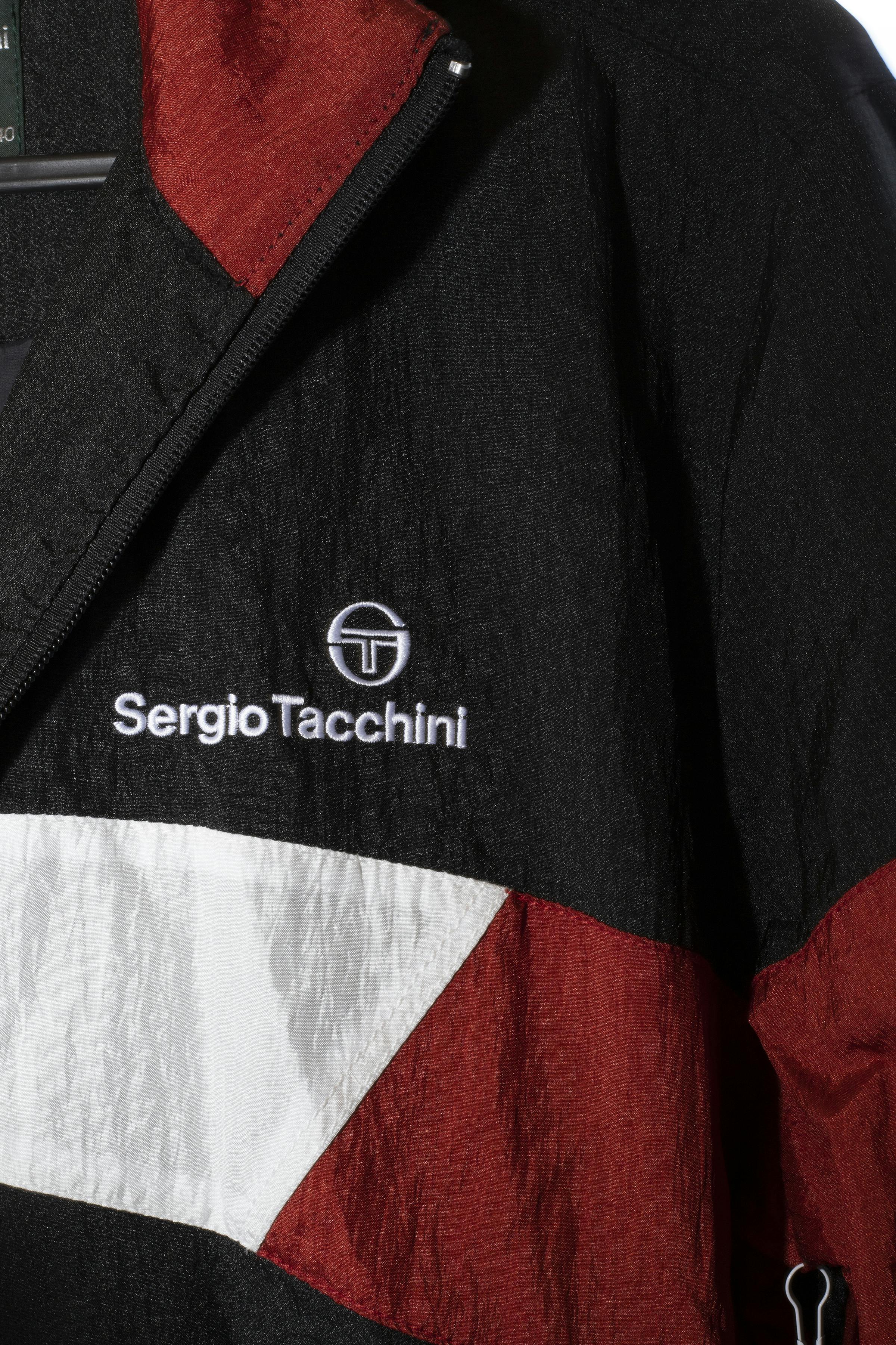
Color Palette based archive adverts and garments. A standard typographic family with unique variation.
Initial overall brand items were developed in tandem with the 2020 brand guidelines document.
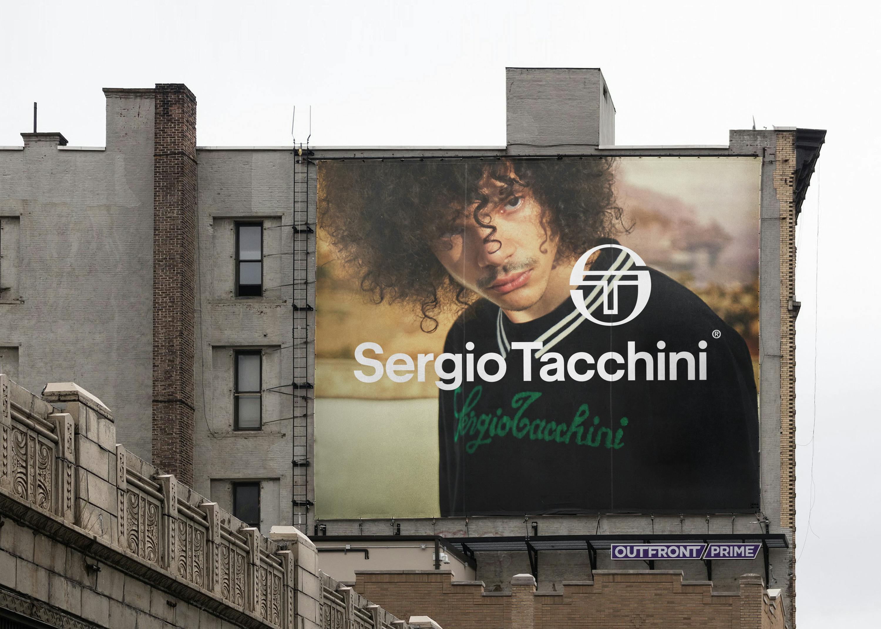
Campaign ‘Test’ visuals and layout
Capsule graphics Proving the roll out of the new brand Identity Beginning Spring ’21.

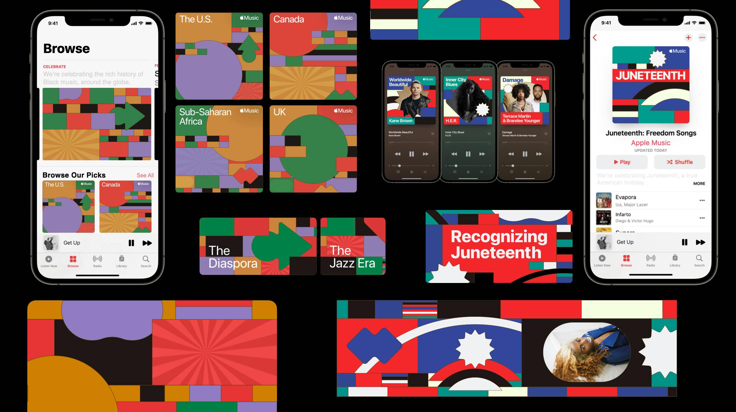
Initiated April 2021, Completed June 2021 — Kendall Henderson
Initiated April 2021, Completed June 2021 — Kendall Henderson
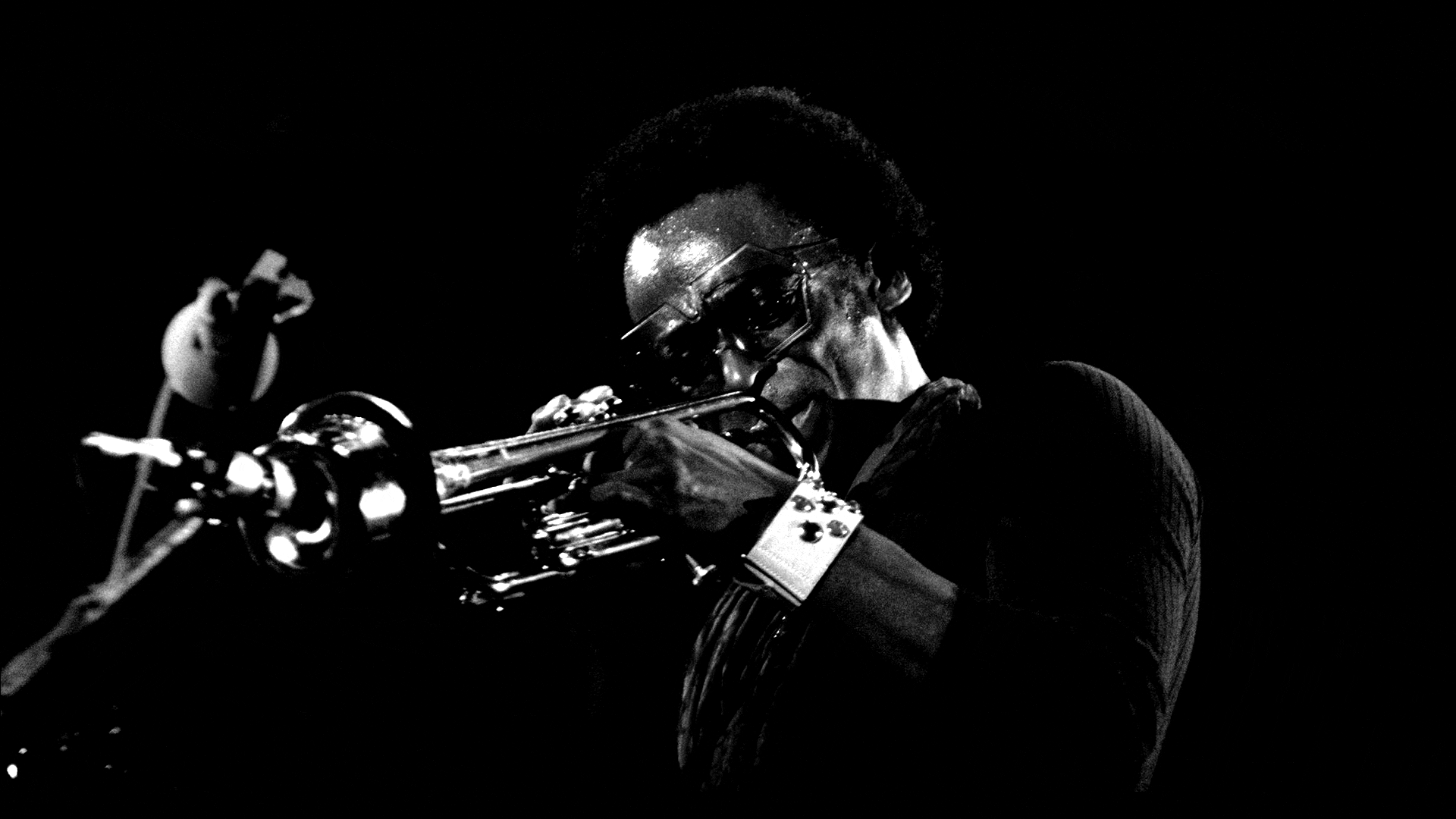
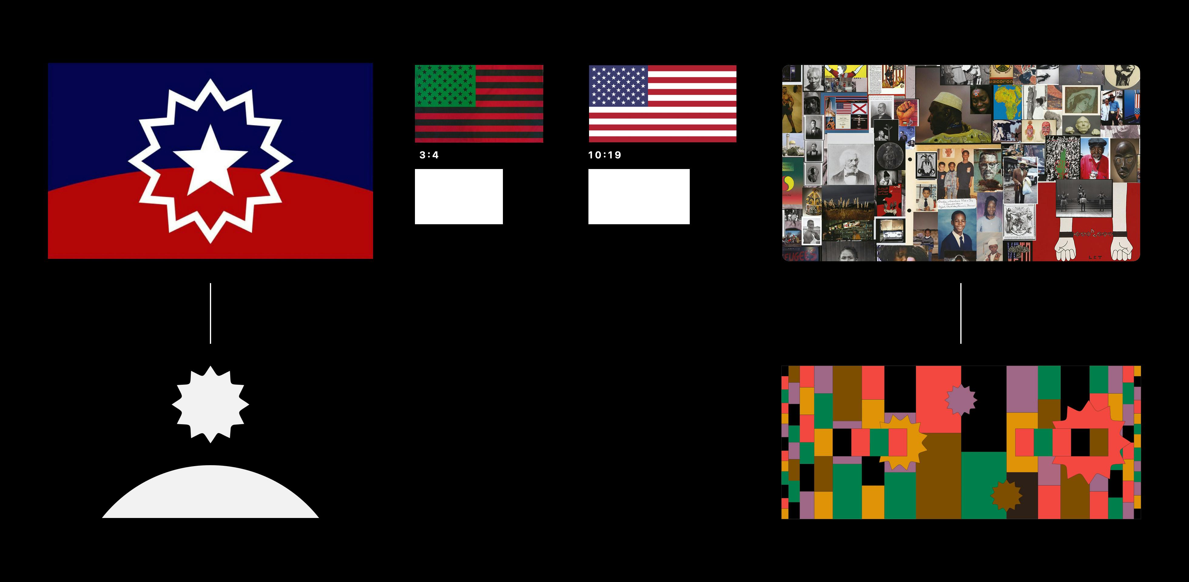
Syncing with the Apple Music (design / strategy teams) and Apple Values this conversation begins with dialogue around what Black Music means beyond the stereotypical connotations. (Some of) Our thought starters as follows...
Positioning Black Music as an expression of Black lifestyle & acknowledging how it pushes beyond limits became key pillars. We aim at celebration while aware this multi-genred, nuanced expression shares moments of trial, sadness & sorrow.
Initial visual direction exploration plays with: Large expanses as yet to be defined potential, abstract molecular like evolving shapes, and solid graphic flag like compositions.
Our conclusion became an extension of a reference piece, a photograph mosaic from the team's collective friend and artist Ibrahem Hasan.
A deduction based kit of parts that allowed the Apple Music design team to expand this system across all touch points and differentiated elements for assets related to BMM (2/3) and the Juneteenth portion of the campaign (3/3)
Overview of both Black Music Month and Juneteenth components in use across the Apple Music desktop and mobile platforms.
My relationship to Colette Pomerleau began several years ago as she was introduced to me online through a mutual connection. Over the years I have been slowly watching her eye capture subtle still moments over instagram and falling in love with the understated aesthetic she has been building with these images. This type of imagery was well suited for the inspiration and initiation of the "sealed archive of otherwise personal instagram content" concept that would later develop.
Initial casual project brief, description & conversation. via Instagram:
Kendall: You wanna work on something with me?
Colette: What if I said yes blindly.
Kendall: Then I would give you the details.
Colette: Yes ✨
Kendall: I basically wouldn't need you to do much besides collate your images :)
I have been trying inspire myself to do design work / art direction of projects that feel more like art works, or at least more that exist off screen.
Colette: ❤️
Kendall: I have been toying around ways to show the 1000s of my photos that don't end up on instagram, due to them not being "good enough" or whatever social reasons, or just simply personal editing.
Following so far...?
Colette: I am :)
Kendall: So, I wanted to explore the idea of an archive of photos meant for publishing, those meant for instagram, and those almost seeming forgotten. All mixed into the same document.
Then I thought, why use my photos when I can use someones that I admire and someone who actually creates artful images with their eye and camera. The format is inspired by a couple design things i've seen around.
Using the glue edge on all the exposed sides to seal the book shut.
Burying the the photos in a book that cannot be opened.
Colette: Can I see the thing that inspired you?
Kendall: (Shares an image of Commission Studio's DKNY stacked and pad bound invites)
So like similar, but you wouldn't tear into the pages... but I guess one could. If they desired, which would change their relationship to the photos.
Initiated February 2020, Completed February 2021 — Sophia Marinelli, Colette Pomerleau
Initiated February 2020, Completed February 2021 — Sophia Marinelli, Colette Pomerleau
Initial casual project brief, description & conversation
Colette Pomerleau, gathered some 200+ photos to be printed in a book bound on all sides and never shared online. The book explores the relationship to photography in our current unsolicited feed based and instantly gratifying visual culture.
The Forward.
Written by Kendall Henderson
Introduction pages are left loose to reveal only some of the details, title, image formats, and image timestamps before the sealed portion of the object.
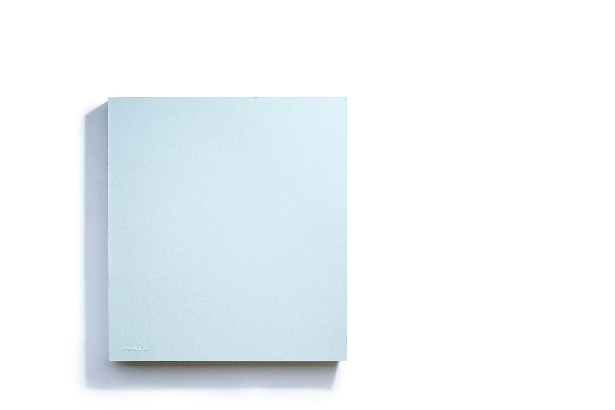
10" x 11" 233 pgs, individually hand bound with glue exposed on three sides. Perfect bound cover with light embossed "We Want You To Care" title. Combination of risograph and laser printing on arjowiggins creative papers.
Initiated September 2020, Completed February 2021 — Kendall Henderson, Sophia Marinelli
Initiated September 2020, Completed February 2021 — Kendall Henderson, Sophia Marinelli
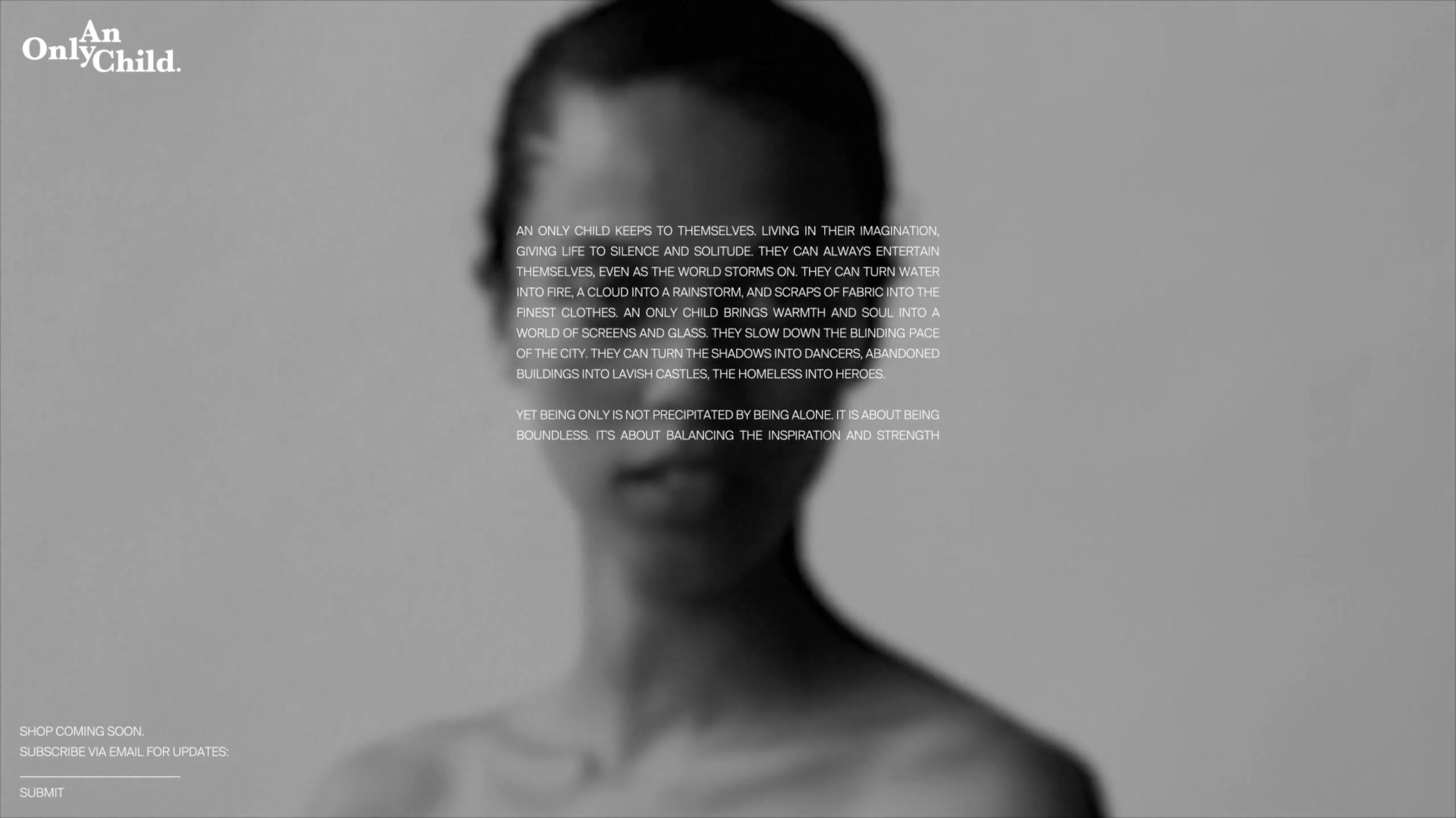
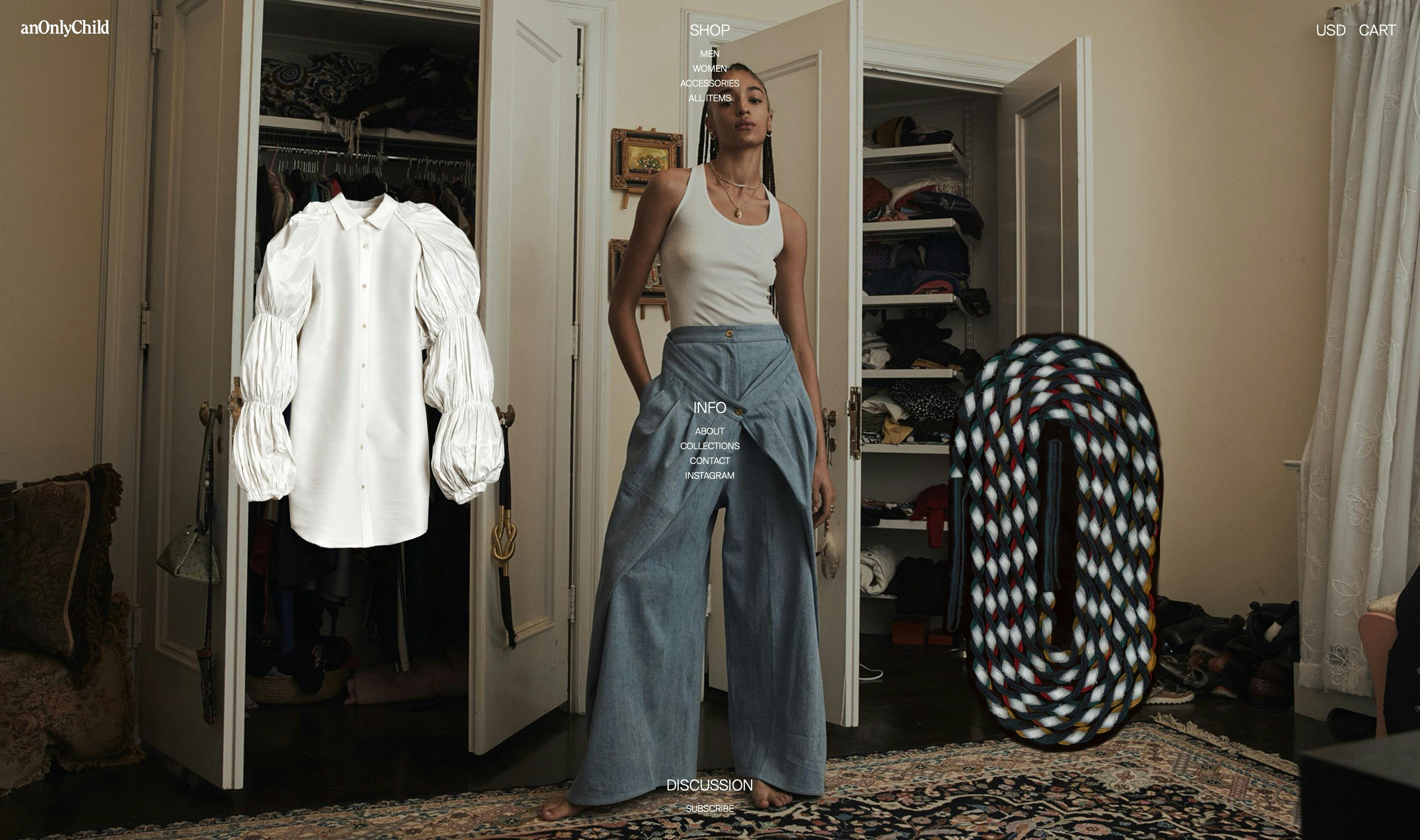
anOnlyChild approached us with the quick task of developing a splash page for the launch of the brand, before beginning the ongoing website design and development.
We were given this peek into to anOnlyChild's brand ethos. Which is a reflection of the lifestyle and Jamaican-American heritage of its founder.
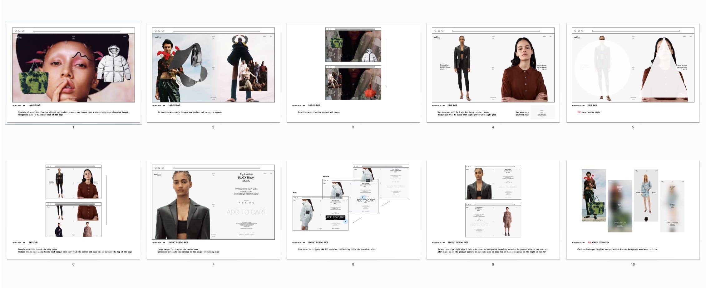
We started the ecomm phase of the website with a simple unconventional navigation placement. Inspired by the clients reference to martine-rose.com. Which intrigued us for many reasons but led to us building around this unique centered skeleton.
The center piece, fixed navigation, gave us the foundation for the design direction.
We were then asked to spend a week on an identity concept, which was still undecided at the time.
The 6 directions we shared were all based on simple wordmark forms that explore the phonetics of the name and its spacing.
The launch version of anonlychild.com featured a 2-up shop page in order to present more like a lookbook, with a content scrollable landing page, and leaned on subtleties in typography throughout.
Follow up pieces to showcase the collections full looks and campaign images in a digital-physical format.
DESIGN DIRECTIONS
01 ItIsWhatItIs
- Ultra familiar
- Spelled out Info
- Default Typography
- Understated Quality
- Labeling
02 Bookish
- Super readable
- Comfortable type choices
- Academic by nature
- Identifying content, generous margins. List Form
03 Point ~ Counter Tertiary
- Technical / clumsy
- (un)refined / (un)sophisticated
- Low brow / high brow
- Accidental success
- Freudian slip
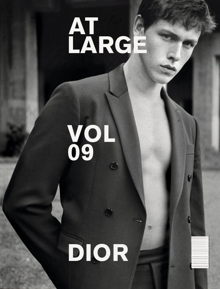
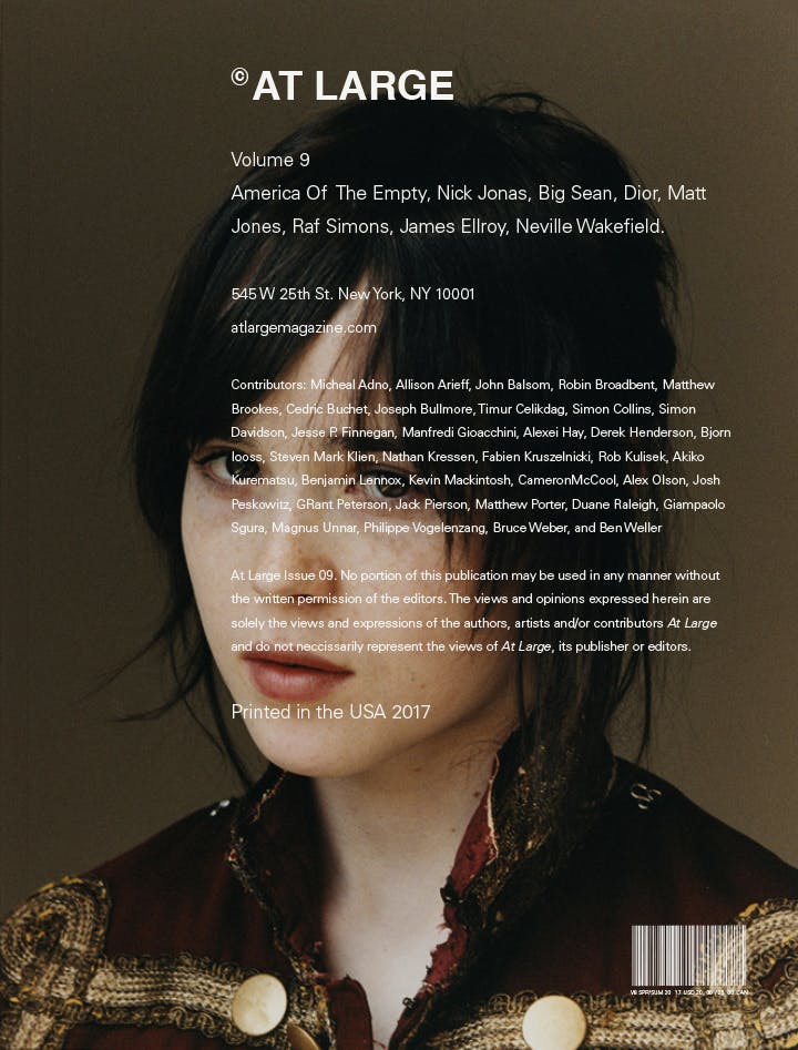
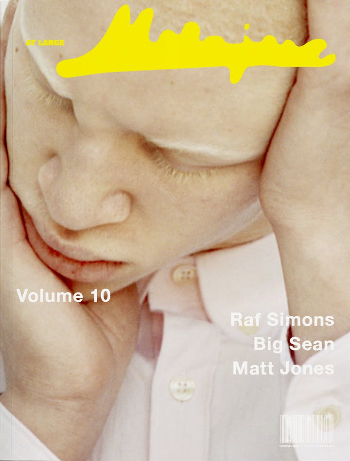
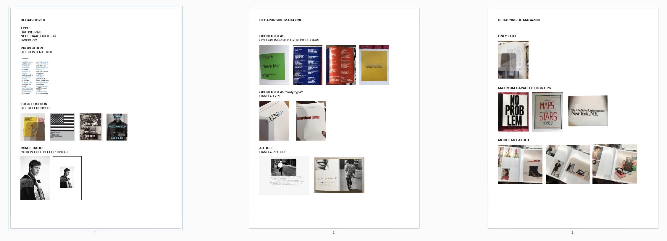
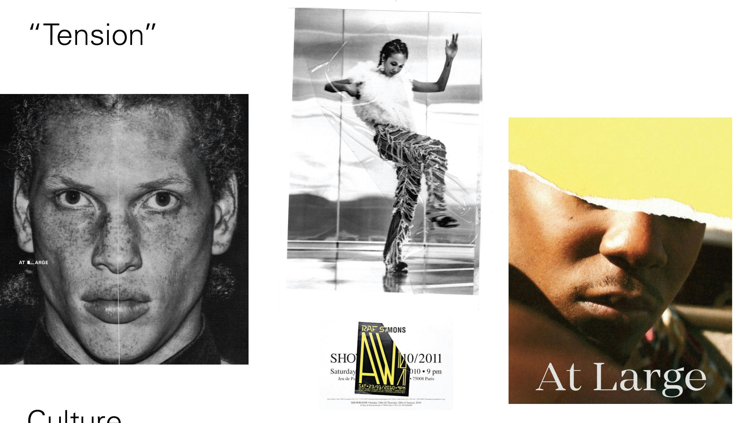
Initiated September 2019, Completed November 2019 — Kendall Henderson, Nick Weltyk
Initiated September 2019, Completed November 2019 — Kendall Henderson, Nick Weltyk
Our initial key conceptual goals. Determined from assessing other sources, points of success and intrigue
Proposed directions that aimed at finding various ways to add abstract tactility to the ethos of the magazine
Direction 1 based on straight forward and subtle familiarity in labelling printed materials.
Direction 2 built from the monotonous but clear display of long form layout. Formating information into a whole.
Direction 3 looks for ways to birth moments of unexpected tension.
Synthesized client feedback and typographic studies
A Refined Variation of Direction 1 & 2
Brand direction executed across further issues 10—13
Initiated February 2020, Completed March 2020 — Kendall Henderson, Michael Malowanczyk
Initiated February 2020, Completed March 2020 — Kendall Henderson, Michael Malowanczyk
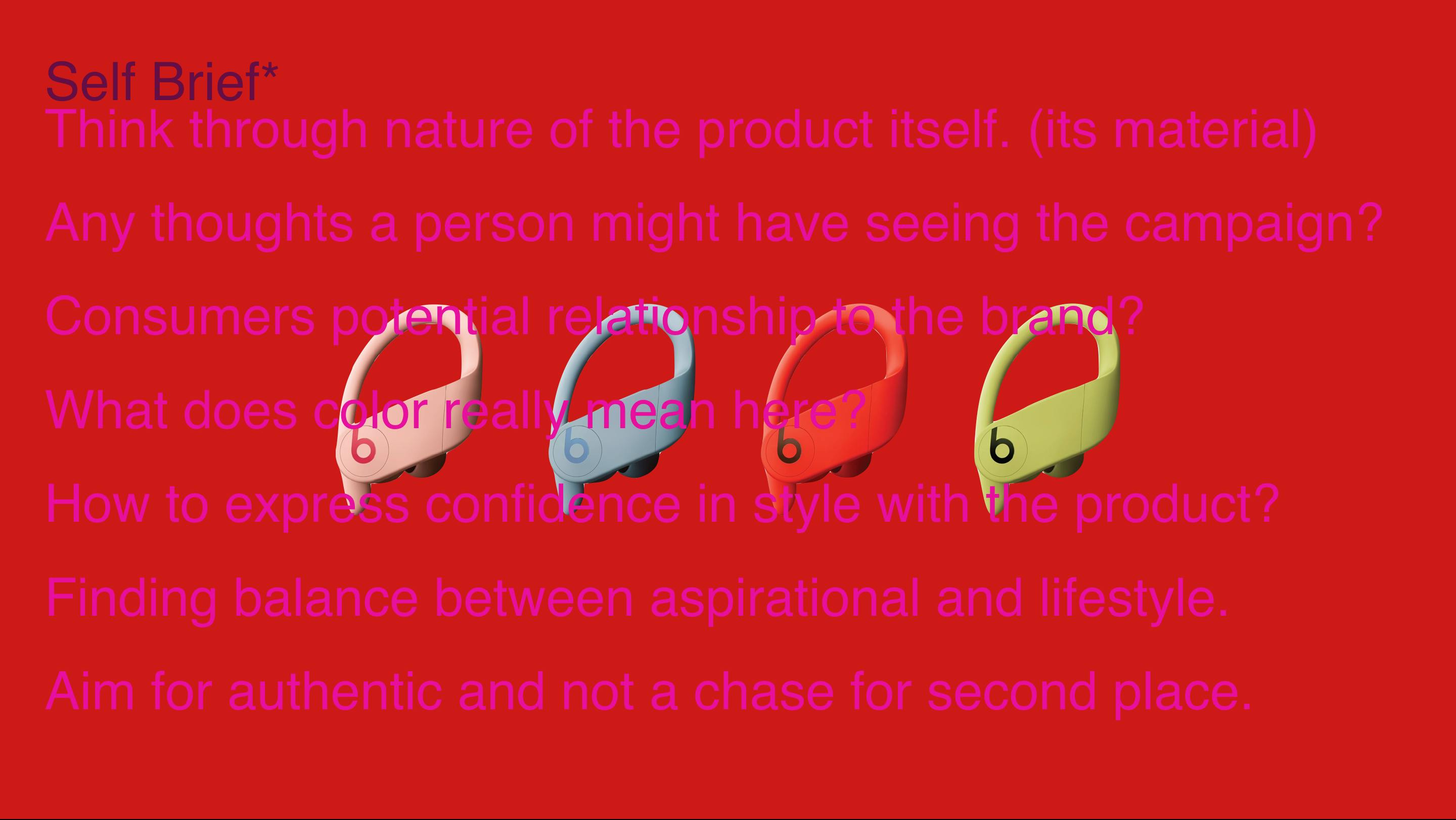
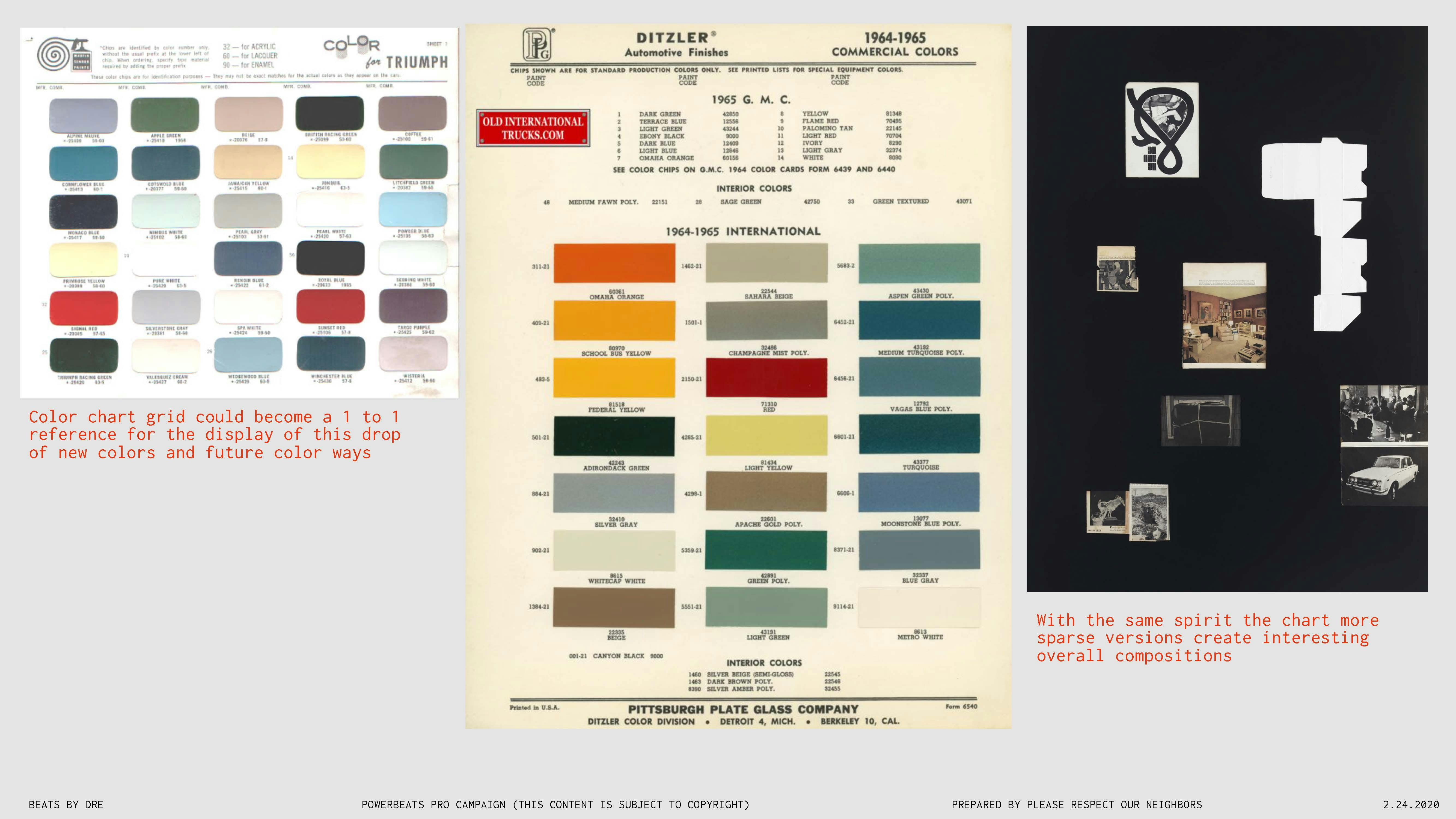
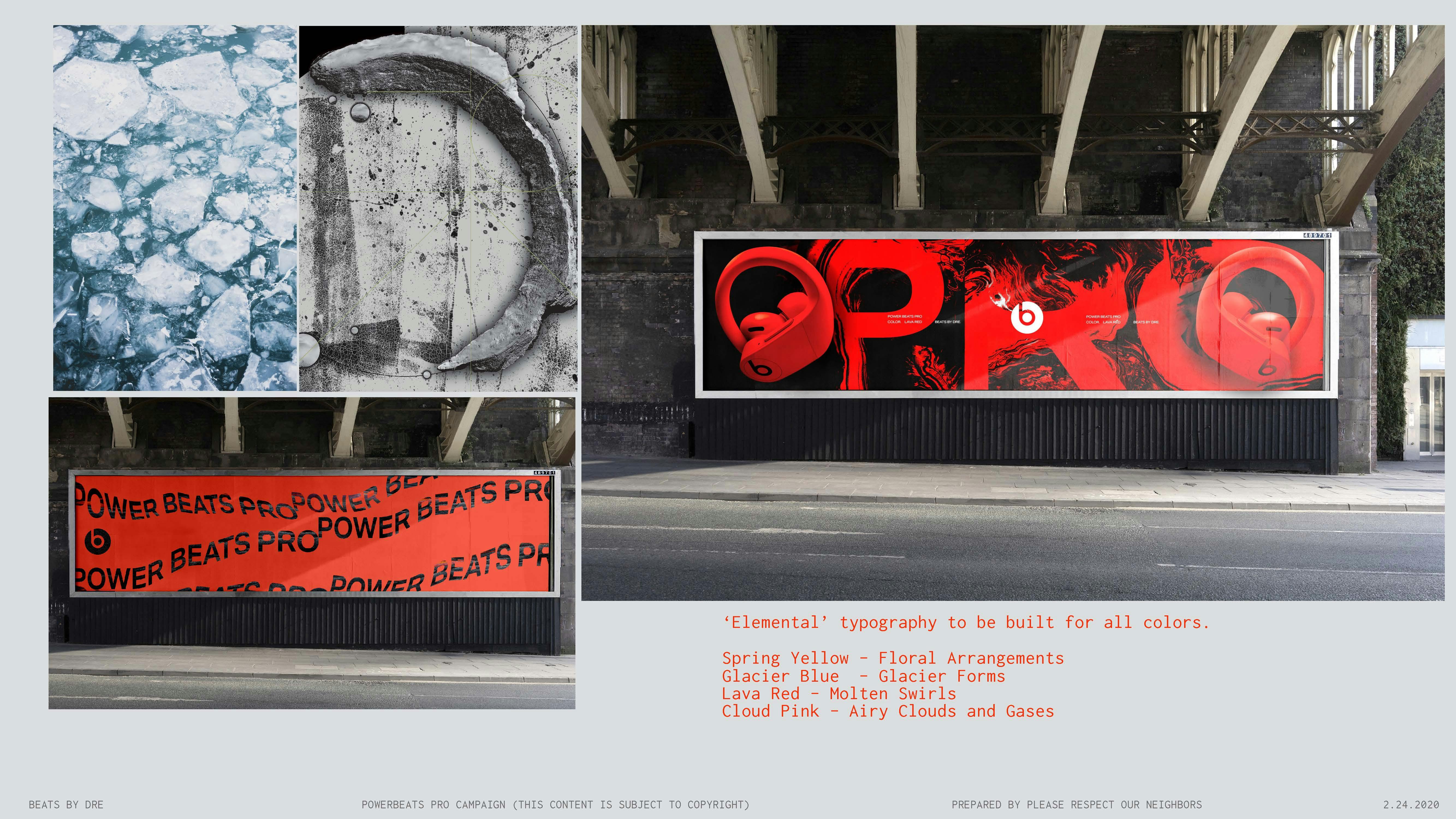
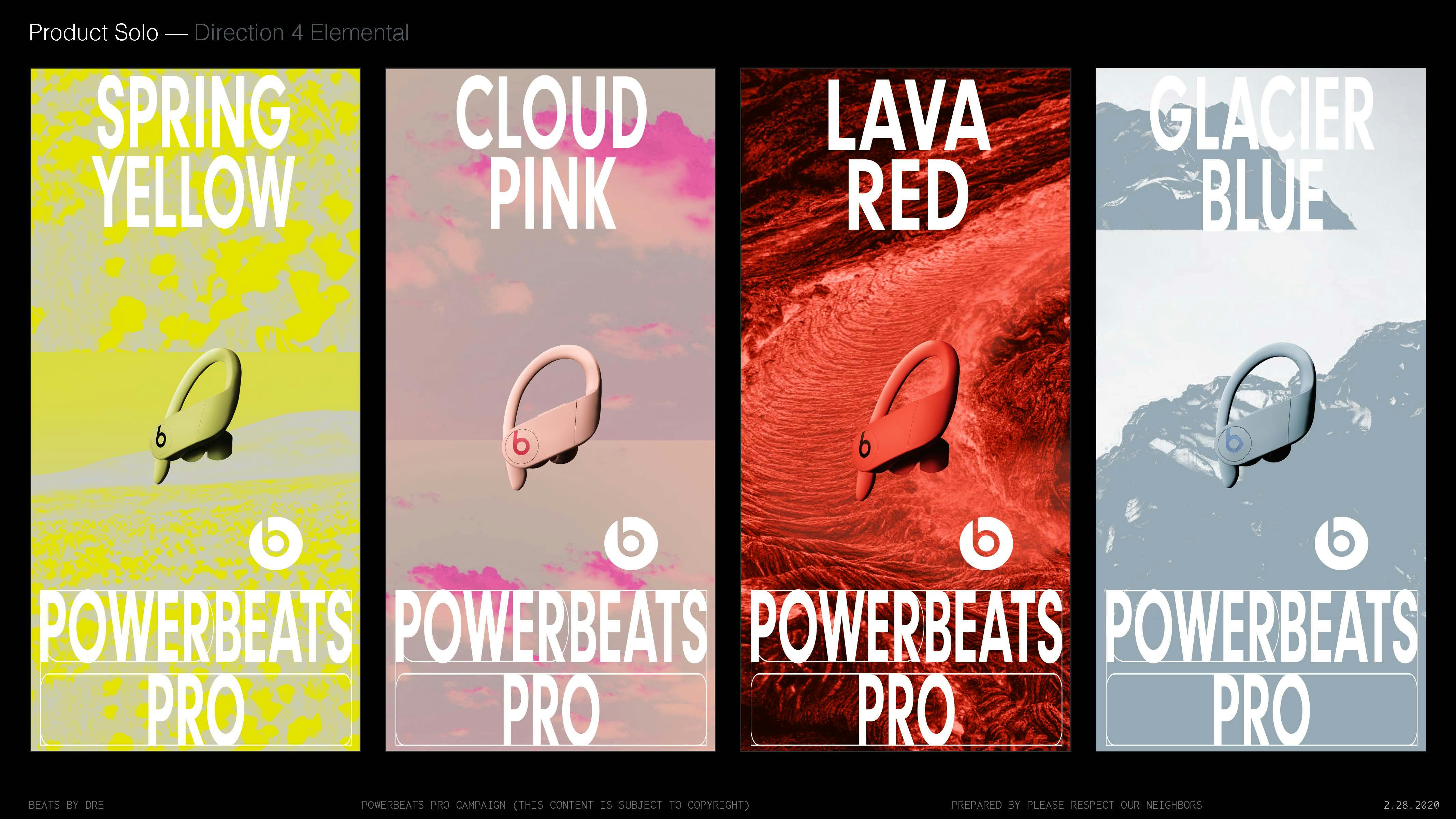
We started by dissecting the Powerbeats Pro New Colors brief. Then asking ourselves a series of questions in response.
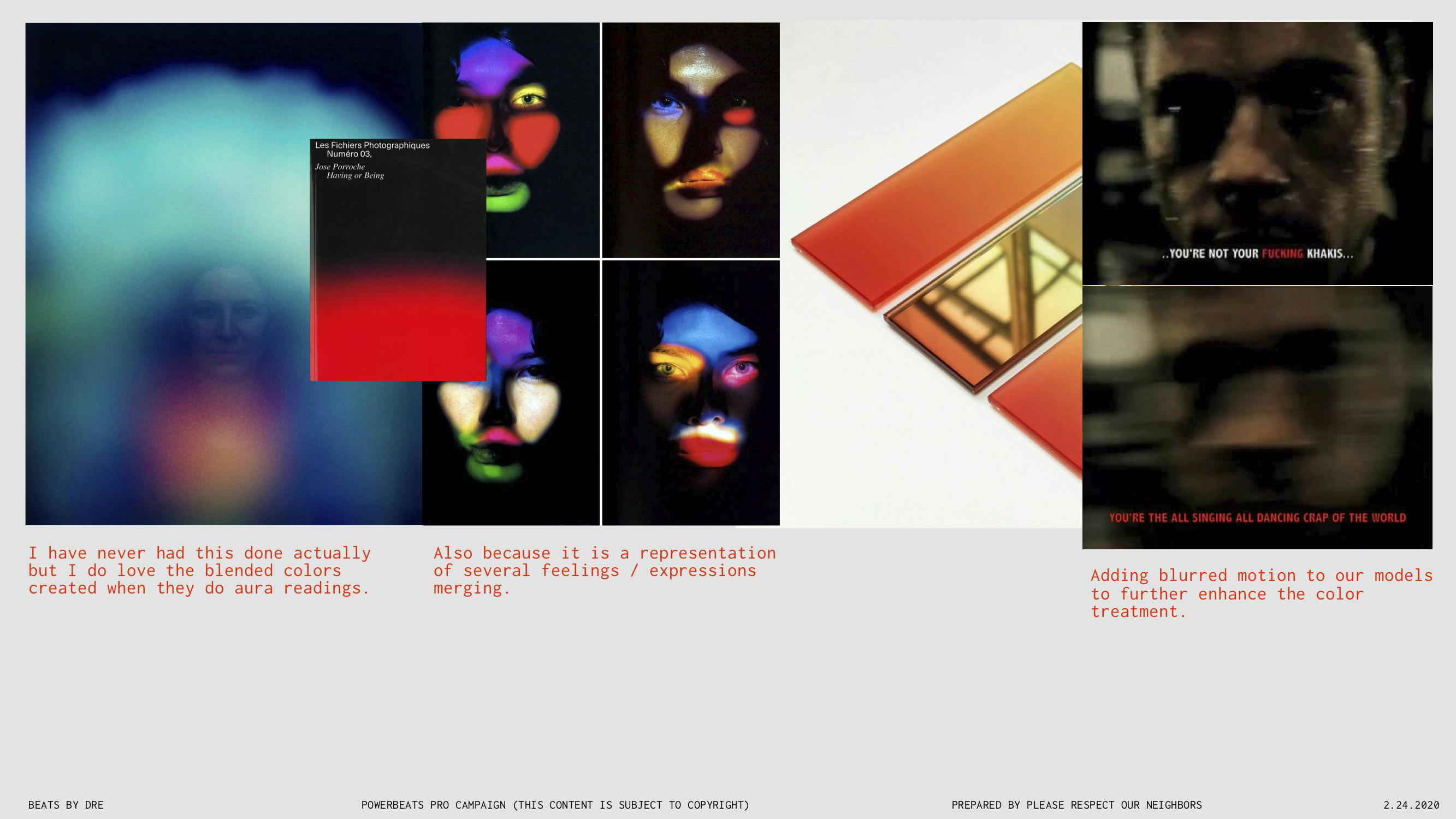
Round 1 — Direction 1 — Deals with Aura based mood colors.
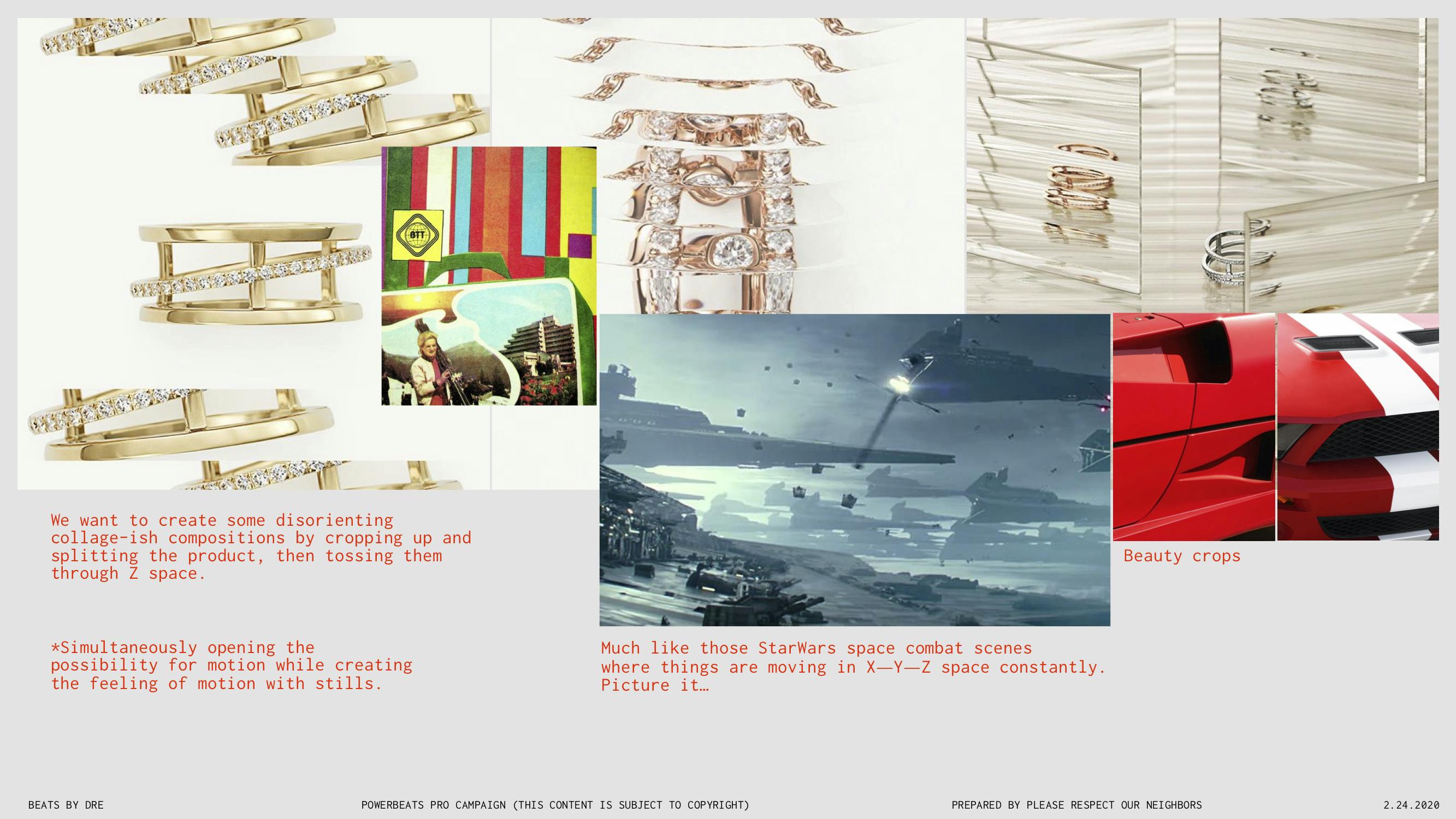
Round 1 — Direction 2 — Aims to show uniqueness in the product update by focusing on abstract crops.
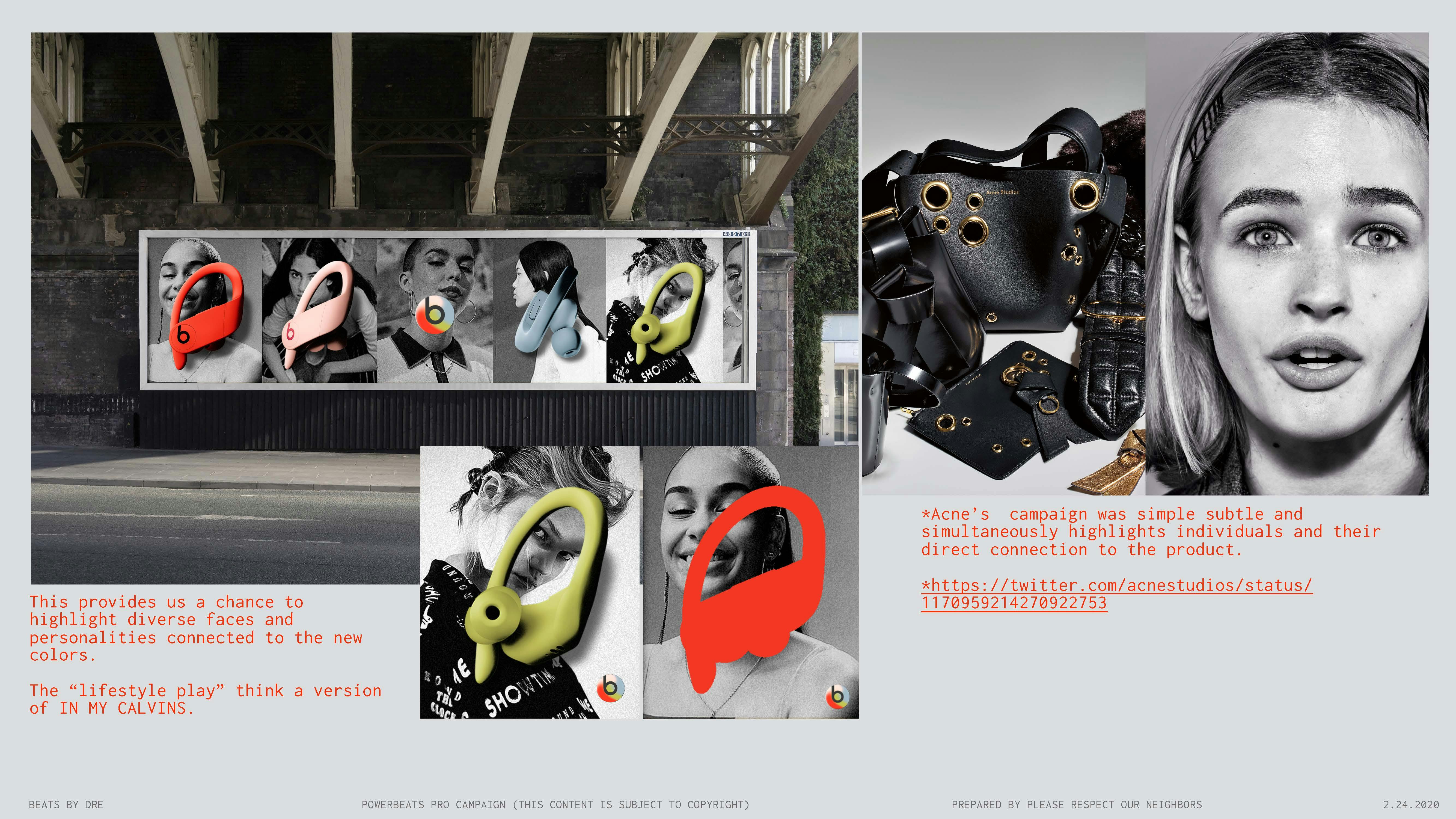
Round 1 — Direction 3 — A simple portraiture direction that highlights individuality in choice of color.
Round 1 — Direction 4 — Looks at the colors as a coded reference.
Round 1 — Direction 5 — Enhances the color way names as physical elements.
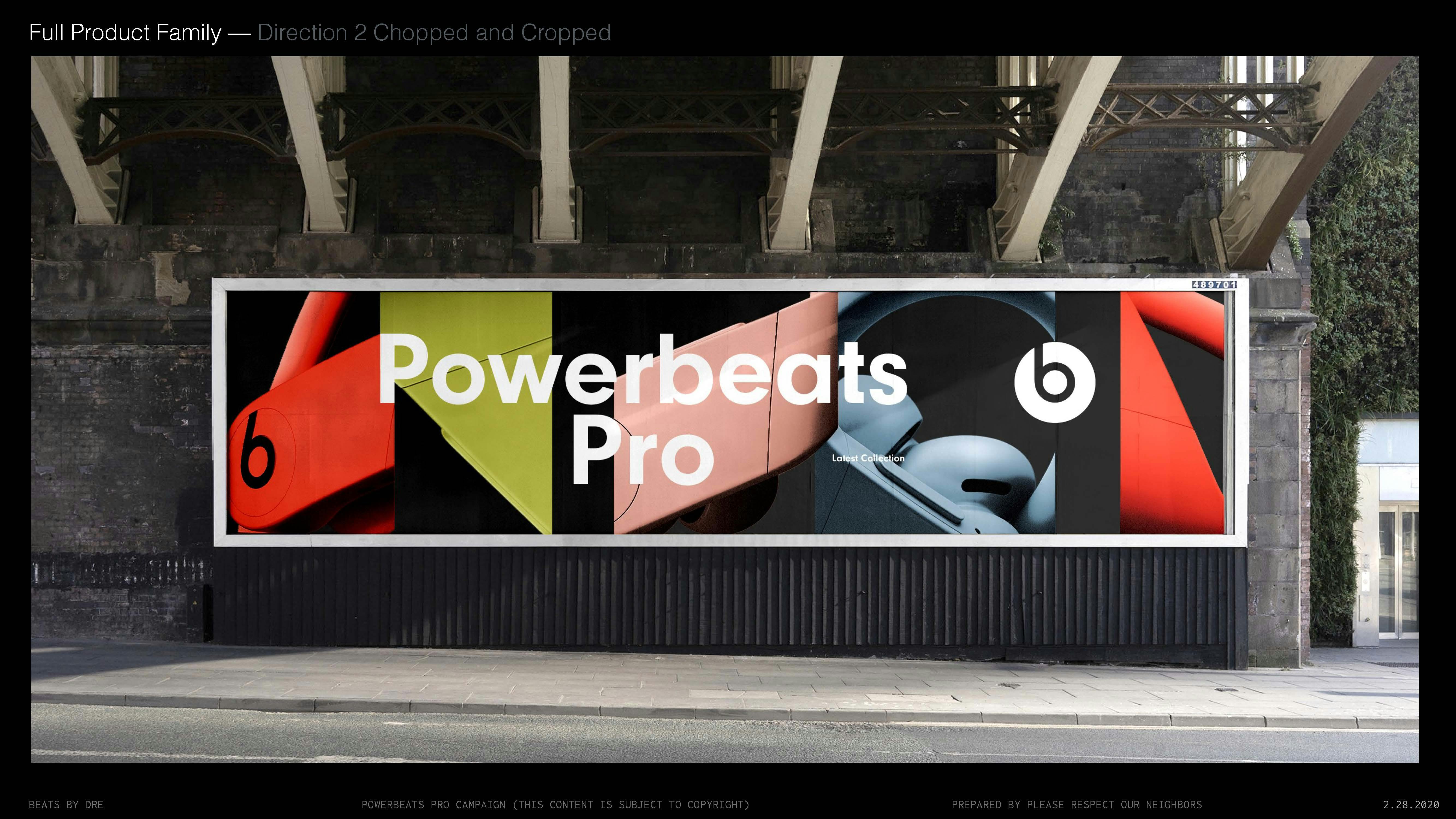
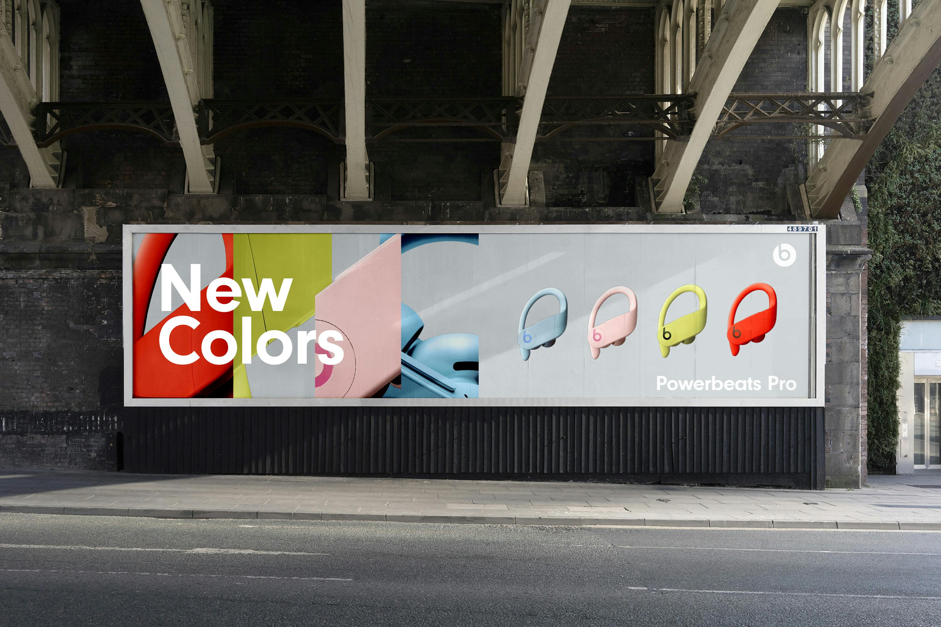
Selected Round 2 — Direction 2 "Chopped and Cropped" — Initial exploration explores ways to show full product with the abstracted cropped product images.
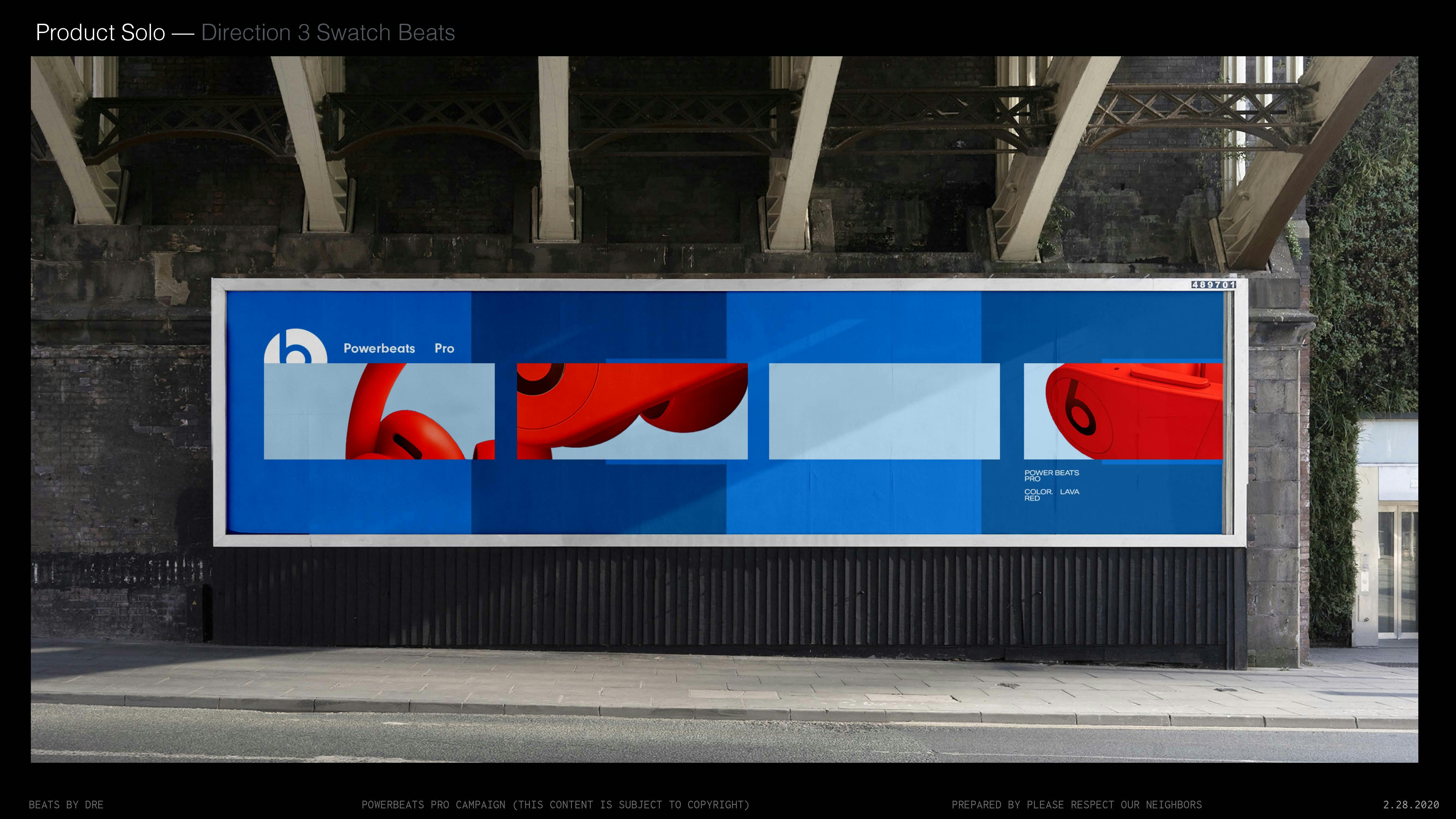
Selected Round 2 — Direction 4 "Swatch Beats" — Uses the color bar swatches as frames for product.
Selected Round 2 — Direction 5 "Elemental" — Simplifies and explores all the elemental representations.
Final "Chopped and Cropped" Approved and Launch Direction.
JAMES OLIVER HORTON
Was the Benjamin Banneker Professor of American Studies and History at George Washington University, who's works were contemplated when forming this sequence.
Published Writings:
pg 36 Slavery and the Making of America
pg 40–41 Slavery and Public History, the tough stuff of American history. Chapter 3 Slavery in American History an Uncomfortable National Dialouge.
"Popular novels and films portrayed slavery in
romantic and sentimental terms, casting slaves as childlike creatures who
often exasperated lovingly benign white masters. Generally, textbooks
reinforced this view."
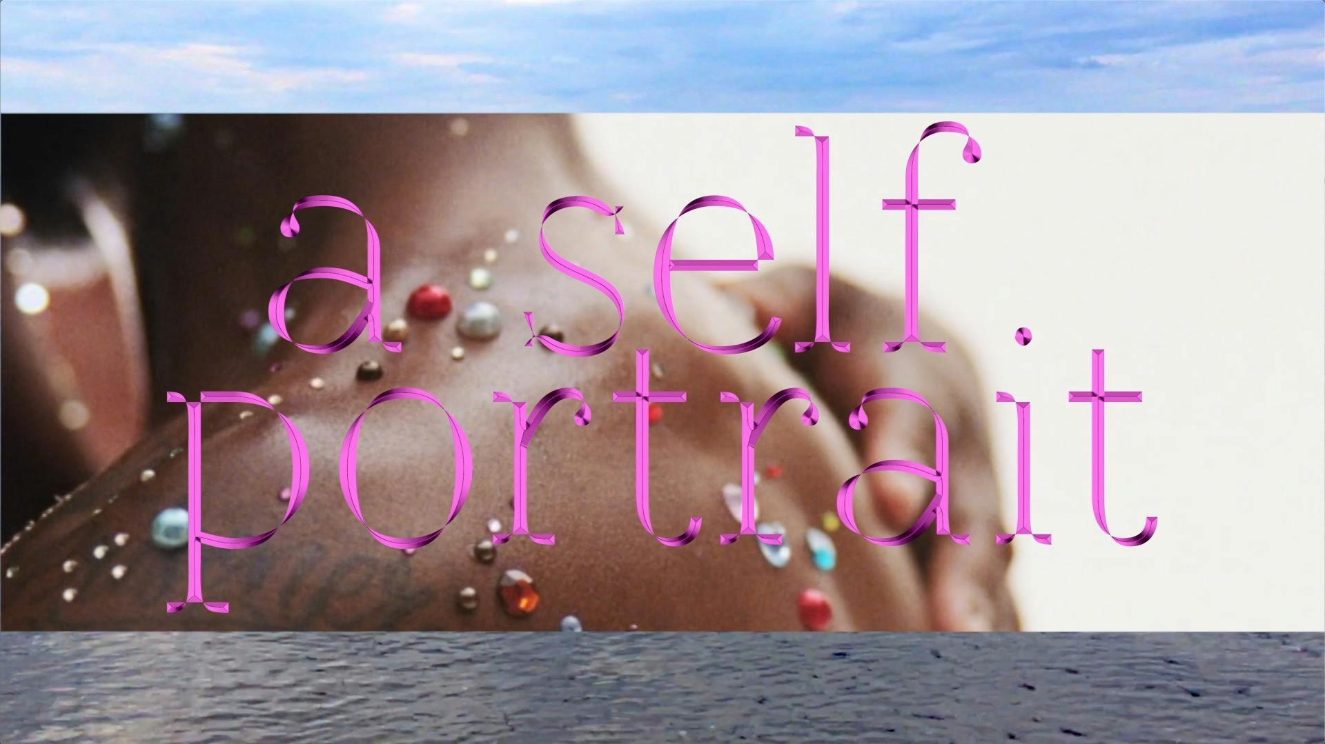
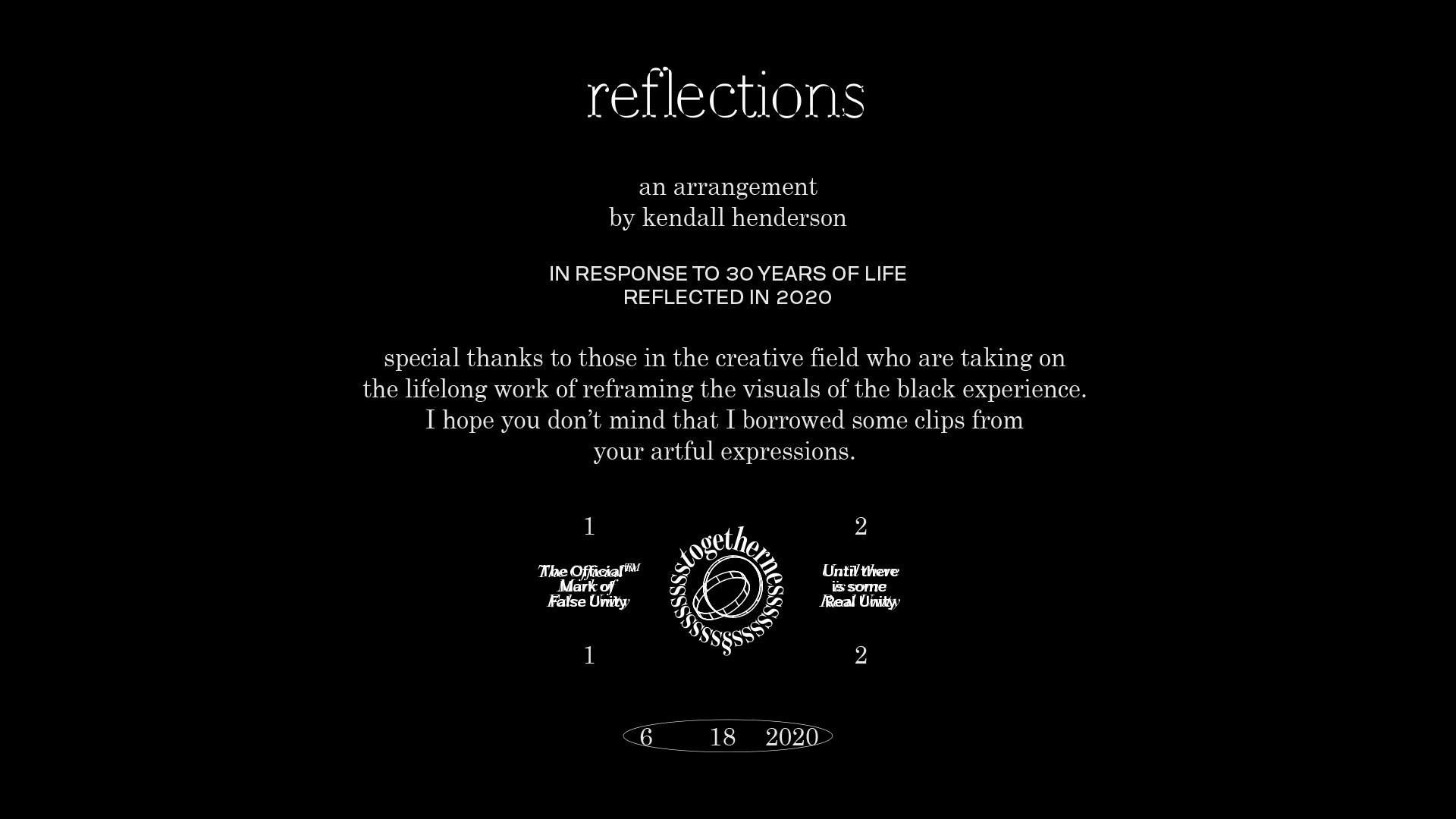
Initiated July 2020, Completed August 2020 — Kendall Henderson
Initiated July 2020, Completed August 2020 — Kendall Henderson
Thoughts regarding the subject of slavery's effects are internal, however some of the words have been inspired by the research and writings of Boston historian, James Oliver Horton.
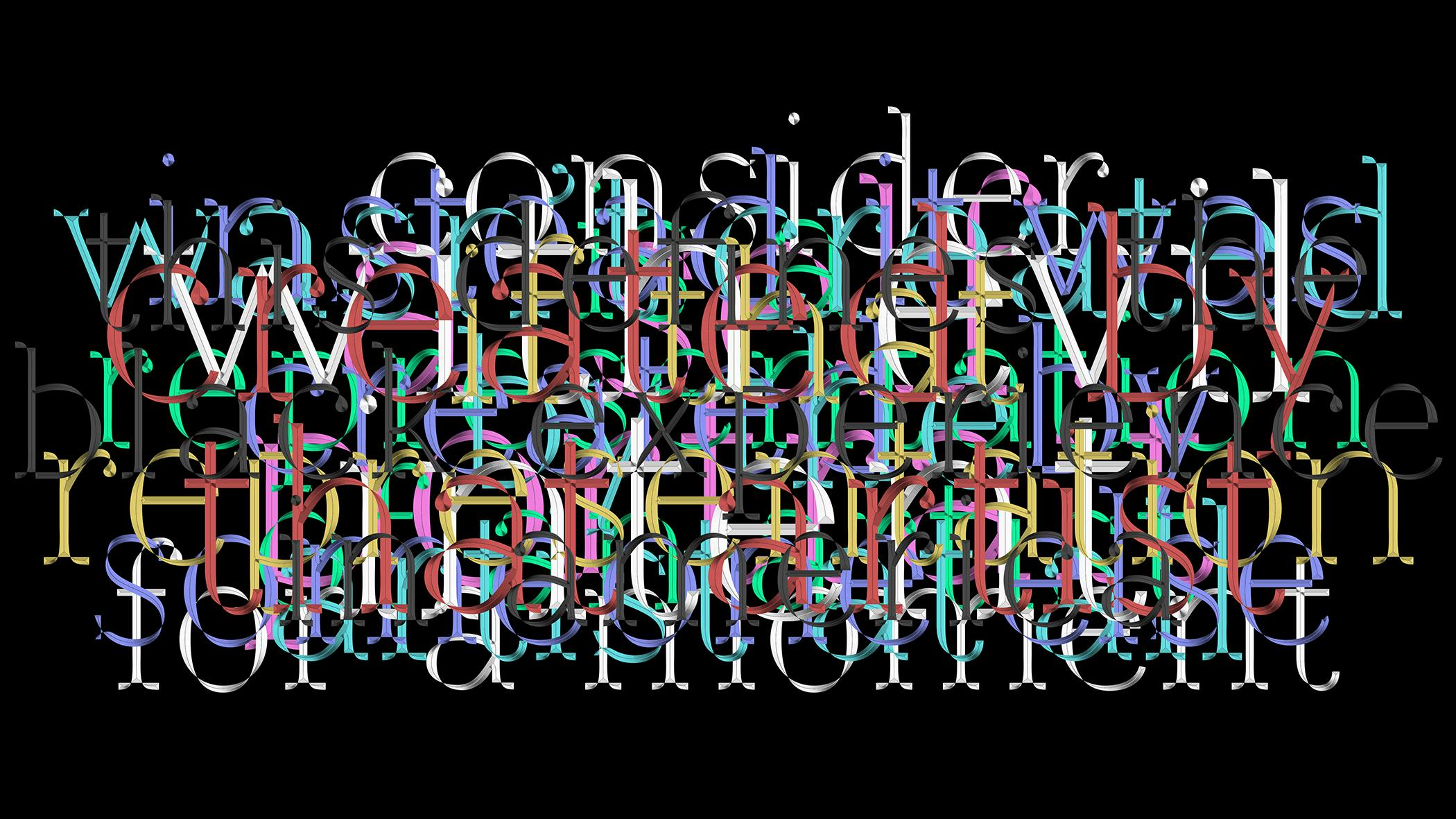
Visual, Conceptual and Mental References
Initial written statement.
Full arranged sequence of clips arranged and spliced throughout.
Each clip was sourced specifically from Black or pro-Black filmmakers (see credits)
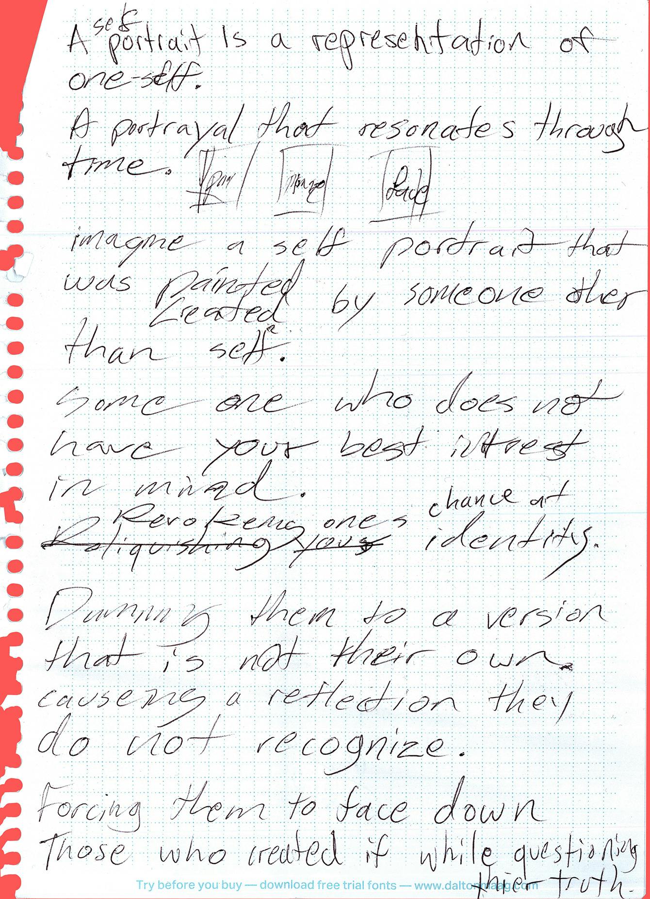
"A self portrait is a representation of an artist, created by that artist. Consider for a moment. If that representation wasn't created by that artist at all. Instead it was created by someone else, with evil intent."
Film Credits and Sources
Clips 1, 5, 20 — Clips 2,4,5,6 — Clips 7,12 — Clip 8 — Clip 9 —Clips 10,17,18,19,24,25 — Clips 11,13 — Clips 14,21,22 — Clip 16
VISUAL AUDIT
01 SSENSE.COM
- Unique feature imagery
- 4up Shop
- Large Look Product Pages
- Categorized Editorial Buckets
- Need to Know Collapsed Header & Footer
02 ARKET.COM
- Featured Product & Stories
- 4up Shop
- Process & Material Story
- Expanded Header Nav & Trending Items
03 ACNESTUDIOS.COM
- Editorial Masthead
- Store Images
- Home Page Peeking
- Style, Color and Size Nav
Initiated December 2018, Completed February 2020 — Kendall Henderson, Dinesh Dave
Initiated December 2018, Completed February 2020 — Kendall Henderson, Dinesh Dave
Undefeated semi initial correspondence, containing initial brief document and Asset plan
A set of key UI/UX findings considered to be successful amongst category adjacent ecomm websites
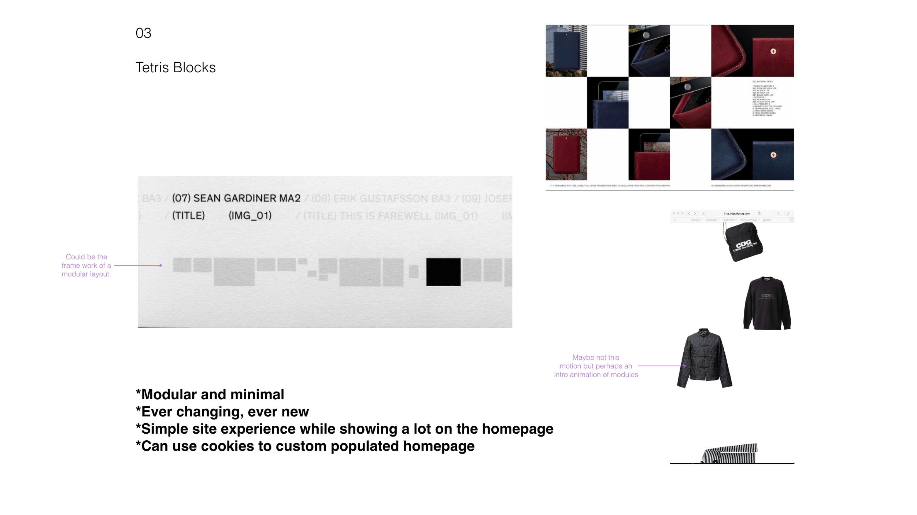
Selected Direction, 03: Tetris Blocks—Beginning to ideate on a straight forward yet unique modular layout
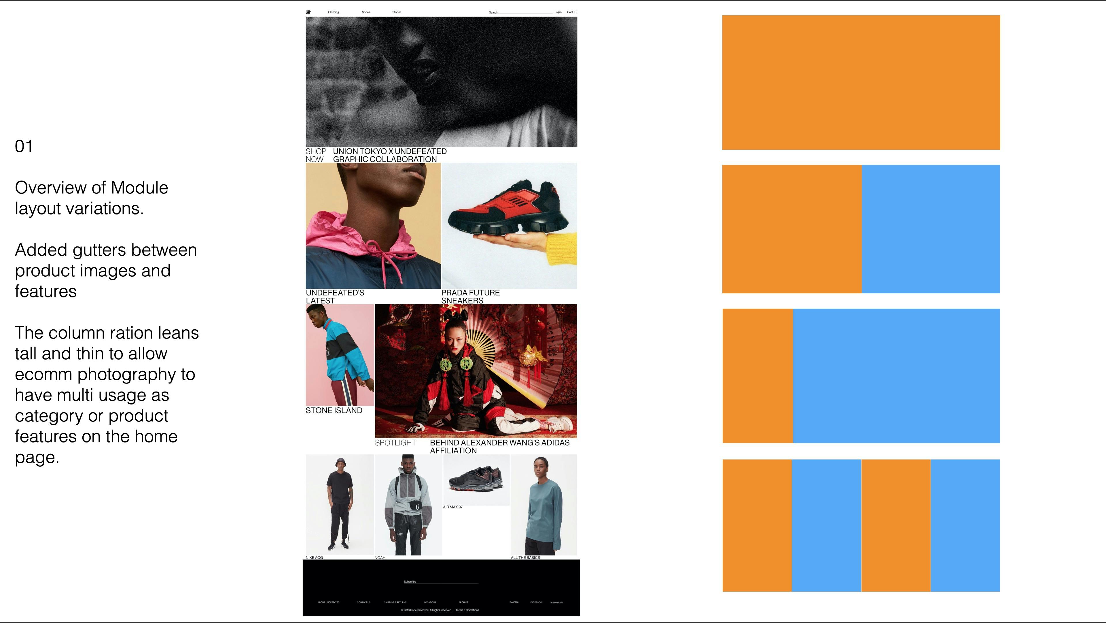
R1 approved home page design
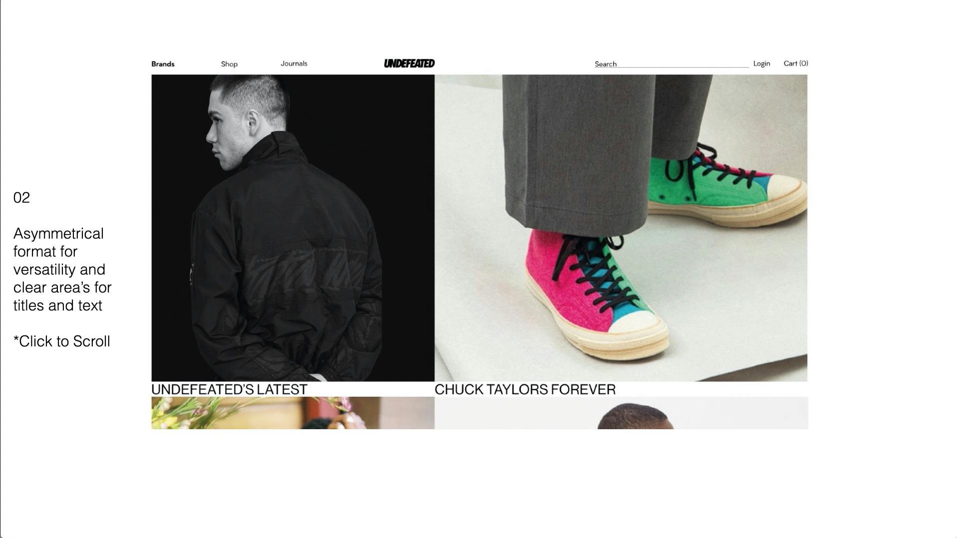
Full Presentation of our layout represented across primary and secondary pages.
UNDEFEATED.COM Feb 2020
He took my hand. Led me to the red carpet. I stopped myself before reaching the road, In objection. "But I have no shoes to dance the dance," I said. And In my objection I stepped into the shoes and his grin grew gaudier. With uncertainty and one crooked foot in front of the other, I began to dance. His talons now grip my bleeding hands. Descending came the shadow of my eyelids revealing the red carpet to me. So vast and so appealing! How could he be so kind to share all of this with me? Here we are many years later. Me facing the devil, dancing the same dance of yesterday.
After the uprisings last year and even before then I've been consistently thinking about how we can successfully achieve our visions without the coercion of capitalism. When I think about the type of career I want to build for myself it has a lot to do with the freedom to express myself in the way I see the best fit. Entering the world of photography has been both invigorating and uninspiring simultaneously . There is this unfortunate fixation on someone being the first and the youngest that creates a delusion around assumed access. "Responsibility without power is a mockery and a farce." (W.E.B. Du Bois)
Will we have proper time to grow and nurture our gifts? When each institution that we assimilate to is owned by the prior stakeholders, who is really in control? Is first and young, the path to power and true growth? Is this really all we have to offer as the image-makers of the future? I dream about being able to create my visions without the transactional conditioning of capitalism and you all should too. I will be the first to say that I am guilty of this as well, and the problem can not be solved by one individual. We might be "getting money", but we should be careful about the mirages we sell to our communities, especially when it means selling our identities back to us. What will be left of us?
There's a responsibility that rests on the shoulders of photographers who are Black to not be lazy about propping up false images. As image-makers, we have a responsibility to perception, and it's better to tell the truth than to feed a lie. Buying from Black-owned businesses does not mean subscribing to capitalism although be it at the moment supporting us. And at the same time, it's unfair, isn't it? It's unfair that we shouldn't indulge the vain luxuries that come with participating in the democratization of telling the world what it means to be Black in America. It's unfair, isn't it? Is it unfair that we might hold the "youngest Black photographer" accountable for pretending to be an agent of change in the face of cronyism and ignorance? It is disappointing to see advertisements and magazine covers be enough to satisfy our years of effort. Shaking the table and shaking hands are two different things.
Some of our focus seems to be on false progress; here we are a year later assimilated into what we preached against. I may never be the "first," "youngest," or give up my body to the old and wicked who lust at it, nor do I desire to, and that's okay. My identities are sacred to me. So, if I have to dance the dance I hope I'm able to save myself from the dance when I can. My aim is to hold the door open and lend a hand when and where I can. We're all guilty on the red carpet and not a single person is to blame. We all have red hearts and blood on our hands.
Not much has changed, and all is well in the devil's heaven.
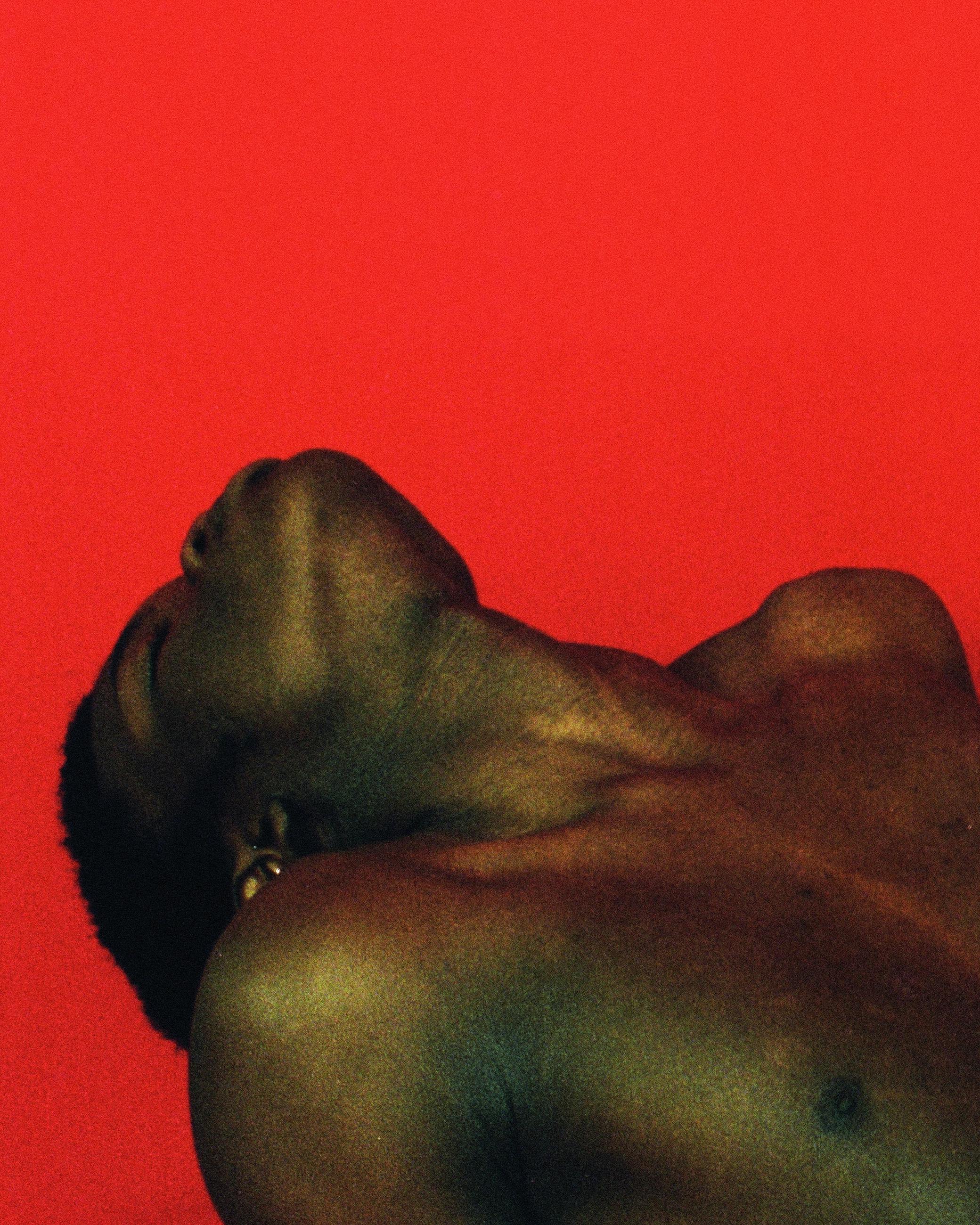
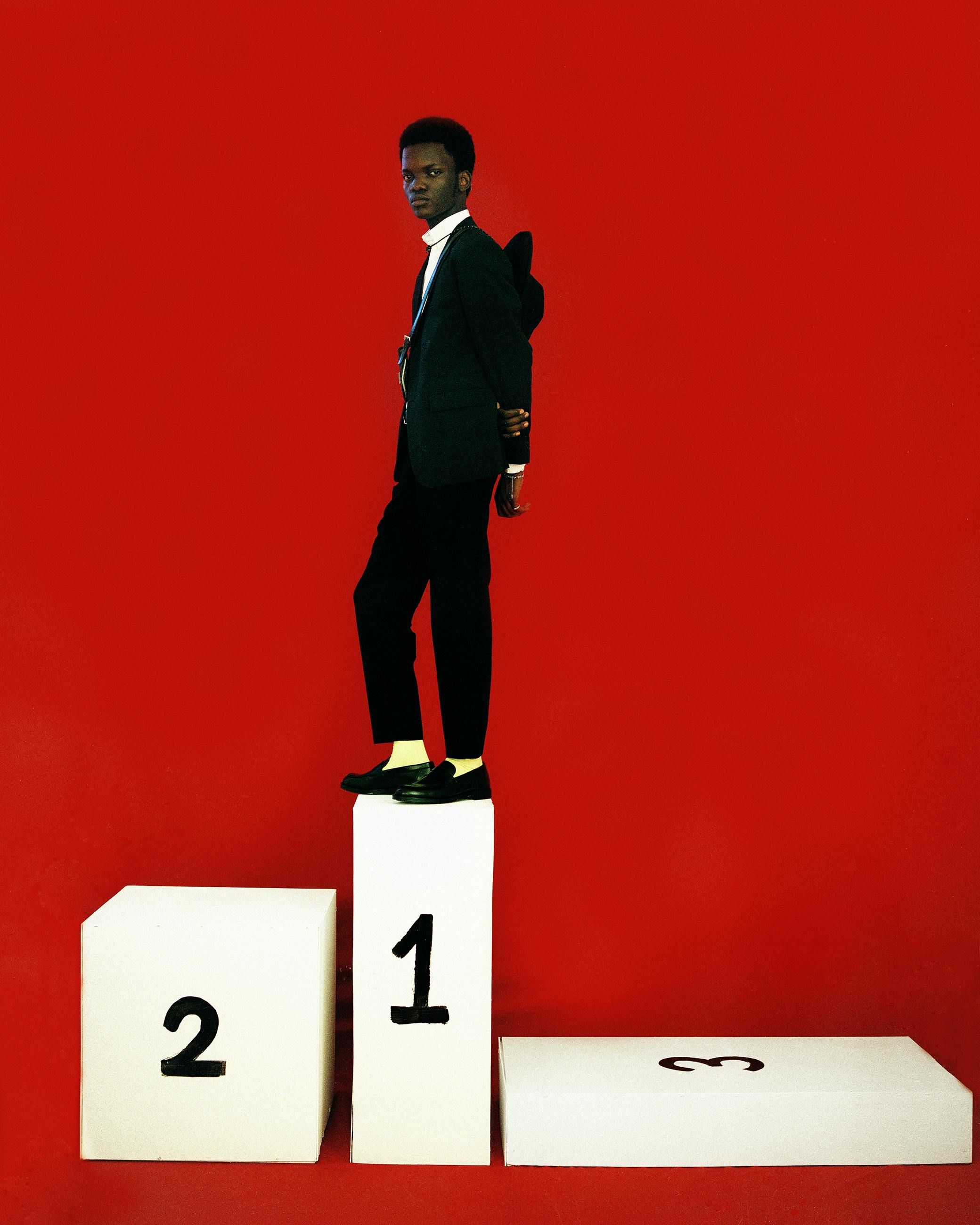
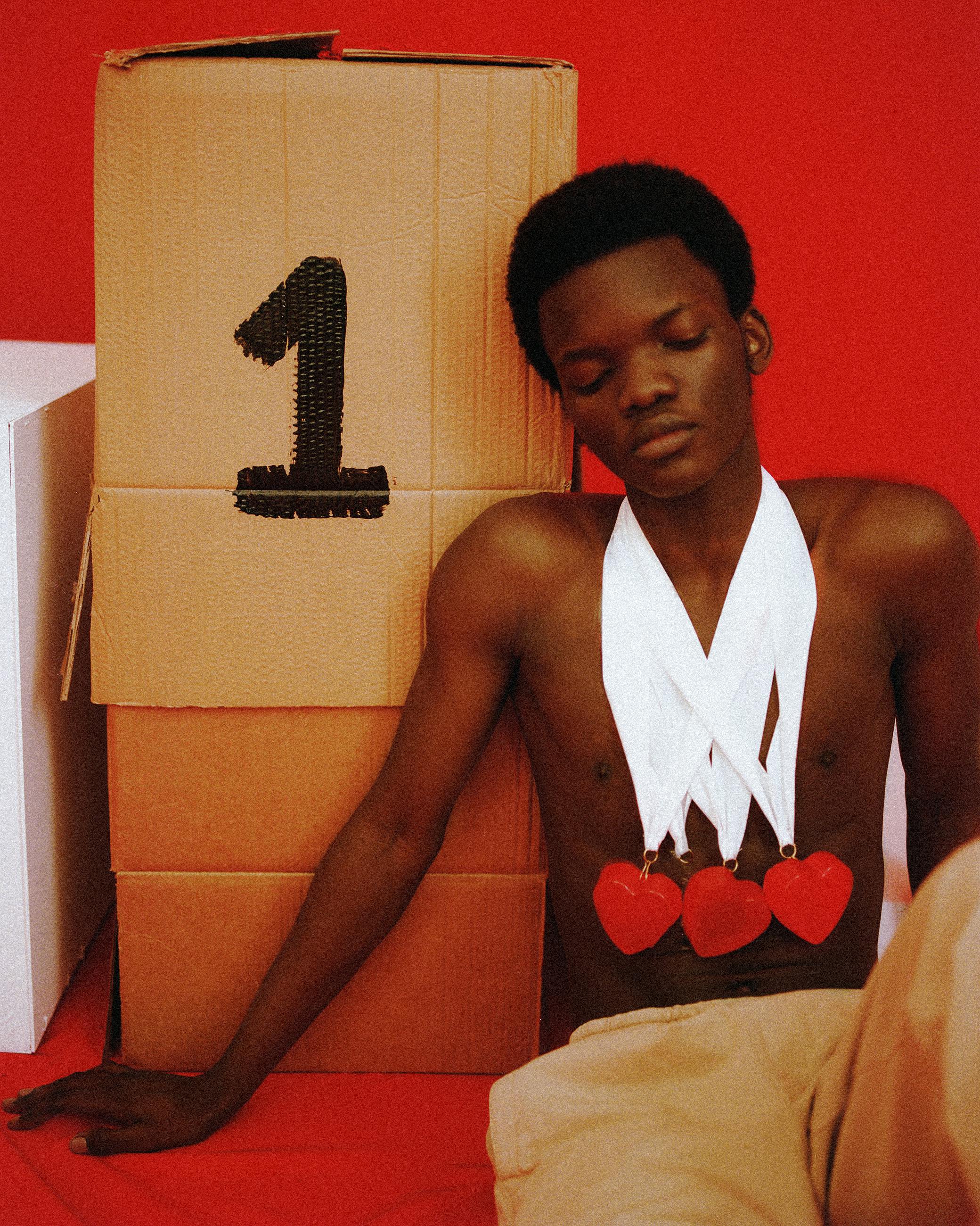
Completed March 2021 — Adraint Khadafhi Bereal
Completed March 2021 — Adraint Khadafhi Bereal
The Essay
Image 1
Image 2
Image 3.
Styling:@caribenacowgirl Model:@aheem_sosa Set Design:@dstroiker Photo Asst:@_juntan

Initiated September 2020, Completed November 2020 — Kendall Henderson, Thee Tham
Initiated September 2020, Completed November 2020 — Kendall Henderson, Thee Tham
"Marking of Local Services"
"Sticky Portals"